A dynamic logo lets your brand adapt without losing its identity. Instead of relying on one fixed mark, you build a system of controlled variations that keeps your company recognizable across every touchpoint while staying fresh, relevant, and responsive to the world around you.
This article walks you through what dynamic logos are, how brands like Google, MTV, Michelin, and FedEx use them, and how to create one for your own business.
Table of Contents
- What Is a Dynamic Logo?
- How Dynamic Logos Work in Practice (With Real Examples)
- Why Use a Dynamic Logo? Benefits for Modern Brands
- Core Principles of Effective Dynamic Logo Design
- How to Create a Dynamic Logo: Step‑by‑Step
- When a Dynamic Logo Is (and Isn’t) the Right Choice
- Practical Tips for Keeping Dynamic Logos Consistent
- Key Takeaways
- FAQs
What Is a Dynamic Logo?
A dynamic logo is a logo system that changes selected elements—color, background, secondary icons, or animation—based on context while preserving a consistent core so the brand remains recognizable.
Traditional logos remain unchanged across applications: one fixed mark, same colors, same layout, every time. A dynamic logo, by contrast, is a family of related marks built from the same foundation.
The core of a dynamic logo typically includes the primary wordmark typography, main symbol silhouette, and key base colors. These are the invariants. What may vary includes patterns, supporting illustrations, accent colors, layouts, and even motion behavior.
The concept of dynamic logos gained traction as brands shifted from print-first to screen-first, interactive environments.
The broader system is called a dynamic brand identity: it encompasses the flexible logo plus adaptable color palettes, motion rules, and contextual brand behaviors across digital and physical touchpoints.
Dynamic logos can change color, shape, or form for different platforms, and core elements remain consistent for recognition.
How Dynamic Logos Work in Practice (With Real Examples)
Effective dynamic logos share a stable base and controlled variables. The table below breaks down how four major brands handle this balance.
| Brand | What Stays Fixed (Core) | What Changes (Variable) | Context for the Variation |
|---|---|---|---|
| Four-color wordmark, sans-serif letterforms, letter order | Illustrations, animation, environment | Holidays, events, cultural moments (Doodles) | |
| MTV | Large “M” + overlapping “TV” silhouette | Interior fills, textures, patterns, surrounding shapes | Music genre, show, campaign |
| Michelin Man (Bibendum) | Character’s basic form and facial features | Pose, props, surrounding context | Message being communicated (driving, guiding, tires) |
| FedEx | Core typography, hidden arrow in “Ex” | Subtext wording and color | Service line (Express, Ground, Freight) |
Google alters its logo for special occasions while its letterforms never waver. MTV alternates colors and textures in its logo for creativity, treating the block “M” as a canvas. FedEx changes subtext and colors in its dynamic logo to distinguish service lines.
Successful dynamic logo systems include consistent visual anchors like shape and typography. The shared principle: a stable core, clear rules for what can change, and context-driven variations that always feel like the same brand.
Why Use a Dynamic Logo? Benefits for Modern Brands
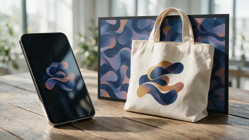
Dynamic logos are especially useful for brands that live across social media, app interfaces, packaging, and events—contexts where one rigid mark can feel limiting.
They signify a brand’s versatility and relevance in the market while allowing the organization to communicate different aspects of its personality without changing who it is at the core.
Dynamic logos enhance brand identity and creativity by letting you showcase diversity in your visual language. They can increase audience engagement and interaction: customers may look forward to seasonal variations, product launches, or cultural moments, which drives shares on platforms like Instagram or TikTok.
A 2025 study in Behavioral Sciences using AI-powered eye-tracking and EEG found that dynamic elements in logos capture and maintain attention more effectively than static designs, strengthening emotional engagement and brand recall.
They also foster deeper connections with audiences. When a logo reflects current events or local culture, it creates a sense of connection that a static image cannot. Dynamic logos signal innovation and modernity in dynamic branding practices, allowing brands to stay relevant and responsive.
From a practical standpoint, they enable easier sub-branding for product lines or regional markets—think color or wording variants—without constant full rebrands, giving your business a real edge over the competition.
Core Principles of Effective Dynamic Logo Design
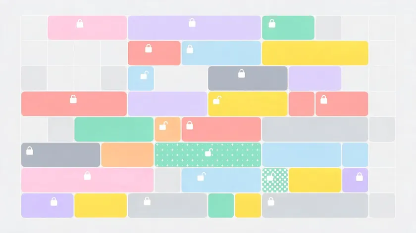
Strong dynamic logos follow a clear rulebook that defines what always stays the same and what can change under which conditions. Dynamic logos require clear brand guidelines to preserve recognition and coherence.
Key invariants:
- Primary wordmark fonts and typography
- Main symbol silhouette or character
- Base color palette (or at least one anchor color)
- Core proportions and spacing
Typical variables:
- Accent colors, patterns, and textures
- Supporting icons and background shapes
- Motion behavior (bounce vs. fade, for example)
- Context-specific illustrations or a tagline swap
Core elements of a dynamic logo must remain consistent. Every variation should be identifiable at a glance—even out of context, a Google Doodle still reads as “Google,” and an MTV graphic still uses the same block “M.”
A good dynamic logo should be versatile across various media, and simplicity in design enhances the effectiveness of dynamic logos by making the essential elements stand out.
Build a modular logo system: primary version, minimal icon, wordmark-only, and context-based versions, all derived from the same grid and type scale. Then document everything side-by-side: static and dynamic examples, do’s and don’ts, motion specs, and graphics for print, web, and app use.
How to Create a Dynamic Logo: Step‑by‑Step
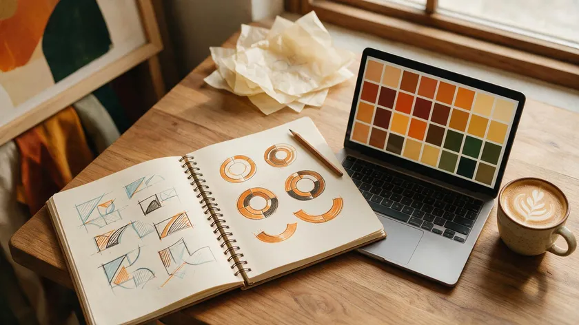
Here is a practical roadmap for creating a dynamic logo system, whether you are a startup, a small business, or planning a rebrand.
Step 1 – Define your brand core.
Clarify your mission, personality (playful vs. premium), target audience, and key values before touching any design tool. Your dynamic identity must convey a clear brand message, or variation becomes noise.
Step 2 – Design the static core logo first.
Choose a sleek wordmark and/or symbol. Ensure legibility at small sizes. Test in black-and-white before adding brand colors to confirm the essence holds.
Step 3 – Choose what will be dynamic.
Pick three or four concrete variables: seasonal color overlays, background illustration sets, pattern libraries, or character poses. Tie these choices to your brand story—a travel company might use changing map textures.
Step 4 – Build variation rules.
Create a matrix defining which elements can be altered by channel (social avatars, app icons, and print), by campaign type, or by time (events, holidays, product launches). This is crucial for consistency.
Step 5 – Prototype and test.
Mock up multiple variations and test them in real contexts—mobile screen, packaging, profile picture, and banner. Gather feedback from your team and customers about recognition and clarity. Dynamic logos adapt to different contexts and environments, so verify they hold up across various devices and marketing materials.
Step 6 – Codify and roll out.
Assemble a mini brand guide with logo files, usage rules, motion specs, and examples of acceptable vs. off-brand treatments.
An AI Logo Generator can help you rapidly explore multiple core logo directions during Steps 2 and 3, letting you see which ideas scale best into a dynamic system across different layouts and color applications.
These six steps turn an abstract concept into a usable, documented logo system that your whole organization can follow—from your design team to your marketing materials collection.
When a Dynamic Logo Is (and Isn’t) the Right Choice
Dynamic logos are powerful but not universally appropriate. The decision should align with your business model, audience, and industry norms.
Dynamic logos work well for digital-first brands, media and entertainment, tech startups, cultural institutions, and any company with frequent campaigns or content updates. Dynamic logos are commonly used in digital environments for flexibility and engagement, and they let you adapt to the world in real time.
More conservative contexts include regulated industries such as banking, insurance, or government service, where stability and trust favor minimal variation. A 2025 study published in Psychology & Marketing found that low-dynamic logos scored higher on perceived brand premiumness than high-dynamic ones, particularly among status-motivated consumers—an effect researchers attribute to the psychological distance a stiller mark creates.
Dynamic branding should never compensate for weak strategy. Changing a logo constantly will not solve unclear positioning or inconsistent messaging. A quick checklist: if your audience values innovation, if you communicate across many channels, and if you often run themed campaigns, a dynamic logo is worth the extra effort.
A well-documented, slightly dynamic system—with occasional illustrated variants and modular sub-brands—can be a fun and sensible model for brands that want flexibility without full constant evolution.
Practical Tips for Keeping Dynamic Logos Consistent
The main risk of a dynamic identity is fragmentation. These safeguards keep everything aligned.
- Cap your variations. Set a maximum number of core versions per use case—a defined collection of seasonal or campaign templates prevents a chaotic, unrecognizable mix.
- Build a shared asset library. Master logo files, approved background patterns, icon sets, and color tokens that designers and marketers must use when creating new variants. Free-form improvisation is the enemy of coherence.
- Appoint a brand owner. A small review group should approve new variations and ensure they meet legibility, contrast, and recognition benchmarks before anything goes live.
- Design for accessibility. Define contrast ratios, size minimums, and motion speed limits so dynamic treatments remain inclusive and readable across devices. Your new logo styles should work for every viewer.
- Audit regularly. Twice a year, review all live logo instances across your site, apps, signage, and social profiles. Retire outdated or off-brand variants to keep the system fresh, memorable, and coherent.
These steps help your organization explore creativity without sacrificing the image and recognizable quality that represents your brand in the world.
Key Takeaways
- A dynamic logo keeps core elements fixed—typography, silhouette, base colors—while allowing controlled variation across different contexts, letting a brand adapt without losing what makes it recognizable.
- Multi-screen usage, social media formats, and global audiences make adaptable logo design essential, since a single rigid mark can’t serve every touchpoint.
- Google Doodles, MTV’s changing fills, Michelin Man’s different poses, and FedEx’s shifting subtext colors show how major brands use this approach to stay culturally relevant without losing recognition.
- Dynamic logos are a strategic extension of brand identity, not a trendy replacement for solid branding fundamentals. They reward planning and documentation over random experimentation, helping a company express versatility and creativity while staying consistent.
Ready to build your core logo? Generate a professional logo in seconds with AI, then test how it holds up across colors, formats, and contexts — no designer required.
Try the AI Logo Generator →
FAQs
Below are common practical questions about dynamic logos that this article hasn’t fully addressed.
Is a dynamic logo more expensive to create than a regular logo?
Yes, dynamic logos usually cost more upfront because they require strategy, multiple versions, and a stronger guideline document. However, they can reduce future rebrand costs by allowing incremental updates instead of total redesigns.
Small brands can start with a simple static logo plus a few defined variations and scale the system over time as budget allows.
Can small businesses or local shops really benefit from dynamic logos?
They can—especially if they communicate frequently through seasonal menus, local events, or promotions. Simple dynamic elements like changing accent colors or background illustrations keep the brand fresh.
Avoid overcomplicating: for a neighborhood shop, a few steady, easily managed variations are better than a large, complex system.
Do dynamic logos hurt brand recognition over time?
Poorly governed dynamic logos can hurt recognition, but well-designed systems improve it by making the brand more visible and contextually relevant. The key is a stable foundation type, silhouette, base colors, and clear rules for change.
Can a static logo be turned into a dynamic one later?
Many brands evolve this way. They start with a static logo, then gradually introduce patterns, motion, sub-brand colors, or event treatments while keeping the original mark intact.
Conduct a small audit of your existing logo’s strengths and limits, then design a controlled set of extensions rather than redrawing everything from scratch.
Do dynamic logos have to be animated?
No. A logo can be dynamic purely through changing layouts, colors, or supporting illustrations in static media. Motion can enhance a dynamic logo on digital platforms, but printed marketing materials and signage can still express dynamism through evolving graphic treatments.

