The best minimalist logo examples prove that stripping a design down to its essence can make it stronger, not weaker. In this post, you’ll see how brands like Uber, Audi, Spotify, Instagram, Pinterest, Dunkin’, and Slack use clean lines, simple shapes, and restrained color to build instantly recognizable identities.
We’ll cover both minimalist and minimalistic logos across wordmarks, icons, monograms, and geometric marks, plus when to use a logo maker versus hiring a professional designer.
Every example is a real brand launched or refreshed between 2000 and 2025, giving you more ideas you can actually model rather than abstract theory.
Table of Contents
- What Makes a Logo Truly Minimalist (and Why It Works)
- Text‑Only Minimalist Logos: When Typography Does All the Work
- Icon‑Plus‑Wordmark Minimalist Logos: Simple Symbols With Big Impact
- Geometric and Monogram Minimalist Logos: Structure and Initials
- Color‑Led Minimalist Logos: Flat Palettes, Gradients, and Monochrome
- Minimalist Logos by Industry: Tech, Food, Fashion, and Automotive
- How to Design Your Own Minimalist or Minimalistic Logo
- Key Takeaways
- FAQs About Minimalist Logo Design
What Makes a Logo Truly Minimalist (and Why It Works)
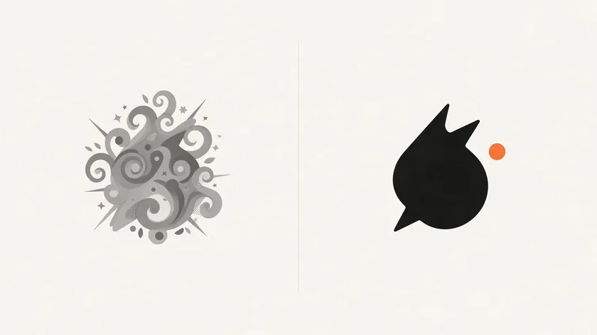
A minimalist logo is a mark stripped to essential elements—few shapes, simple type, and a restrained color palette—that still captures a brand’s personality. Minimalist logo designs are defined by simplicity and the removal of unnecessary elements, yet they remain full of character.
Key characteristics include the following:
- Limited colors: a minimalist logo uses one or two colors, plus a neutral
- Generous negative space and clean geometry
- High legibility at small sizes (favicons, app icons)
- No unnecessary decoration—no shadows, textures, or bevels
Simple, clean shapes are processed faster by the brain than complex designs, which is why minimalist logos communicate one core message, reducing cognitive load for potential customers.
Successful minimalist logos have limited color palettes and clean typography, making them versatile logos that remain legible at any size from small icons to large billboards.
The business benefits are concrete: faster recognition on mobile screens, cheaper printing, quicker website loading, and a modern, sophisticated appearance. Timelessness in logo design is achieved by avoiding complex decorations.
Note that “minimalist” and “minimalistic” are used interchangeably in design discussions—both describe the same style of simplicity. Keep these traits in mind as you browse the examples below.
Text‑Only Minimalist Logos: When Typography Does All the Work
Typographic minimal logos focus on fonts and letter arrangement, making them ideal for service brands, creators, and startups that want the name itself to be the hero. Use a simple typeface for minimalist logos, and let spacing do the heavy lifting.
Uber
In 2018, Uber replaced its earlier “bits and atoms” symbol with a bold, all-caps geometric sans serif wordmark in black on white. The symbol was dropped entirely to improve recognition across 660+ cities worldwide. The result is a sleek, simple design that solves legibility issues at small sizes and on varied backgrounds.

Spotify
Spotify’s wordmark uses lowercase, rounded sans-serif letter forms that feel approachable and tech-forward. In 2024, the brand introduced “Spotify Mix,” a custom typeface with sharper angles that took 18 months to develop. The almond-shaped counters in letters like “p” and “d” echo the arcs of the brand’s icon, creating a cohesive identity.
COS and Glossier
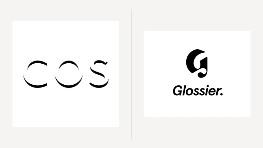
COS uses ultra-clean uppercase sans serif type with generous spacing—no icon, no ornament. Glossier takes a softer approach with a serif-inspired wordmark and pastel tones. Both show how minimalist logos typically use clean, well-spaced lettering and subtle quirks in letter forms instead of graphic symbols.
Practical tips: Choose one strong font, rely on kerning and spacing for elegance, and limit color to one base hue. Try a logo maker to quickly preview multiple font pairings, then hand your best concepts to a professional designer who can refine custom letter shapes and craft a more distinctive, minimalistic logo.
Icon‑Plus‑Wordmark Minimalist Logos: Simple Symbols With Big Impact
Many minimalist logo designs pair a stripped-down icon with a wordmark so the brand can use either the full lockup on a website or just the symbol on an app and apparel. This folding of identity into two interchangeable parts gives companies maximum flexibility.

Spotify
Spotify’s icon—a flat green circle with three white curved lines—represents sound waves in the simplest possible shape. The emblem works at tiny app-icon sizes because of its minimal geometry. Notable minimalist logos convey messages succinctly through simple shapes and clever negative space, and Spotify’s icon is a textbook case.

In 2016, Instagram replaced its detailed skeuomorphic camera with a simple camera outline on a gradient background. A rounded square, a circle for the lens, and a small dot were all that remained. The result became instantly recognizable worldwide. Photographers weighing a camera motif can compare it with these minimalist photography logo ideas.
A minimalist logo should be memorable and recognizable, and Instagram’s redesign proves that opting for less detail can make a symbol more iconic.

Pinterest uses a stylized “P” inside a red circle. The letter doubles as a pin or map-marker shape, making the logo an effective visual metaphor. It succeeds as both a social-media avatar and an app icon with minimal shapes.
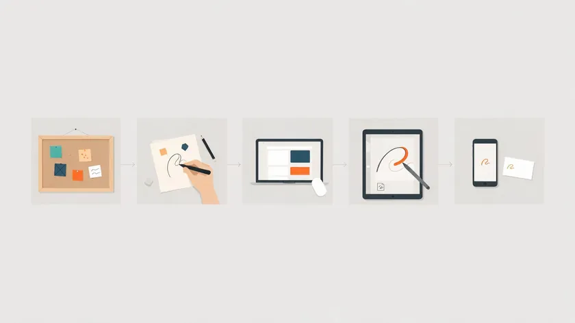
Design advice: Choose one visual metaphor, reduce it to basic geometry, and avoid thin details that vanish when scaled down. Sketch icons in black and white; effective use of negative space creates hidden meaning without adding complexity. Add color only after the silhouette works on its own.
Geometric and Monogram Minimalist Logos: Structure and Initials
Geometric minimal logos use basic shapes for visual harmony, creating a sense of precision and trust—especially useful for fintech, SaaS, or architecture brands, the same logic behind geometric abstract logos, which lean on shape alone to signal trust in tech and fintech. Good minimalist logos often feature simple geometric shapes that convey sophistication without clutter.

Audi
Audi’s four interlocking rings trace back to the merger of four companies during the Great Depression. In 2016, Audi moved to a flat, 2D version, removing metallic bevels and shadows.
The monochrome mark shows how geometry alone can carry decades of brand recognition across every surface, from car badges to digital interfaces.
Monogram Logos (CH and Interlinked Initials)
Monogram logos represent brands using initials in a sleek design. If you’re weighing a monogram against other lettermark styles, see how it compares to the full menu of logo types. Calvin Harris’s overlapping “CH” and luxury fashion houses with interlinked letters all compress a name into a tight, minimal mark.

Slack
Slack’s 2019 redesign by Pentagram replaced the complex hash icon with a symmetrical arrangement of rounded rectangles. The color palette shrank from eleven colors to four. The goal was to “scale easily and work better in many more places,” making the logo a solid example of geometric minimalism in action.
Practical advice: Start from circles, squares, and lines. Build initials into balanced grids. A professional designer is often worth the investment for monogram work, as subtle spacing and optical adjustments separate an amateur mark from a timeless minimalist logo.
Color‑Led Minimalist Logos: Flat Palettes, Gradients, and Monochrome
Minimalist logos don’t have to be black and white. Many rely on one strong color or a subtle gradient to pull attention while keeping shapes bold and simple. A minimalist logo uses one or two colors, but that constraint forces inspired choices.
Instagram’s gradient—a smooth transition from purple through pink to orange—was chosen to stand out on crowded home screens. In 2022, the brand brightened the gradient further while keeping the same geometric glyph. Minimalist logos focus on high contrast and leverage negative space for impact, and Instagram’s color strategy is a masterclass.
Spotify
Spotify’s flat green (#1DB954) has served as the brand’s signature hue for nearly a decade. Even without the wordmark, this single color is enough to generate instant recognition—proof that a restricted palette can convey a brand’s essence.

Dunkin’
After dropping “Donuts” in its 2019 rebrand, Dunkin’ kept its bold orange and pink wordmark. No icon, no extra ornament—just letterforms and two playful colors on a clean surface. The statement is clear: even playful color stays minimalist when typography is kept simple.
Monochrome
Black and white logos emphasize form and structure without color. Fashion and tech brands regularly default to monochrome for maximum versatility—print, embossing, apparel, and digital all covered. Always create a single-color fallback version in your brand guidelines.
Actionable tips: Pick one dominant hue, test it on light and dark backgrounds, and ensure enough contrast for accessibility. Negative space logos cleverly conceal images within blank spaces, so consider how your color choices interact with the white space around them.
Minimalist Logos by Industry: Tech, Food, Fashion, and Automotive
Different industries lean toward different minimalist design patterns. Use these as guardrails when searching for more minimalist logos that match your niche.
Tech & Apps
Brands like Uber, Slack, and Spotify rely on flat color, rounded geometric fonts, and simplified icons. Clarity on small screens and dark-mode interfaces is the priority.
Food & Beverage
Dunkin’ is the standout minimalistic logo example—a streamlined wordmark, dropped secondary text, and flexible use on cups, storefronts, and digital ads.
Fashion & Lifestyle
COS and Uniqlo use simple wordmarks or square marks, proving that minimalism in fashion can feel stylish and premium without images or complex art.
Automotive

Audi’s flat rings and Jaguar’s flatter emblem versions, part of the same digital-first flattening trend reshaping legacy automotive branding, show how legacy companies are embracing minimalist design for digital-first reality. Less chrome, more clarity.
| Industry | Example Brand | Signature Trait |
|---|---|---|
| Tech & Apps | Uber, Slack, Spotify | Flat color, rounded geometric type |
| Food & Beverage | Dunkin’ | Streamlined wordmark, dropped secondary text |
| Fashion & Lifestyle | COS, Uniqlo | Simple wordmarks or square marks |
| Automotive | Audi, Jaguar | Flatter, less chrome, digital-first refinements |
Study 5–10 minimalist logos from your own niche, take notes on fonts and shapes, and adapt patterns rather than copying any single design. Effective minimalist logos communicate brand identity clearly, regardless of industry.
How to Design Your Own Minimalist or Minimalistic Logo
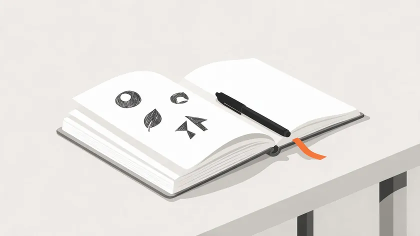
You can create a strong minimalist logo through a straightforward process: research, sketch, digitize, refine, and test in context. A minimalist logo should communicate your brand’s essence from the very first draft.
- Collect inspiration. Gather 10 to 20 logo ideas for inspiration—screenshots of Uber, Spotify, Pinterest, and others. Note what you like about spacing, color, and icon style. Define 2–3 brand adjectives that represent your preferences.
- Sketch in black and white. Draw rough concepts with a black marker, focusing on one wordmark, one icon-plus-text, and one monogram idea. Classic minimal logos feature clean lines and simple icons, so keep your sketches stripped down.
- Test with a logo maker. A logo maker helps non-designers quickly test fonts, color palettes, and layouts. Logo.app allows instant logo downloads in various formats, giving you free access to preview ideas before committing. It’s a low-cost way to generate and explore multiple logo designs.
- Hire a professional designer. Once your business has traction, hand the best concept to a designer who can craft refined kerning, alignment, and responsive logo variants that convey real sophistication.
- Test everywhere. Preview final candidates on mobile screens, social avatars, invoices, and signage mockups. Minimalist logos use simple shapes and restricted color palettes to convey a brand’s essence—make sure yours holds up across every world your user encounters it in.
Follow these five steps in order, and you’ll have a polished, ready-to-use minimalist logo—one that looks just as sharp on a phone screen as it does on a storefront sign.
Key Takeaways
- Minimalist logos strip branding down to essential shapes, colors, and typography, which makes them clearer, more memorable, and easier to use everywhere from apps to signage.
- Well-known brands like Uber, Audi, Spotify, Instagram, Pinterest, Dunkin’, Slack, and Jaguar all rely on minimalist or minimalistic logos, each proving that “simple” doesn’t mean “generic.”
- You don’t need a big budget to start: explore ideas with a logo maker, then refine your strongest logo designs with a professional designer when you’re ready to invest.
- The article is structured by logo type (wordmarks, icons, monograms, geometric marks) so readers can quickly jump to the style that matches their brand.
- Choose one logo style that matches your industry and personality, and keep testing at small sizes.
- Use this article’s examples as a springboard for more ideas, not templates to copy, so your minimalist or minimalistic logo stays unique. Timeless logos tend to age better and remain relevant for longer.
Ready to make your minimalist logo real? Logo.app’s AI generator turns your concept into a finished design in minutes — instant SVG and PNG exports, unlimited revisions included.
FAQs About Minimalist Logo Design
Is a minimalist logo always better than a detailed logo?
Not always. Minimalism excels in digital contexts, scalability, and cross-platform consistency. However, niche or artisanal brands sometimes benefit from a bit more detail to convey craftsmanship. The key is matching your logo style to where and how your audience encounters your brand.
How many colors should a minimalist logo use?
Most minimalist logos use one main hue plus a neutral, with a maximum of two to three in total. Always create a single-color fallback version for tricky print jobs, embroidery, or embossing where full color isn’t available.
Can I get a good minimalist logo from a logo maker?
A logo maker is great for early exploration—testing fonts, layouts, and color combinations. For a more original, ownable result with refined spacing and custom letter shapes, investing in a professional designer is the stronger long-term move for any serious startup or business.
How do I avoid copying existing minimalist logos?
Search for competitors in your niche and compare your concepts side by side. Change at least three major elements—font, shape, and color—from any single source of inspiration. If you plan to trademark your brand, get legal feedback before finalizing.
How often should I update my minimalist logo?
Small refinements every 5–10 years keep your logo fresh without sacrificing recognition. Update when platforms change (new app icon requirements or dark mode surfaces), but preserve the core silhouette. Brands like Instagram have refined their logo multiple times while keeping the same basic glyph intact.

