A construction logo must instantly signal strength, reliability, and professionalism. Whether you’re a contractor bidding on residential remodels or a construction firm chasing commercial projects, your logo is often the first thing clients judge before reading a single review. A good construction logo inspires trust in clients and sets the tone for every interaction that follows.
There are five core visual directions for construction logo design: classic/vintage, modern/tech-forward, literal/icon-based, character/mascot, and playful/niche. Each fits different types of construction businesses.
Your color palette, font choices, and symbols—cranes, rooftops, beams, tools, and grid patterns—should be chosen deliberately to match your niche.
A great construction logo must remain legible when resized for various formats, from 32×32 favicons to billboard-sized graphics. And the good news? You can turn these ideas into a custom logo in minutes using Logo.app, without hiring a full agency.
Table of Contents
- Why a Strong Construction Logo Matters in 2026
- Core Styles of Construction Logos (With Practical Ideas)
- Visual Building Blocks: Colors, Fonts, and Symbols That Work
- Construction Logo Ideas by Business Type
- Practical Design Tips: Making Your Logo Work in the Real World
- From Idea to Custom Logo: Using Logo.app for Your Construction Brand
- Key Takeaways
- FAQs
Why a Strong Construction Logo Matters in 2026
Post-COVID infrastructure spending has intensified competition among construction firms worldwide. U.S. highway upgrades, EU energy-efficient retrofits, and a surge in residential builds mean more companies are fighting for the same clients.
Your logo is your first sign of professionalism on Google Maps, jobsite boards, and truck wraps—before anyone reads your bid.
A professional logo reduces perceived risk on high-ticket projects. Research published in the Journal of Marketing Research found that logos with realistic depth cues increase brand trust, especially for tangible industries like construction. Logos should communicate trust and brand identity at every touchpoint.
Consistent logo use across estimates, invoices, contracts, and safety documentation builds brand recognition over time. In 2026, logos also need to look sharp on mobile search results, construction directory listings, and social media profiles.
If your logo falls apart at small sizes or on a dusty background, you’re losing ground before the conversation starts.
Core Styles of Construction Logos (With Practical Ideas)
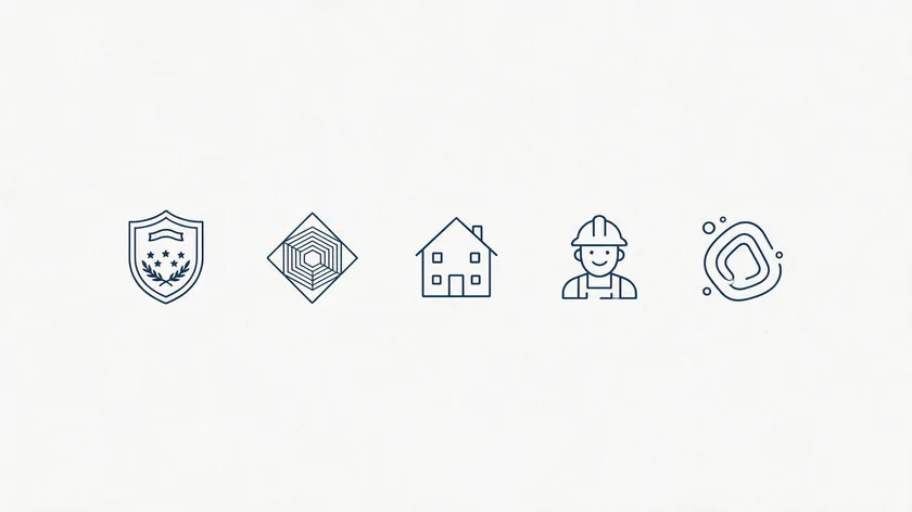
Designing a construction company logo involves balancing industrial strength with modern aesthetics. Below are five style families to help you find inspiration, each suited to different clientele and project types. Simple shapes and clean lines make logos easier to recognize across all of them.
Vintage / Heritage
Badges, shields, and serif or slab-serif wordmarks with muted palettes—deep green, navy, and brick red—and details like “Since 1998.” Vintage logos evoke nostalgia for traditional craftsmanship. Best for established firms wanting to communicate excellence and longevity.
Modern / Tech-Driven
Flat logo designs with geometric shapes, minimal icons, and clean layouts in charcoal, white, and accent colors like electric blue. A minimalist design suggests refinement and class, making it ideal for BIM-driven or green building companies that want a modern identity.
Literal / Icon-Based
Silhouettes of houses, cranes, a hammer, or hard hats deliver instant recognition. Industry analysis of nearly 148,000 construction logos shows crane-and-building combos and worker silhouettes are among the most popular logo options. Great for a contractor who wants zero ambiguity about what they build.
Character / Mascot
Simplified builders, foremen, or animal mascots (bulldogs or eagles) humanize your brand. This style works well for family-run businesses or local residential contractors where personal connection matters. The risk: it can feel informal for commercial or industrial clientele.
Playful / Niche
Abstract illustrations, clever negative space, or unexpected colors suit specialty trades: tiny home builders, outdoor living specialists, and sustainable carpentry. An isometric cube, for example, conveys structure without literal house imagery.
Your chosen style should align with your typical client and average project size, not just personal taste.
Visual Building Blocks: Colors, Fonts, and Symbols That Work
Three decisions shape every effective logo: color palette, typography, and iconography. Let’s dive deeper into each.
| Business Type | Recommended Colors | Why |
|---|---|---|
| Safety/general contracting | Yellow + Black | Visibility on job sites |
| Commercial/corporate | Dark Blue + Gray | Professional, trustworthy |
| Eco / solar / green building | Green + White | Signals sustainability |
High-contrast colors like safety orange, navy blue, and steel gray are commonly used in construction logos. Yellow is a popular color choice for construction logos because it mirrors equipment and safety gear. Strong color palettes convey trust, stability, and energy.
Avoid overly light or pastel tones—they disappear on dusty job sites, hi-vis vests, and vehicle wraps viewed from a distance.
Typography
Bold, blocky typefaces are common in construction logos for good reason: they convey structural power and remain legible across materials. Opt for bold sans-serif or slab-serif fonts with heavy weight.
Caterpillar’s iconic bold sans-serif wordmark, for example, reads clearly from a bulldozer blade down to a business card. Thin scripts or decorative fonts degrade fast when scaled down on permits or embroidered on caps.
Iconography / Symbols
Construction logos benefit from using industry-specific imagery like roofs, buildings, and tools. Match your icon to your trade:
- Rooftops—for residential builders
- Steel beams or I-beams—for structural specialists
- Gridlines or blueprints—for design-build firms
- Electrical or plumbing icons—for trades
Using negative space creatively can enhance a construction logo’s appeal. Limiting elements to one clear icon, one to two fonts, and using three or fewer colors creates a compelling logo. Make sure icons are legally cleared custom art or licensed assets, not copyright-restricted clip art.
Construction Logo Ideas by Business Type
Your construction logo design should reflect what you actually build. A general contractor’s ideal logo looks nothing like a solar installer’s perfect logo. Here’s how to represent each niche.
General contractors: Combine a solid wordmark with a simple skyline or house silhouette. Include “Builders” or “GC” in the business name. These logos must feel authoritative on bids for multi-unit or commercial projects.
Residential remodelers: Warm, approachable colors—dark teal, brick, and warm gray—and roofline or doorway motifs connect with homeowners planning kitchen remodels or ADU builds.
Commercial and industrial firms: Minimal, almost corporate style. Strong sans-serifs, abstract structures, deep blues, and grays. These need to look sharp in RFP documents, safety programs, and large jobsite hoarding.
Specialist trades (roofing, electrical, plumbing, concrete, HVAC): Focused icons—shingles, lightning bolts, pipes, trowels, ductwork—plus clear wording so customers immediately understand the specialty from a truck or yard sign.
Eco-focused and solar companies: Green-forward motifs such as leaves, sunbursts, and circular forms that suggest sustainability. Keep them bold enough that simplicity doesn’t make them vanish at a small scale.
A construction business operating in multiple niches can create one core logo plus sub-marks (“Smith Construction,” “Smith Roofing,” “Smith Concrete”) using consistent typography to establish a unified brand.
Practical Design Tips: Making Your Logo Work in the Real World
A memorable logo is more than creative art—it has to perform on real materials. Effective construction logos often use structural elements and bold typography to convey reliability across every medium.
Scalability
A clean logo layout scales well across different mediums. Test your logo at favicon size (32×32 pixels) and at 4×8 ft banner size. Avoid tiny details and overly thin lines that vanish or blur. A great construction logo must remain legible when resized for various formats.
Versatility
Design in vector format. Logos need to work in full color and black and white. Test one-color versions for invoices, stamps, and monochrome safety documents. Always keep your vector files (SVG, EPS) organized—without them, recoloring or resizing later becomes a costly investment.
Placement Testing
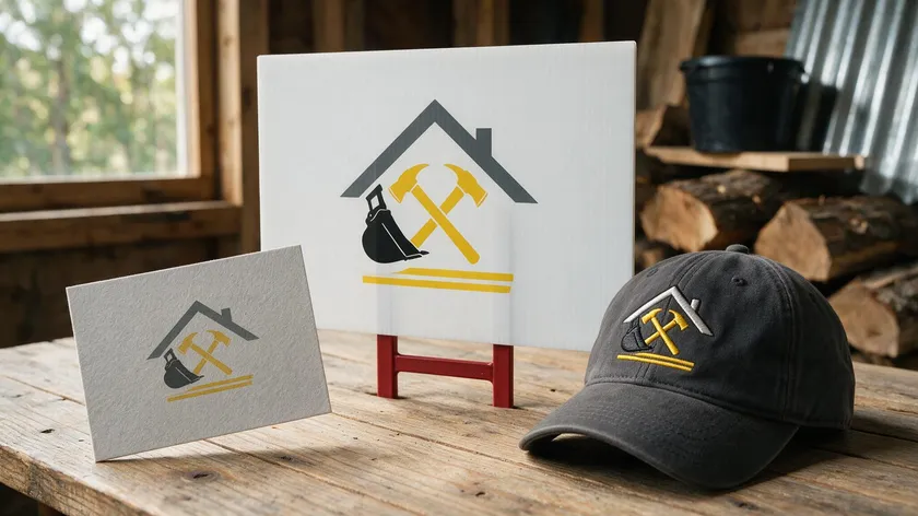
Preview your logo on mockups: site boards, hard hats, pickup truck doors, construction dumpsters, and social media avatars. What looks great on a website may fall apart on corrugated sign materials.
Naming and Tagline
Keep the business name prominent. Taglines should be short—”Concrete & Framing” or “Design-Build Specialists”—so they stay legible on moving vehicles and yard signs.
Future-Proofing
Your logo should still feel current in five to ten years. Caution against ultra-trendy gradients or effects that may date quickly or print poorly on rough surfaces. Maintain brand consistency: same colors, same logo, same spacing rules across your website, estimates, contracts, and social profiles.
From Idea to Custom Logo: Using Logo.app for Your Construction Brand
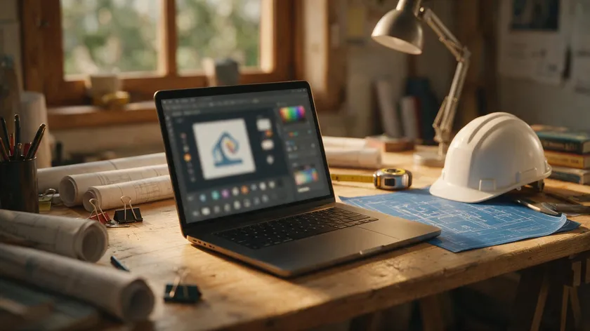
After choosing a style and visual direction, you don’t need to pay an agency to make it happen. Professional designers can create custom logos from scratch, but DIY logo makers can be used for budget-friendly designs that still look polished. AI logo makers can generate hundreds of custom logo mockups in minutes.
Logo.app‘s AI generates multiple logo design variations you can customize by adjusting colors, fonts, spacing, and icon choices until the logo matches your construction company personality. Here’s a simple flow:
- Enter your business name
- Select your industry as construction/building
- Choose a style—modern, classic, bold, or minimal
- Pick relevant icons—houses, cranes, beams, or tools
Save several logo options, get feedback from partners or crew members, and then finalize a custom logo package with the high-resolution and vector files needed for printing and digital use.
You’re free to revisit and tweak your logo as your company grows from small local projects to larger commercial or regional contracts—no money wasted on starting over from scratch.
Key Takeaways
A strong construction logo is the visible structure behind every estimate and jobsite sign. It should connect trust, expertise, and visual clarity so your marketing works even before you pick up the phone.
Choosing the right style—vintage, modern, literal, mascot, or playful niche—plus deliberate colors, fonts, and symbols creates a logo aligned with your real-world construction work. The sense of professionalism it communicates can set your construction firm apart in a crowded industry.
Practical considerations—scalability, versatility, and consistent use—matter as much as creativity for a logo that survives trucks, helmets, and years of business growth. Turn these ideas into a professional, custom logo design through Logo.app so you can focus on building while your branding works in the background.
Ready to bring your brand to life? Turn your business name and style into a professional construction logo in seconds with our AI Logo generator—fully editable, yours to own.
FAQs
Here are answers to common questions about creating and using construction logos that weren’t fully covered above.
How simple should a construction logo be?
Most successful construction logos are simple enough to recognize at a glance from 20–30 meters away and to reproduce in one color. If your logo requires a detailed explanation, it’s too complex. Aim for one icon, one wordmark, and a limited color palette.
Can I redesign my existing construction logo without confusing clients?
Yes, opt for gradual evolution rather than a total overnight change. Refine fonts, clean up the icon, or adjust colors incrementally. Consider overlapping old and new logos on documents for a few months so your existing clientele adjusts naturally.
Do I need different logo versions for trucks, websites, and uniforms?
A logo system is the standard: a primary logo, a horizontal version, and an icon-only mark. All should be visually related and created from the same core design template so your brand stays consistent.
What file formats do I need for my construction logo?
Keep vector files (SVG, EPS, or PDF) for print and large-format use, plus PNG and JPEG exports for web and office documents. Logo.app provides these formats so you’re covered from day one.
How do I check if my construction logo is unique?
Search local competitors’ websites, social media profiles, and your country’s trademark database. This quick ground-level check helps you avoid accidentally copying an existing construction logo and protects your brand identity long-term.

