Emblem logos are among the oldest logo types in branding, yet they still power some of today’s most recognizable brands in education, automotive, food, and government.
This article explains what an emblem logo is, how it differs from other types of logos, where it works best, and how to design one that stays clear on everything from a beer bottle cap to a conference backdrop. Use it as a practical guide before you commit to an emblem for your brand.
Table of Contents
- What Is an Emblem Logo?
- Short History and Evolution of Emblem Logos
- Where Emblem Logos Shine (and Where They Don’t)
- Emblem Logo vs. Other Logo Types
- Real-World Emblem Logo Examples (Without the Usual Suspects)
- Core Principles of Emblem Logo Design
- Step-by-Step Emblem Logo Design Process
- Shape, Typography, and Color Choices for Emblems
- Scalability and Digital-First Emblem Logos
- Emblem Logo vs. Mascot Logo vs. Badge Logo (Key Differences)
- How to Create an Emblem Logo (Tools, Files, and Handover)
- Key Takeaways
- FAQs
What Is an Emblem Logo?
An emblem logo is a type of logo where the company name, initials, or other text is locked inside a single shape—typically a badge, seal, shield, or circle. Emblem logos feature text inside a symbol or icon, and they often resemble badges, seals, or crests.
Unlike a combination mark logo, where the icon and wordmark can be separated and used independently, an emblem logo is difficult to separate into text and imagery due to its cohesive design.
Emblem logos are characterized by a cohesive design incorporating text and imagery into one inseparable brand mark. The visual feel is compact, framed, and formal, often symmetrical, with a “stamp” or “medal” quality rather than open, airy space.
They are commonly used by schools and organizations, as well as police and fire departments, craft breweries, luxury car makers, coffee roasters, heritage clothing labels, and airlines. A well-designed emblem logo creates instant recognition, which is why many emblem logos have survived for over a century without losing relevance.
Short History and Evolution of Emblem Logos
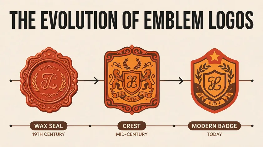
Emblem logos draw from a deep well of history. Medieval heraldic shields and guild marks in Europe (12th–15th centuries) were among the first visual identity systems that fused symbols with text and territorial meaning. Wax seals on letters in the 1600s–1800s followed the same principle: a single, contained mark that authenticated the sender.
The industrial era brought packaging seals, railway crests, and trade guild badges that emphasized ornate detail as a sign of quality. Real examples of early emblems include the Royal Mail coat-of-arms–style mark in the UK, BMW’s 1917 roundel based on the inverted colors of the Bavarian flag (not the aircraft-propeller story, which was a 1929 marketing invention added twelve years later); and Ford’s blue oval badge, introduced in 1927, as a proto-emblem design.
In the 20th century, printing improvements in the 1950s–1970s allowed more detailed badges on packaging and vehicles, while modernism pushed some brands toward simpler, flatter emblems. Since about 2010, “flat” redesigns—like Volkswagen’s 2019 simplified 2D roundel—have prioritized digital legibility without discarding heritage cues.
Where Emblem Logos Shine (and Where They Don’t)

Strengths
Emblem logos convey a sense of heritage and authority. They carry an instant sense of structure and officialness, which is why they’re an excellent choice for institutions, premium products, and government bodies.
Emblem logos often work well on merchandise, signage, and uniforms due to their distinctiveness, and their enclosed design provides versatility in merchandising—think patches, stamps, wax seals, bottle caps, and pins.
Emblem logos evoke tradition and heritage, making brands feel established. Many congregations choose badge-style marks for the same reason; see these church logo styles for how they translate.
For tradition-focused schools like Princeton University’s shield, established automotive brands like Mercedes-Benz’s three-pointed star in a circle, or premium food and drink producers, emblems are a natural fit.
Limitations
The trade-offs are real. Complex detail doesn’t scale well for tiny UI elements like browser toolbar buttons or small social media profiles. Some layouts struggle on narrow horizontal placements like website navbars or email signatures.
Emblem logos are less flexible than other types of logos like combination marks. If your brand is a minimalist SaaS app, an early-stage startup that needs maximum flexibility, or a company relying heavily on responsive, dynamic logos, a different type of logo might serve you better.
Emblem Logo vs. Other Logo Types
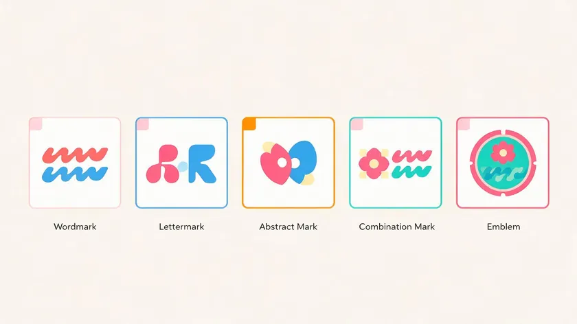
Logo.app‘s guide to the main logo types breaks brand identity into seven core categories: wordmark, lettermark, symbol/brand mark, abstract mark, combination mark, mascot, and emblem. If you’re weighing your options, it helps to understand how an emblem compares to the others.
Wordmark logos consist solely of the business name in text—think of a pure typography-based logo. They scale easily but lack a strong visual symbol. Lettermark logos use initials (a company’s initials) to represent a brand, offering compactness but limited narrative depth.
An abstract logo relies on a non-literal symbol that can represent a wide range of meanings. And combination marks combine text and a symbol for branding, but the pieces remain separable.
An emblem can sometimes be built from other logo types: a lettermark inside a shield or a pictorial mark framed by a circular badge. The difference is that the emblem locks everything into one unit.
If you’re still unsure which approach fits your goals, it’s worth reading a broader guide to the main logo types before committing to an emblem.
Real-World Emblem Logo Examples (Without the Usual Suspects)
Here are five recognizable emblems worth studying, each solving the container-shape challenge differently.
BMW
BMW’s roundel encloses blue-and-white quadrants (echoing Bavaria’s state flag) inside a black ring bearing the letters “BMW.” It represents precision engineering. The container is a circle—universal, balanced, and unmistakable on a car hood.
Porsche
Porsche’s crest layers the Stuttgart horse, antlers, and red-black-gold color blocks inside a shield. The 2023 modernization refined colors and lines for cleaner 2D and 3D reproduction while keeping the heritage imagery integrated.
Ferrari
Ferrari’s Cavallino Rampante (prancing horse) sits on a yellow shield with the company name above and Italian flag colors along the top. The emblem stands for racing pedigree and Italian craftsmanship.
Warner Bros.
The Warner Bros. shield has evolved from a detailed, three-dimensional crest to a bold, flat, blue-and-gold mark optimized for screens. It’s one of the clearest examples of emblem simplification for digital use.
United States Marine Corps
The USMC emblem integrates an eagle, globe, and anchor inside a circular border with text. It conveys duty, global reach, and military authority in a single image.
The patterns across these emblems—contained shapes, clear hierarchy of text vs. symbol, and strong contrast—all help them remain legible on vehicles, uniforms, and marketing materials.
Core Principles of Emblem Logo Design
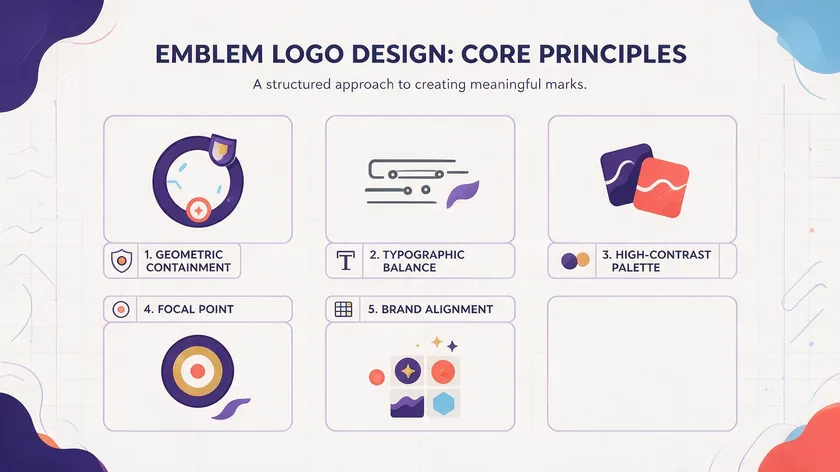
Effective emblem logos emphasize simplicity and legibility for various applications. Here are the principles that separate a beautiful emblem logo from a cluttered mess.
Simplicity in shapes. Emblem logos should use simple and scalable designs. A clean container (circle, shield, or hexagon) with a focused interior creates a stronger, lasting impression than an overloaded crest.
Disciplined typography. Typography in emblem logos should be simple and legible. Stick to one font family, two weights at most. Avoid adding slogans to emblem logos for clarity; secondary text like a tagline or motto competes with the company name.
Strong contrast. Research shows that a luminance contrast ratio of 18:1 significantly improves logo legibility compared to lower ratios. White on dark blue or yellow on black are among the most effective color combinations for small-scale recognition.
Clear focal point. Decide whether the icon or the business name dominates. In a tight container, hierarchy is everything—the brand name must lead, with secondary elements kept subtle or removed entirely.
Brand alignment. The emblem’s shapes, colors, and style should reflect your brand identity—whether that’s a heritage brewery, a modern business school, or a civilian nonprofit.
Step-by-Step Emblem Logo Design Process
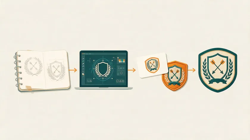
A disciplined logo design process helps you avoid the most common emblem pitfalls. Here’s how to approach it:
1. Discovery
Define your mission, values, and tone. Are you “serious and institutional” or “craft and artisanal”? Clarify main applications: will this emblem live on patches, an app icon, packaging, or all three? Identify your target audience early.
2. Research
Analyze competitor emblems and historic references—old seals, university crests, and transport badges. This helps you avoid clichés and legal lookalikes. Study how other logos in your industry handle the balance between imagery and text.
3. Sketching and Concepting
Explore multiple container shapes (circles, shields, hexagons). Try different arrangements of text and experiment with pictorial mark elements vs. abstract icon options. Sketch at least 10–15 rough concepts before going digital.
4. Digital Drafting
Move your strongest 3–4 sketches into vector software. Refine curves, test fonts at different sizes, and begin applying your color strategy.
5. Refinement and Testing
Test your emblem logo at different sizes for scalability. Print it on a business card, embroider it on fabric, and shrink it to a social media avatar. Check legibility at every scale.
6. Final Production
Prepare vector files, color and monochrome versions, and usage guidelines. Document minimum sizes for print materials and digital exports.
Shape, Typography, and Color Choices for Emblems
Shape and Container
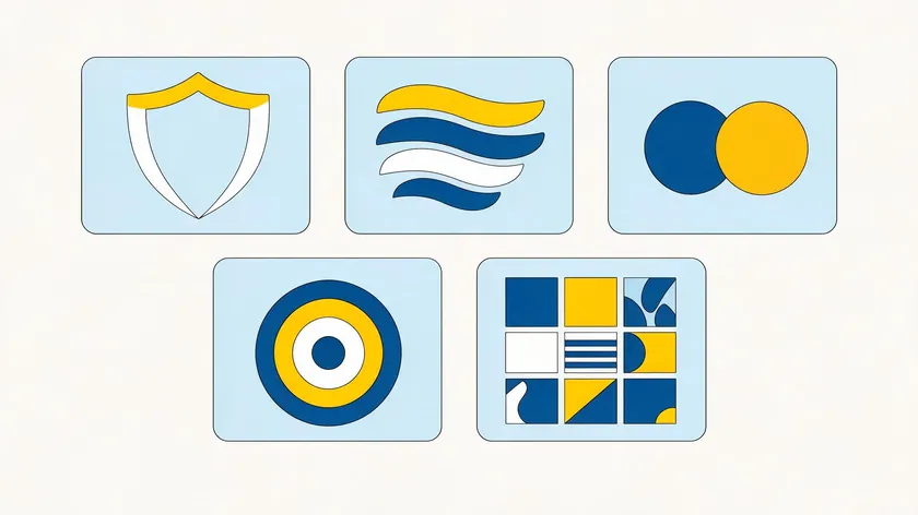
The container shape carries meaning. Circles suggest unity and trust—common in many airline badges. Shields convey protection and authority. Ovals and rectangles offer a more neutral, versatile feel. Thick borders tend to hold up better at small sizes than thin outlines, which can disappear on low-res screens.
Typography
Use one to two fonts only. Classic serifs work well for heritage brands; sturdy sans-serifs signal a more modern organization. Avoid ornate script fonts that break apart at small sizes. Clean sans-serif fonts like Arial consistently outperform decorative options in timed recognition tasks.
Color Strategy
A color strategy for emblem logos typically comprises one to three colors reflecting brand values. Use muted colors for a timeless emblem logo design—bold neons may feel trendy now but age poorly. Consider Porsche’s red-black-gold triad or the USMC’s scarlet and gold as examples of palettes that endure.
Ensure adequate contrast for embroidery, foil stamping, and monochrome printing. If your emblem needs to appear on invoices, legal documents, or single-color print materials, a monochrome version is non-negotiable.
Scalability and Digital-First Emblem Logos

Emblem logos work beautifully at large scales—event backdrops, building signage, vehicle livery—but problems emerge when they shrink. Micro-text becomes unreadable, thin lines vanish on low-resolution screens, and complex textures or gradients turn to mud.
Think about where your emblem will actually live: YouTube channel avatars, mobile app launch screens, browser toolbar buttons, and tiny social profiles. If your full emblem doesn’t hold up in a 48×48 pixel circle, you need a secondary version.
The solution is a responsive identity system. Keep the full emblem for print and hero placements, and create a simplified version—perhaps just the central icon, the company’s initials, or a stripped-down mark—for small digital uses.
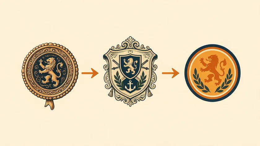
BMW demonstrates this well. Its 2020 digital-first rebrand flattened the roundel, removed chrome 3D effects, and introduced a transparent ring for screen use, while the detailed physical badge remained on vehicles. Porsche similarly maintains both a detailed car-badge emblem and a flat, simplified version for navigation bars and digital backgrounds.
Emblem Logo vs. Mascot Logo vs. Badge Logo (Key Differences)
Many people confuse emblems, badges, and mascot-led marks, but they serve different roles in graphic design and brand strategy.
An emblem is a sealed unit where text and symbol are inseparable. A mascot logo centers on an illustrated character that is friendly, expressive, and often used outside any frame. A badge logo is a broader term for any badge-shaped mark that may or may not fully enclose all text; it’s a looser cousin of the emblem.
| Type | Contains Text? | Uses a Character? | Best For… |
|---|---|---|---|
| Emblem (fused text-icon seal / shield / ring) | Almost always: name, initials, or date are integrated into the shape | Optional: may include a symbolic animal or crest image, but character is secondary | Institutions, luxury goods, automotive, government, heritage brands |
| Mascot logo (character-focused mark) | May include text, but text is often used separately | Yes, the illustrated character is the focal point | Family brands, quick-service restaurants, brands seeking approachability |
| Badge logo (badge-shaped, flexible layout) | Usually includes text, but may allow separation | Sometimes, often used decoratively within the badge | Craft brands, outdoor gear, breweries, informal heritage brands |
Choose based on what you need: an “official seal” feel (emblem), a “friendly character” presence (mascot logo), or an “outdoor heritage patch” vibe (badge). Each is a valid logotype with distinct strengths.
How to Create an Emblem Logo (Tools, Files, and Handover)
DIY vs. Professional
Online logo makers let you experiment quickly, and they’re fine for early concepts. But if you want a perfect emblem logo that functions as part of a complete identity system, hiring a freelance designer or studio for custom emblem logo design is worth the investment. A professional will handle the logo design process end-to-end, from concepting to file delivery.
Essential Deliverables
When you receive your own emblem logo, make sure the package includes:
- Vector files (AI, SVG, EPS) for infinite scalability
- Color and monochrome versions
- Horizontal and stacked lockups
- Clear usage guidelines for marketing materials
Together, these files make sure your emblem logo works everywhere it needs to, without back-and-forth requests down the line.
Technical Requirements
Outline fonts or include licensed font details. Specify minimum sizes for print and digital. Provide export presets for web (PNG, SVG) and print (PDF, high-res PNG). These details prevent your dream logo from being misused by future vendors or internal teams.
Feedback Tips
When reviewing concepts, evaluate legibility, emotional fit, and alignment with your core brand story. Don’t get stuck on small decorative elements like leaf ornaments or border patterns—focus on whether the emblem stands as a bold, memorable mark that will reach your potential customers across every touchpoint.
Key Takeaways
- An emblem logo locks text inside a single symbol (badge, seal, shield). It’s the right choice for brands wanting heritage, formality, and an “official” presence: schools, craft food and drink, automotive, government, and NGOs.
- Strengths: instant sense of authority and structure, ideal for patches, seals, uniforms, and badges used in physical spaces. Emblem logos create brand recognition that few other logo types match in the physical world.
- Trade-offs: detail overload, cramped typography, and poor scalability can make even a beautiful emblem logo hard to read at small sizes or on digital platforms. Most brands need a simplified secondary version.
- A solid emblem follows a disciplined design process: simple shapes, restrained typography, and strong contrast—not the reverse. A 2025 study on logo complexity confirms that complexity can boost luxury perception, but only when craftsmanship signals support it.
- Pair the core emblem with simplified variants and complementary logo types (like wordmark logos) to cover every application. Remember, an emblem is only one of several main logo types worth comparing before committing.
Don’t wait weeks for a designer. Logo.app’s AI Logo Generator turns your brand name into a heritage-ready emblem logo in seconds—commercial-grade files, instantly yours.
FAQs
Is an emblem logo a good idea for a new startup?
It can be, if your brand story depends on instant gravitas or a heritage angle—think craft spirits or a law firm. But startups that need agility, rapid pivots, and maximum flexibility across social media profiles and tiny app icons may find a combination mark or wordmark more practical.
An emblem can feel too traditional for disruptive tech, and its full version is often overkill in early-stage touchpoints.
Can I animate an emblem logo?
Yes. Subtle motion, like a glow, a rotation, or a “seal stamp” reveal, can work well in video or digital ads and make the word “emblem” feel alive on screen. However, the static version must remain clear: avoid thin outlines, micro-text, or elements that don’t translate in animation start and end states. Animation adds personality, but a static emblem that lacks clarity undermines the entire example.
How many colors should my emblem logo use?
Stick to one to three core colors plus tints. More may add richness, but every additional color increases costs for embroidery, single-color printing, and foil stamping. Fewer colors also make managing contrast easier for digital and shrunk contexts, which matters when your emblem appears on print materials, letters, or monochrome invoices.
Do I need different emblem versions for international markets?
If your company name or tagline changes across languages, you’ll need language variants. But keep the core icon, container shape, and color palette consistent to maintain brand recognition worldwide.
Be cautious if certain symbols or colors carry different meanings in different cultures—what represents luck in one part of the world may convey something else entirely. Test physical reproduction (sewing and stamping) at scale internationally before finalizing.

