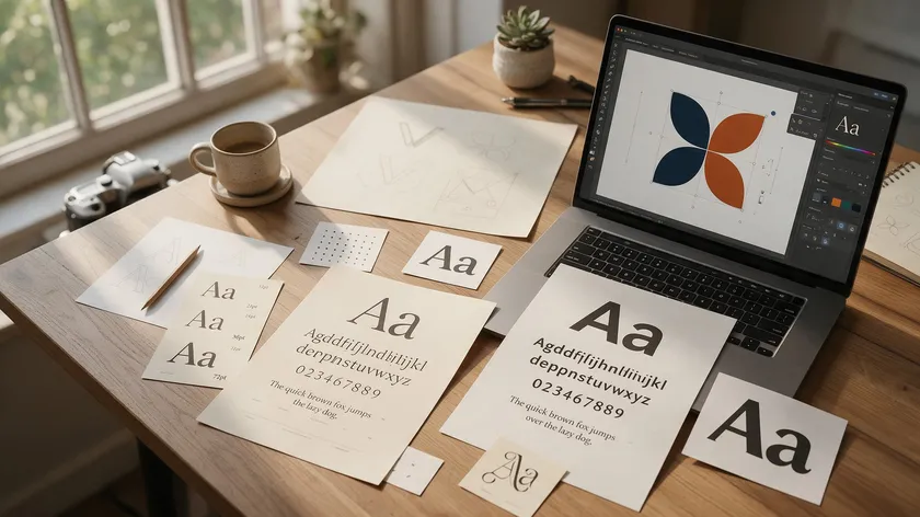
Choosing the right font is essential for effective branding. Typography communicates a brand’s personality, values, and tone—often before a single word is consciously read.
Brand fonts are the consistent set of typefaces used across logo design, websites, packaging, and marketing. There is no single list of “best fonts”—the right fonts depend on your brand strategy, audience, and use cases, from legibility and distinctiveness to licensing and scalability across channels.
A fintech startup might choose a clean sans serif font for trust and clarity, while a handmade bakery might lean toward a script or handwritten style for warmth. This guide gives you a practical framework for finding the best fonts for branding, whether you’re launching a startup or refreshing an established identity.
Table of Contents
- Core Font Categories for Branding (Serif, Sans Serif, Script, Display)
- Matching Font Styles to Brand Personality
- How Many Fonts Does a Brand Need? (Primary, Secondary, Accent)
- Font Pairing Basics for Logos and Brand Systems
- Real-World Brand Case Studies: Fonts in Action
- Fonts for Key Brand Uses: Logos, Websites, and Posters
- Choosing the Right Fonts Step-by-Step
- Brand Fonts & Typography Hub: Types of Fonts We’ll Cover Next
- Common Mistakes to Avoid When Choosing Brand Fonts
- Key Takeaways
- FAQ
Core Font Categories for Branding (Serif, Sans Serif, Script, Display)
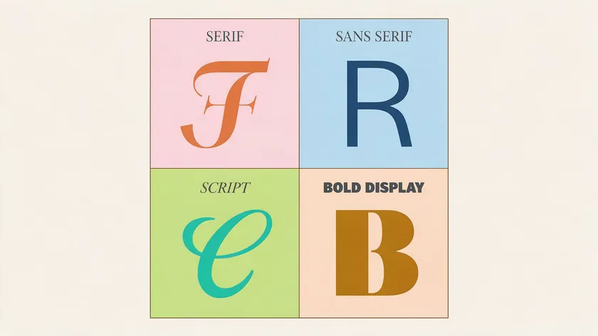
Almost every logo font and brand typeface falls into four broad families. Different fonts have unique structural styles and vibes they project, and different font categories evoke distinct emotional responses. Understanding these categories is the first step toward creating a polished and professional look.
Serif Fonts
Serif fonts feature small decorative lines or “feet” at the ends of letters. These typefaces convey heritage, trust, and sophistication, making them a reliable choice for publishing, law, finance, and heritage brands. The variation between thick and thin strokes gives serif fonts a refined aesthetic and timeless elegance.
Examples include Garamond, which originated in the 16th century and remains highly legible today; Baskerville, known for its balanced proportions; and Didot, which originated in the 1800s and is popular in luxury branding with its sharp serifs and high contrast strokes.
Bodoni, designed in 1798, is widely used in fashion and conveys a sophisticated aesthetic through its elegant contrast between hairline serifs and bold verticals.
Sans Serif Fonts
Sans serif fonts lack decorative feet or strokes at the ends of letters. Sans-serif fonts are associated with modernity, cleanliness, and accessibility—projecting a modern, minimal, and approachable feel. Their clean lines and geometric shapes make them the go-to for tech companies, digital products, and modern brands.
Helvetica was designed in 1957 and is widely used in branding. Futura, designed in 1927, combines geometric shapes with elegant curves for modern aesthetics. Proxima Nova was designed in 2005 for modern branding and is highly versatile across digital and print.
Montserrat is known for its clean, geometric design and legibility. These sans serif typefaces tend to give any modern logo a contemporary style and forward-thinking edge.
Script / Handwritten Fonts
Script fonts mimic handwriting or calligraphy, bringing warmth, personality, and artistry to a brand. Script fonts are personal, creative, and handcrafted in feel, with graceful curves and variable stroke widths.
They work well for artisan, boutique, and lifestyle brands but should be used sparingly—legibility and scalability can suffer, especially at smaller sizes. We’ll explore this category more deeply in an upcoming article on the best handwritten fonts.
Display / Decorative Fonts
Display fonts are bold, expressive, and attention-grabbing. They feature stylized shapes and ornamentation designed to capture attention in headlines, logos, and posters—but they’re not built for body text.
A display font brings a commanding presence and stylish appearance to hero sections and large-format materials. Future articles on the best title fonts and the best bold fonts will cover these in detail.
Brands usually choose one main category as their core voice—often sans serif or serif—and use script or display fonts only as accents to maintain a balanced design.
Matching Font Styles to Brand Personality
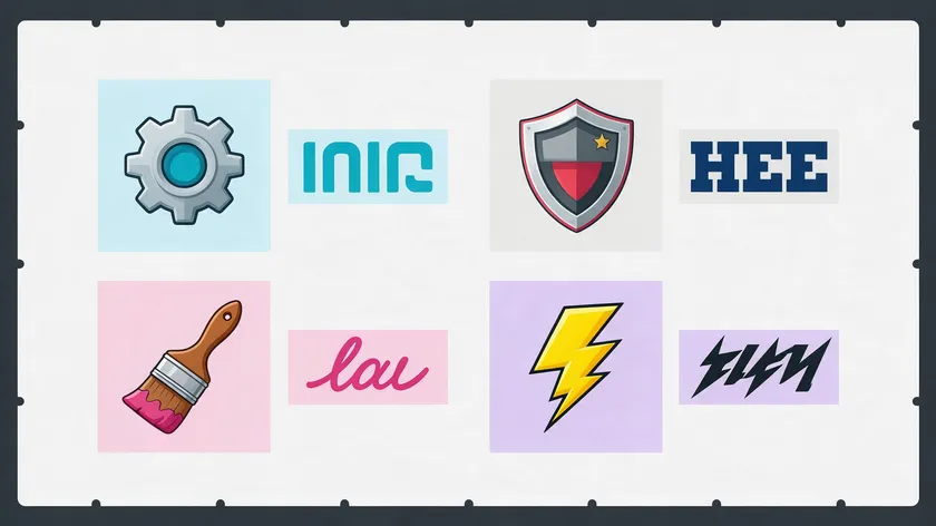
Fonts function like tone of voice, shaping how audiences interpret your brand before reading a single word. A 2025 study published in the European Journal of Marketing by Zhang, Teng, Xie, Wang, and Foti found that serif logos tend to enhance consumers’ perceptions of ‘activity’ (dynamism and movement), while sans-serif logos tend to enhance perceptions of ‘potency’ (strength and authority). Typography choices influence brand identity at a subconscious level.
Consider these personality axes—classic vs. modern, playful vs. serious, affordable vs. premium, and minimal vs. expressive—and map them to font types:
| Brand Personality | Recommended Font Style | Examples |
|---|---|---|
| Modern, tech-forward | Geometric sans serif fonts | Plus Jakarta Sans, Montserrat, and Avenir |
| Classic and trustworthy | Serif fonts | Garamond, Baskerville, Alegreya |
| Expressive and artistic | Script or handwritten fonts | Grand Hotel, Quintessential |
| Bold and disruptive | Chunky display or bold sans serif | Alfa Slab One, Exo 2 |
Fashion brands and luxury branding often gravitate toward high-contrast serif fonts like Didot and Bodoni because of their delicate serifs, high contrast between thick and thin strokes, and sophisticated aesthetic. Separate articles on classy fonts and fashion fonts will explore this territory in depth.
A quick workshop exercise: list 3–5 adjectives for your brand, then test font samples against those words to see which typefaces visually match each adjective.
How Many Fonts Does a Brand Need? (Primary, Secondary, Accent)
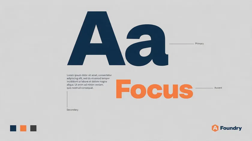
Most brands work best when they limit their choices to two or three complementary fonts across their brand system. Stick to a primary font for headlines and a secondary font for body text—this simple structure creates consistency without visual clutter.
Primary Logo Font
Your primary logo font is the typeface used in your wordmark. It must be distinctive, scalable, and instantly recognizable. Think of Google’s custom geometric sans serif or Coca-Cola’s script logotype—both are unmistakable at any size.
Secondary Font
The secondary font handles body text on websites, apps, and documents. Prioritize legibility and availability across platforms. Fonts like Roboto, Lato, Work Sans, and Merriweather are strong workhorses that remain highly readable across contexts.
Accent or Display Font
An optional accent font is used for big headlines, campaigns, or posters. It can be more expressive and bold but must not overpower the logo font. Avoid using too many typefaces to maintain a stronger identity—three or fewer fonts usually outperform messy systems with many uncoordinated weights and styles.
Font Pairing Basics for Logos and Brand Systems
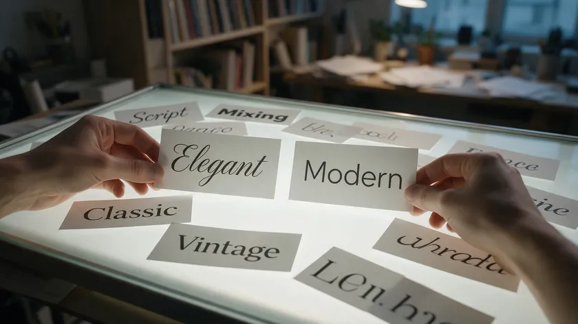
This section covers only high-level pairing principles; detailed font pairing recipes will appear in other articles on the best bold fonts, the best title fonts, and typography logo ideas.
For the complete step-by-step process—including proven formulas and a comparison table of real combinations—see our full font pairing guide.
The core principle is contrast and complement: pair fonts that differ clearly in weight, style, or classification but share something in common, such as x-height or mood. A serif font for headings with a sans serif font for body text is the most time-tested combination.
Safe combinations include:
- Serif and sans serif (e.g., Playfair Display with Source Sans Pro) for an elegant feel that balances tradition and clarity
- Strong display font for logo + neutral sans serif for supporting text (e.g., Abril Fatface logo with Work Sans for UI)
- Bebas Neue for headers with Montserrat for text creates a modern twist on editorial design
- Libre Baskerville for body copy with a geometric sans serif headline
Simple rule of thumb: pick one hero font for attention and one workhorse font for readability. Avoid mixing more than two significantly different logo fonts unless you are very experienced in graphic design.
Real-World Brand Case Studies: Fonts in Action
These five brands demonstrate how different font strategies support distinct identities.
Coca-Cola
Coca-Cola’s custom Spencerian script logo font communicates heritage, warmth, and friendliness. The elegant curves and vintage charm of that script have remained virtually unchanged for over a century, creating a lasting impression.
Supporting typography in campaigns often uses simple sans serif fonts for clarity alongside the iconic wordmark.
Google evolved from a serif logotype (Catull) into a custom geometric sans serif (Google Sans) that feels playful yet clean. Google Sans now supports over 20 writing systems, reinforcing consistency across products while maintaining a modern aesthetic and highly legible design at every scale.
Nike
Nike’s bold, simple sans serif logo font works seamlessly with the Swoosh. The brand’s broader typography system uses strong, condensed sans serif fonts in posters and athletic apparel graphics to emphasize performance, speed, and energy—a professional aesthetic built on minimal forms.
Spotify
Spotify moved from Proxima Nova to its own custom geometric sans serif, Spotify Circular, in 2015. The shift to a proprietary typeface gave the brand a highly readable, neutral sans serif voice it fully owns across web and mobile—something a licensed font can’t offer.
Mailchimp
Mailchimp pairs a bold, rounded slab serif (Cooper Light) in its wordmark with approachable sans serif fonts in its product UI. This illustrates how brand logos can mix expressive display fonts for personality with functional text fonts for usability—creative flair up front, clean utility everywhere else.
Fonts for Key Brand Uses: Logos, Websites, and Posters
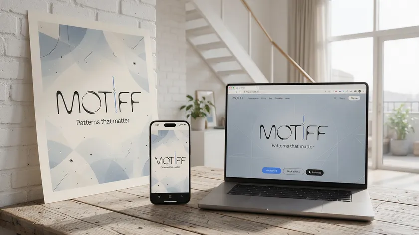
Different channels place different technical demands on your brand fonts, even if you keep the same family.
Logo Fonts
Logo design demands scalability from tiny app icons to large signage, uniqueness for trademarking, and high contrast and clarity. Slab serif or bold sans serif options often hold up well across extremes. Separate articles will deep-dive into typography, logos, the best serif fonts for logos, and the best logo fonts overall.
Best Fonts for Websites
Highly optimized fonts improve screen readability for digital-first brands. Variable fonts with multiple weights reduce page load times while maintaining hierarchy. Instrument Sans is a modern geometric sans serif font well-suited to web interfaces.
Inter, Roboto, Work Sans, and Lato are common digital workhorses. Inclusive Sans improves readability with open shapes and generous spacing, addressing accessibility needs.
Best Fonts for Posters and Large-Format
Posters need sturdy display fonts with strong shapes that remain readable from a distance. Anton, Alfa Slab One, and bold slab serif options provide the attention-grabbing weight required for large-format work. Futura combines geometric shapes with elegant curves for modern ads and posters alike.
A good brand system reuses the same core fonts across logo, site, and print where possible, adjusting weight and size instead of constantly switching typefaces.
Choosing the Right Fonts Step-by-Step

Here’s a practical checklist to move from “no idea” to a shortlist of right fonts for your brand:
- Define your brand adjectives and audience. Write down 3–5 words that describe your brand (e.g., “confident, modern, inclusive” for a SaaS product vs. “warm, handcrafted, local” for a cafe).
- Choose your main category—sans serif for clarity and modernity, serif for tradition and timeless appeal, and script for expressiveness and display for impact.
- Shortlist 5–10 candidates from reputable libraries like Google Fonts, Adobe Fonts, or commercial foundries that match your chosen category and tone.
- Test in real mockups. Place each candidate in logo lockups, a website homepage, social media posts, and a poster layout. Type “the quick brown fox jumps over the lazy dog” to evaluate every letterform. Seeing “quick brown fox” in each candidate reveals how balanced proportions and thin strokes hold up in context.
- Check technical and business details—licensing for commercial use, webfont performance, Figma compatibility, and language character support.
- Finalize and document. Pick one primary logo font and 1–2 supporting fonts, then create a one-page brand typography guideline with sizes, versatile weights, and example use cases.
Ready to visualize your options? Try plugging your chosen fonts into an AI logo generator to quickly see how they look in a real logo lockup.
Brand Fonts & Typography Hub: Types of Fonts We’ll Cover Next
This article is the central guide in our Brand Fonts & Typography series. Explore the deep-dive articles we’ve published so far on specific needs and styles:
- Typography logo ideas and best logo fonts
- Best serif fonts for logos
- Business fonts by industry and use case
- Font pairing guide and reusable combinations
Bookmark this page—we’ll add new articles to this list as they go live.
Common Mistakes to Avoid When Choosing Brand Fonts
Choosing brand fonts comes with a few common pitfalls that can undermine an otherwise strong identity. Here are the mistakes to watch for before you commit to a typeface.
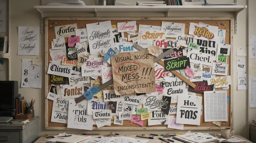
Using Overly Trendy Display Fonts
A trendy display font as your main logo font can date your brand within a year or two. It can also hurt legibility in smaller sizes. Choose typefaces with timeless appeal for your primary mark.
Using Too Many Fonts
More than three fonts in one system create visual noise and inconsistency across graphic design materials. Restraint builds recognition.
Ignoring Licensing and Legal Issues
Using fonts without proper commercial licenses can expose your brand to legal and financial risk. Always verify terms before committing a font to your logo or website.
Overlooking Accessibility
Fonts with extremely thin strokes or low contrast can reduce readability for users with visual impairments, especially on screens. Test for accessibility alongside aesthetics.
Not Testing Fonts Across Backgrounds
Always test fonts on light, dark, and image-overlay backgrounds in different weights. A font that looks elegant on white may become illegible on a busy photograph.
Key Takeaways
- The best fonts for branding depend on your brand personality—there is no universal “best” serif or sans serif font list.
- Most brands need just 2–3 core brand fonts: a primary logo font, a secondary text font, and sometimes an accent display font.
- The four main categories—serif, sans serif, script, and display—each map to distinct brand traits like trust, innovation, elegance, and playfulness.
- Consistency in typography is a major driver of long-term brand equity. Pick fonts with versatile weights, test them across every channel, and document your choices.
Ready to see these fonts in action? Create your logo now with our AI Logo Generator and preview your brand instantly.
FAQ
Here are answers to practical questions that come up frequently when selecting brand fonts.
How do I know if a font is unique enough for my logo?
Uniqueness comes from a combination of font choice and custom tweaks. Start with a less overused typeface, adjust letter spacing, or customize a few letterforms to create distinctiveness.
Search your industry competitors’ brand logos and do a quick visual comparison to avoid obviously identical logo fonts.
Working from a high-quality base font and lightly modifying it is often safer and more sustainable than attempting a fully custom typeface from scratch.
Can I use the same font for my logo and body text?
Many brands successfully use one flexible font family with multiple weights for both their logo and all other text—Montserrat or Lato, for example, can handle logos, headings, and body text when used across different weights and styles to create hierarchy.
If your logo needs more personality, pick a separate logo font and keep a simpler sans serif font or serif font for long-form content.
Are free fonts from sites like Google Fonts good enough for professional branding?
Many respected brands rely on free or open-source fonts, especially for digital products, and Google Fonts often meets professional standards. Verify licensing terms, character sets, and performance, but know that free fonts can absolutely be used for serious brand identities.
Paid commercial fonts may offer more originality and less common usage, which can help a logo stand out in crowded markets.
Should my brand use serif or sans serif fonts?
The decision should come from brand positioning. Serif fonts tend to suggest tradition, reliability, and editorial or luxury vibes—they evoke tradition, high quality, and authority. Sans serif fonts tend to feel modern, clean, and digital-first.
If unsure, starting with a neutral sans serif font like Work Sans or Inter is usually a safe, flexible choice. Pairing a serif font for headlines and a sans serif for body text is a classic approach that balances both signals.
How often should I update or change my brand fonts?
Strong brands rarely change their core fonts. Instead, they refine or expand them every few years as platforms evolve. Revisit typography choices when undergoing a full rebrand, entering new markets, or when current fonts cause technical issues like poor web rendering or limited language support.
Frequent style changes weaken recognition—consistency in logo fonts and brand typography is what builds a lasting impression over time.

