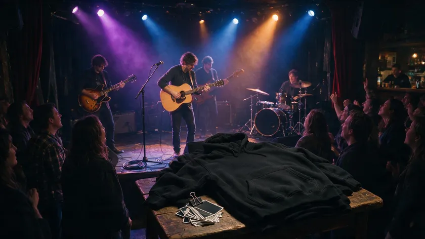
A band logo is more than album art—it’s a visual representation of the band, a shortcut fans recognize instantly on streaming thumbnails, tour posters, and merch.
This guide covers concrete band logo ideas by music genre, core design building blocks like typography and symbols, logo colors that match your sound, and how to take a rough sketch to a stage-ready mark.
A band logo maker like Logo.app lets bands sketch, test, and export a custom logo in just a few clicks—no design degree needed. Whether you’re printing flyers for a garage demo or stocking a touring act’s merchandise table, the right tool helps you easily create something you’re proud to slap on everything.
Table of Contents
- Why your band logo matters more than ever
- Find your visual hook: band logo ideas by music genre
- Core building blocks: name, symbol, and typography
- Choosing logo colors that sound like your band
- From rough sketch to stage-ready: working with band logo templates and makers
- Making your band logo work everywhere
- Advanced band logo ideas: evolving your mark over time
- Key Takeaways
- FAQs
Why your band logo matters more than ever
With 82% of U.S. music industry revenue now coming from streaming, your visual identity travels faster than your songs. A band logo appears on Spotify thumbnails, TikTok clips, festival posters, and fan tattoos before anyone hits play.
Logos help establish a professional image in the music industry, and a strong logo can link fans and build community around your sound.
A memorable band logo must feel like an extension of the music. When someone spots your mark on a crowded lineup poster, they should sense what genre and energy to expect. Logos can represent a band’s ideals and values—rebellion, joy, melancholy—without a single note being played.
Your logo travels further than any single release. It lives on hoodies, drum heads, guitar cases, stickers, stage scrims, and profile icons across every platform. Maintaining a consistent visual identity helps strengthen audience recognition of the band across all of those touchpoints.
Think of how the Rolling Stones tongue and lips or the Wu-Tang “W” became cultural symbols—they were simple, bold, and easy enough for a fan to draw from memory.
Your logo doesn’t have to be permanent either. Many bands start with a rough, hand-drawn mark for early demos and fine-tune it into a polished version as their audience grows.
Find your visual hook: band logo ideas by music genre
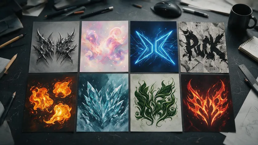
Before you open any logo maker or browse band logo templates, translate your music genre into visual decisions. Consider your music genre when selecting design elements—each scene carries its own typographic and color expectations.
Designing a band logo involves balancing genre aesthetics with unique artistic elements so you stand out without confusing your audience.
Here’s a quick reference pairing genre with recommended style. Imagine a table with four columns—music genre, recommended logo style, color palette, and an example concept. For melodic death metal, picture a spiky, semi-illegible wordmark in cold blues and gunmetal grays with imagery like ravens or cracked stone.
For bedroom pop, think soft, rounded type in pastel pinks and lilacs with a simple star or cloud icon. Garage rock pairs well with raw, hand-stamped wordmarks in black and mustard. Hip-hop leans toward bold stacked lettering—Run-DMC’s logo uses bold, stacked letters in Franklin Gothic, a template the genre still references.
EDM and DJ acts suit geometric sans serif marks with neon accents, while Daft Punk’s logo features handwritten typography for authenticity, proving rules bend. A creative logo design should reflect a band’s ethos and musical genre, but subverting expectations intentionally can be an eye-catching move.
Some of the best band logos in rock history demonstrate this genre-to-visual translation perfectly. AC/DC’s logo includes a lightning bolt symbolizing power. Nirvana’s logo features a smiley face with X eyes—simple enough to spray paint on a wall.
The Rolling Stones logo, designed in 1971 by John Pasche, works without any text at all. Simple geometric shapes can visually represent the tempo or energy of the music, giving you band logo inspiration even before you pick a font.
Core building blocks: name, symbol, and typography
Name treatment
Every band logo combines three pieces—your band name, a symbol (if any), and typography. For the name, decide between the full band name and initials. A stacked layout works on square avatars; a horizontal version suits banners and stage scrims.
Sometimes a minimal symbol—like the Justice logo cross—can carry the brand on a backdrop even without text, letting fans fill in the rest.
Symbol ideas
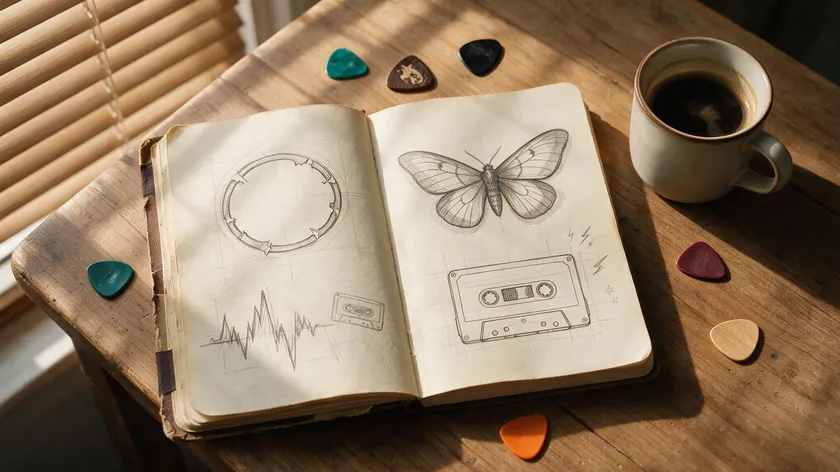
Symbols can serve as shorthand for your band’s identity. Tailor them to your sound: an abstract waveform for electronic acts, a broken halo or moth for a goth rock band, a cassette outline for a nostalgia-driven indie group. Using original hand-drawn icons can enhance a band’s logo uniqueness far more than any stock-specific icon.
Hidden meanings or symbols can enhance the depth of a band logo’s design, and negative space can be used to incorporate additional imagery—like a skull hidden inside a letter. Custom illustrated characters can become iconic mascot-style symbols for bands over time.
Typography choices
Typography conveys a lot about your band’s personality. Razor-sharp serif lettering suits technical metal; handwritten script fits folk; blocky condensed sans serif screams hardcore. Choose a font that reflects your band’s music style, and limit yourself to one primary typeface plus an optional accent.
Custom typography can give a distinctive character to a band logo, and custom typefaces help band logos stand out and add personality in ways a generic preset never will.
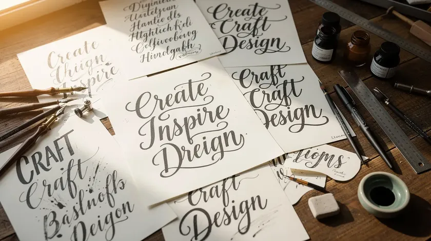
Avoid clichés unless you subvert them—using a skull but making it geometric and neon for a synth-metal act instead of standard horror art turns a familiar idea into a fresh logo design.
Choosing logo colors that sound like your band
Think of logo colors like chords—each color palette carries an emotional tone that should match your band’s music and live energy. Colors evoke strong emotions and set the stage for the genre before music is heard. Research suggests brand color tends to be more memorable than the name itself, and that applies to bands too.
Concrete palette Examples: sludge metal pairs with swampy greens and rust browns; hyperpop demands neon cyan and magenta against high-contrast black; lo-fi indie works in washed-out mustard and faded navy. Deep purples and golds suit psychedelic rock, while black and red remain a go-to for aggressive punk. Use no more than three colors for your band logo—restraint keeps the mark printable and memorable.
A band logo should work well in both black and white and in color, so plan a monochrome version for flyers, tattoos, and embroidered patches.
Texture is an artistic choice that can affect the design of a logo too. Using genre-inspired textures—grit for punk, chrome sheen for industrial—helps align a logo’s design with its musical style.
On the practical side, certain inks print better on dark t-shirts than others, and gradients should be used carefully for posters versus embroidered caps where stitch count limits detail.
From rough sketch to stage-ready: working with band logo templates and makers
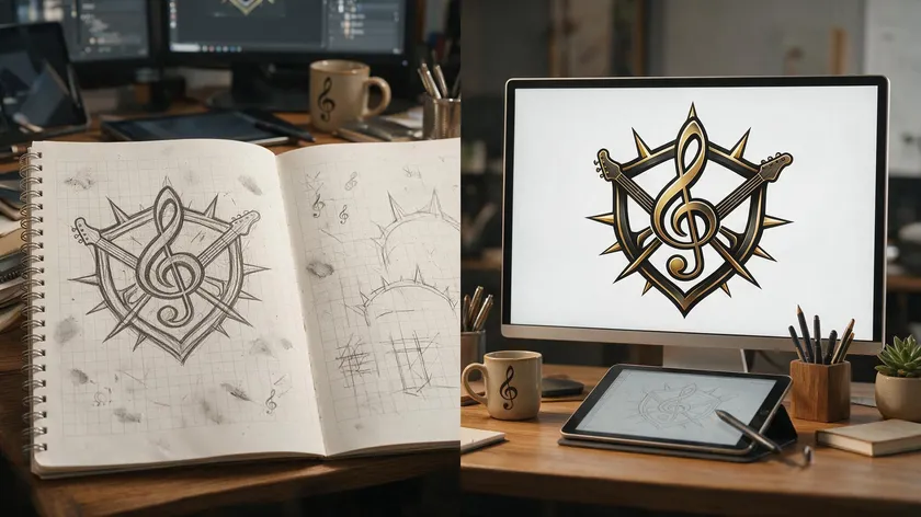
Bands can start with messy notebook scribbles and refine them using band logo templates inside a band logo maker like Logo.app’s band logo maker—no formal training required.
- Sketch five to ten quick thumbnail concepts by hand. Focus on shapes and lettering, not polish.
- Pick your two or three strongest ideas. Look for the ones that read clearly even as tiny doodles.
- Recreate them in a logo maker to test fonts, spacing, and color palettes in a clean environment. Logo.app lets you browse templates by vibe—”dark & heavy,” “retro & funky”—then customize icons and typography until the design feels like a true custom logo rather than a generic preset.
Logo.app is built to let you start designing and export files ready for real-world use in minutes. You can download logos in high resolution and vector formats for everything from gig posters to vinyl sleeves.
Imagine a garage punk band that scans a photocopied zine-style sketch, then traces and cleans it in Logo.app, locking in a gritty wordmark they can drop on every flyer. That’s the workflow—rough to refined in minutes, user-friendly enough for anyone in the band to handle.
Making your band logo work everywhere
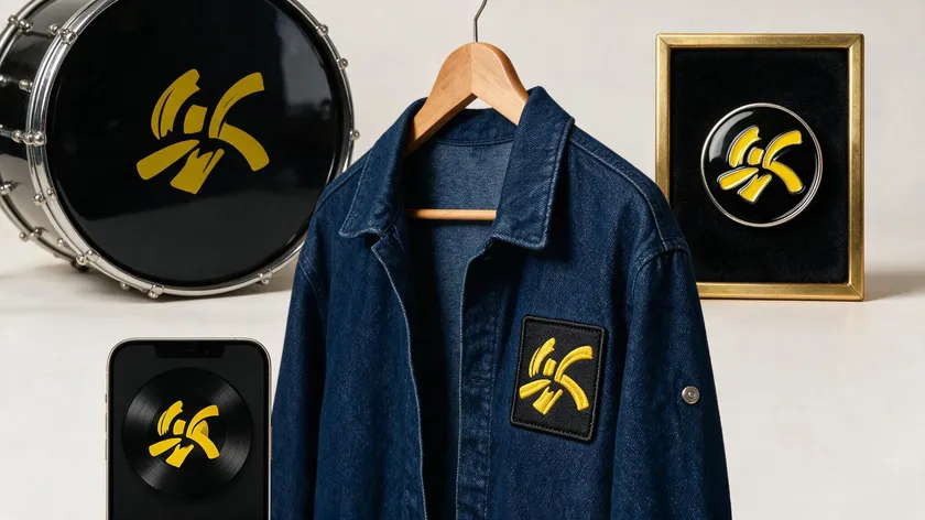
A great band logo isn’t just eye-catching on a screen—it’s flexible enough for tiny app icons, projector backdrops, embroidered patches, and drumhead prints. A logo should be recognizable at any size or medium, whether it’s a 16-pixel streaming thumbnail or a six-foot stage banner.
Plan multiple layout variations: a primary logo with the full name and symbol, a simplified mark using just an initial or icon, and a text-only version. Each serves different use cases—festival posters need the full wordmark, while an Instagram avatar might use only the symbol.
Think through real placements: a logo on a kick drum in a circular crop, a Bandcamp banner as a wide rectangle, a 40 mm enamel pin that demands clarity at a tiny scale. Versatility is key for a band logo used in multiple mediums, including clothing and digital platforms.
Timeless logos avoid overly detailed designs that lose clarity at smaller sizes. A logo should remain clear and recognizable when scaled down for social media use, and a good band logo should be legible and recognizable when printed small on merchandise.
Test legibility by printing the logo at business-card size and taping it to a wall. If bandmates can still read the name from across a rehearsal space, the mark works. Ensure your logo is legible across all mediums and design logos that look good at any size.
Keep logo files organized in named folders by year and version so future singles, album covers, and tour visuals all share the same core mark. A good band logo should be distinct enough to form part of the band’s identity on merchandise for years to come.
Advanced band logo ideas: evolving your mark over time
Many bands refine or reinvent their logos across eras—different tours, album cycles, or side projects—while keeping a recognizable thread. Lamb of God recently retired their longstanding wordmark after 22 years, proving that even iconic marks can evolve.
Strategies for evolving without losing identity: keep the same base symbol but swap logo colors per album, or maintain a core wordmark while the surrounding art shifts by era.
Concrete ideas include seasonal color swaps for tour posters in different colors, a stripped-back monochrome variant for an acoustic EP, and glitching or fragmenting the logo for a darker concept record.
Even subtle tweaks—tightening letter spacing, simplifying complex flourishes, or redrawing a mascot character—can make a new logo work better for formats like AR filters or LED walls. Your perfect band logo is the one that grows alongside your music career.
It’s okay if the first version isn’t the perfect logo. The important thing is to pick a direction, use it consistently, and improve it as the band’s sound and audience evolve. Your band’s personality will sharpen over time, and the logo should listen to that evolution and represent it faithfully.
Key Takeaways
- Match your logo style to your musical style: genre alignment in typography, symbols, and color palette gives fans an instant sense of your sound before they press play.
- Use no more than three colors in your logo and always plan a black-and-white version for merch, tattoos, and lo-fi printing.
- Prioritize scalability: a logo that looks great on a world tour backdrop but vanishes on a streaming thumbnail fails where most discovery happens.
- Start with rough hand sketches, then refine in Logo.app or a similar band logo maker to produce a clean, export-ready custom logo without needing a background in design.
- Treat your logo as a living mark—evolve it across album cycles and tours while keeping one recognizable element so fans never lose the thread.
Ready to bring your sound to life? Create a professional band logo in seconds with our AI Logo Generator — fully editable and yours to own.
FAQs
How detailed should my first band logo be?
Early logos work best when simple and bold—easy to stencil on a flight case or print on a cheap t-shirt. Avoid tiny details until you know the mark reproduces well at multiple sizes. A clean wordmark or a single symbol with strong contrast will serve you far better than an intricate illustration that falls apart at a small scale.
Can my band logo reference existing symbols or famous logos?
Avoid closely imitating famous band logos or corporate marks. You can use a universal symbol—like a cross, eye, or animal—but transform it enough that it’s clearly your own.
If your band is planning major commercial use on the band’s merchandise or licensing deals, speaking with a lawyer about trademark clearance is worth the cost.
Do I need different logos for my band and my solo side project?
Separate projects deserve distinct logos. However, subtle links-a similar color palette, related typography, or a shared layout approach—can signal a shared creative universe without confusing your audience or diluting either brand.
When should we hire a designer instead of using a band logo maker?
DIY tools and logo templates are ideal for early demos, local shows, and testing vibes. A free logo maker or Logo.app’s band logo maker covers most needs at that stage.
Hiring a professional makes sense once you’re touring nationally, pressing vinyl, or signing with a label and need a long-term visual identity system that scales across every touchpoint.
Is it risky to change our band logo after releasing music?
Rebrands are common in the world of music but should be handled intentionally. Announce the change—tie it to an album cycle or tour-and keep some recognizable element so fans connect old and new.
Update all profiles, merch listings, and posters at once to avoid confusion. Done well, a refresh signals growth rather than identity crisis.

