Before you open a design tool, clarify your restaurant concept, target guests, and price point. Your brand strategy should drive every visual choice—not the other way around.
A good restaurant logo combines simple shapes, readable typography—the same principle behind these minimalist logo examples—and a focused color palette that signals cuisine type and dining experience at a glance.
Restaurant logos communicate the restaurant’s personality, cuisine, and atmosphere, and a well-designed logo can elevate a restaurant’s perceived value before anyone reads a single review.
Restaurant logo templates are a fast starting point, but you should always customize icons, fonts, and colors so your own restaurant logo feels distinctive, not generic. Test your restaurant logo design on menus, signage, delivery apps, and staff uniforms to confirm it stays clear and appetizing at every size.
A logo maker like Logo.app lets you rapidly generate, tweak, and export multiple logo designs so a restaurant business can launch or rebrand without delays.
Table of Contents
- Why Restaurant Logos Matter More Than You Think
- Prep Work Before You Design Your Own Restaurant Logo
- Step‑by‑Step: From Restaurant Logo Templates to a Unique Design
- Visual Ingredients: Colors, Fonts, and Icons for Good Restaurant Logos
- Practical Testing: Making Sure Your Restaurant Logo Works Everywhere
- Key Takeaways
- FAQs
Why Restaurant Logos Matter More Than You Think
In 2026, first impressions usually happen on Google Maps, delivery apps, and social feeds—where the logo is often the first image people see before any food photos or reviews. A professional logo creates trust and loyalty among customers, while a cluttered or unclear mark sends them scrolling past.
According to Lucidpress’s State of Brand Consistency Report, consistent branding—including logos—can increase revenue by up to 33%.
Logo design sets expectations about the dining experience. A bold burger logo signals affordable, fast energy. A refined serif wordmark on a dark background signals upscale, slower-paced dining.
Color psychology and shape language work together here—rounded shapes and warm colors feel comforting, while angular shapes and dark palettes feel serious and premium. Colors in logos can influence customer perceptions and emotions within the first 90 seconds of interaction.
Imagine a family-friendly burger restaurant that improves its Google Maps click-through after switching from a cluttered, detail-heavy mark to a simple icon-plus-wordmark design. The change works because simple logos are faster to recognize and recall.
A strong logo helps customers remember and identify a brand across physical signage, takeaway packaging, POS screens, and delivery profiles—making even a single location feel like part of a larger, trustworthy restaurant business. Logos also differentiate a restaurant from competitors in crowded markets where dozens of options sit side by side.
Prep Work Before You Design Your Own Restaurant Logo
Strong logo design starts with strategy, not fonts and colors. Spending time on positioning now makes every design decision easier and faster later.
Define Your Concept
Are you a fast casual burger joint, a 12-table fine-dining restaurant, a neighborhood family diner, or a plant-forward bistro? Each demands a different visual identity.
Know Your Audience
Office workers at lunchtime expect speed and clarity. Families with kids respond to colorful, playful visuals. Health-conscious diners look for green and earth tones. Each group expects different logo styles.
Research Competitors
Check nearby restaurant logos on DoorDash, Uber Eats, and Google Maps. Note recurring colors, symbols, and overused clichés—then avoid them. Many logos in the food industry look nearly identical; standing out requires deliberate choices.
Set 3–5 Brand Adjectives
Choose adjectives like bold, playful, rustic, elegant, or fiery, and map each to design choices: line weight, icon style, color intensity. Logos reflect the restaurant’s history, theme, or owner’s passion—let those details guide you.
Decide Practical Needs Early
Will you need horizontal and stacked versions? A favicon? A simplified mark for social avatars? Knowing this upfront affects complexity.
This prep makes it easier to brief Logo.app or any designer, resulting in stronger restaurant logo designs in fewer rounds.
Step‑by‑Step: From Restaurant Logo Templates to a Unique Design
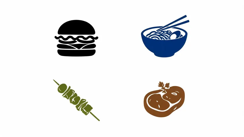
Start from restaurant logo templates and move toward a custom mark that feels original. For a guided, start-to-finish workflow, follow these steps:
1. Enter your business name and industry keywords
Enter your business name and industry keywords (e.g., “burger restaurant,” “steakhouse,” “ramen,” or “tapas bar”) into Logo.app to generate relevant logo designs in minutes.
2. Select your business type
Choose the restaurant industry category that matches your concept so the tool surfaces relevant food-and-beverage templates and icon options.
3. Choose your colors
Browse the color options that generate a draft restaurant logo instantly based on your brand identity and the characteristics of your business.
4. Enter your slogan
This is the step in which you add a slogan to communicate the value proposition and differentiation.
5. Pick related icons
Select an icon related to the nature of your business, so it can be integrated seamlessly into your final logo. Understanding the relationship between the logo and your product or service is key. Finally, choose the one you like the most!
Templates are starting points—experiment with spacing, proportions, and angles so the final mark does not feel like a default preset.
Visual Ingredients: Colors, Fonts, and Icons for Good Restaurant Logos
Color Palette
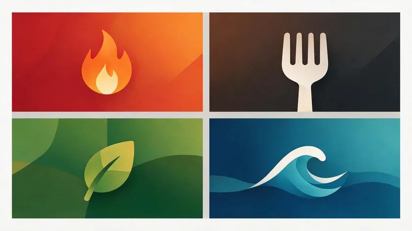
Think of this section as the recipe for your visual identity—choosing the right colors, fonts, and symbols tailored to your cuisine and experience. Research from the University of Winnipeg suggests up to 90% of snap judgments about brands are based on color alone, often within the first 90 seconds of interaction. Color combinations can evoke emotions like hunger and happiness when chosen carefully.
| Cuisine Type | Recommended Colors | Why |
|---|---|---|
| Spicy / grilled (burgers, BBQ) | Red + warm orange | Signals heat, energy, appetite—red stimulates appetite and is commonly used in logos across the food industry |
| Steakhouse / fine dining | Deep brown + charcoal | Feels upscale and serious |
| Farm-to-table / plant-forward | Green + earth tones | Green represents fresh and healthy foods in restaurant logos |
| Seafood / coastal | Cool blue + teal | Blue logos are effective for seafood restaurants and imply coolness |
Yellow is associated with happiness and optimism in branding, making it a strong accent for family-oriented spots. Limit your palette to 1–2 main colors plus 1 accent, and ensure high-contrast colors capture attention across light and dark backgrounds.
Typography
For typography, sans-serif fonts are commonly used in restaurant logos—Starbucks, for example, mixes a sans-serif workhorse font with a serif accent typeface across its brand system. Sturdy sans-serifs suit modern fast-casual spots; slightly condensed sans-serifs help long burger logo names fit horizontally; refined serifs or script accents work for upscale dining.
Pair a bold display font for the restaurant name with a simpler secondary font for taglines like “Since 2022” or “Wood-Fired Kitchen.” Stick to two typefaces maximum to keep the brand identity cohesive.
Icons
For icons, choose one style—line icons, solid shapes, or hand-drawn illustrations—and commit. Mixing a flat burger icon with hyper-realistic flames makes the logo feel unprofessional.
Consider a hypothetical redesign: a 2020 burger logo using neon gradients becomes a flatter, two-color mark in deep red and warm orange. The result prints cleanly on packaging and embroiders crisply on staff uniforms.
Practical Testing: Making Sure Your Restaurant Logo Works Everywhere
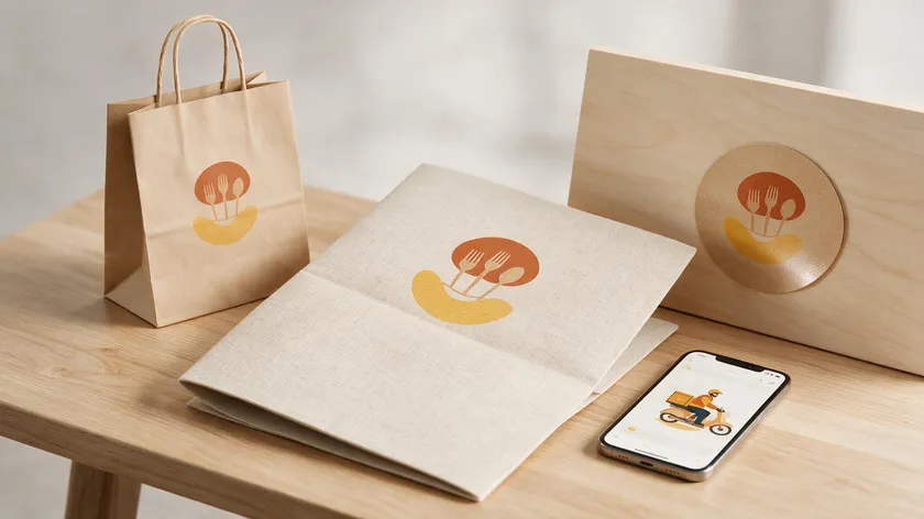
A restaurant logo has to function on everything from a 16-pixel app icon to a 2-meter-wide outdoor sign. Logos should be scalable for various formats and applications, and logos should be recognizable across various media platforms. Testing is how you achieve that.
- Test small first. Shrink the logo to delivery app icon size, social avatar size, and receipt header size. If the name or main shape blurs, simplify. A good restaurant logo conveys brand identity clearly at every scale.
- Mock up print applications. Place the logo on a sample menu PDF, a takeaway bag, and a round sticker. Ensure thin lines survive low-quality printing—this is where many designers find problems.
- Visualize signage. Check the logo in one color on a backlit sign, window vinyl, or wall mural. Consider nighttime visibility and contrast against brick, wood, or painted façades.
- Check digital contexts. In 2026, dark mode on a website, email headers, and Reels cover images all matter. Download your logo from Logo.app in vector format for sign makers, high-resolution PNG with transparent background for menus, and simplified SVG for web performance.
Ask 5–10 people from your target audience to glance at the logo for 3 seconds and say what cuisine and price level they expect. If answers are off, the design needs refinement. The world of restaurant branding moves fast—continue iterating until the signal is clear.
Key Takeaways
- Clarify your restaurant concept, audience, and price point before touching any design tool—brand strategy drives every visual decision and makes the whole process easier.
- Use color, typography, and icons intentionally: red and orange for energy, green for freshness, dark tones for upscale dining, and no more than two typefaces to keep the brand identity tight.
- Restaurant logo templates from Logo.app let you create a professional, free-standing mark in minutes—but always customize and test across menus, signage, apps, and uniforms before committing.
- A strong visual identity empowers your restaurant to stand out in a global community of competitors and find loyal customers who return again and again.
Ready to grow your brand? Create a professional restaurant logo in seconds with our AI Logo Generator—fully editable and yours to own.
FAQs
Below are quick answers to common, practical questions about restaurant logos that go beyond the main sections.
How much should I budget for a restaurant logo in 2026?
Budgets vary widely. Using Logo.app, you can create and download a professional logo at minimal cost—perfect for early-stage restaurants. Mid-range freelance designers typically charge between $500 and $2,500, while agencies can run $5,000 or more.
For most new restaurants, starting with a solid template-based logo and upgrading later is a smart approach. Investing in versatile file formats (vector, PNG, SVG) matters more than paying for unnecessary visual complexity.
Can I safely redesign my existing restaurant logo without confusing customers?
A rebrand makes sense when your menu shifts, your target audience changes, or your current mark looks dated. Keep one or two recognizable elements—a signature color or icon shape—to maintain continuity.
Announce the new logo on social media, menus, and at your entrance for a few weeks so regulars understand that only the visuals changed, not the quality of the food or service.
What file formats do I need for my restaurant logo?
You need vector files (SVG, PDF) for sign makers and printers, high-resolution PNG with a transparent background for your website and menus, and smaller optimized PNG or SVG files for app icons and social media.
Use Logo.app to export and store these variants together so you never end up with pixelated or stretched logos on packaging or online listings.
Should my restaurant logo include a tagline like “Since 2023”?
A tagline helps when your restaurant needs extra clarity in crowded districts—phrases like “Wood-Fired Grill” or “Korean BBQ & Bar” add useful inspiration and context. Design the logo so the tagline is optional, with a version that works perfectly when the tagline is removed for very small spaces like app icons or embroidered uniforms.
How often should I update my restaurant logo?
Most stable restaurants refresh their visual identity lightly every 5–7 years, adjusting colors or typography rather than overhauling everything. Monitor guest feedback and digital performance—if people misread the cuisine type or the logo feels dated compared to competitors, it may be time to log into Logo.app and iterate on a new direction.

