
Choosing the right logo style is one of the first real branding decisions any business makes. It sets the tone for everything that follows—your website, your packaging, your social media profiles, and every piece of marketing material you produce.
What’s striking is how many globally recognizable brands rely entirely on a wordmark—text-only, no icon—to build instant recognition. Google, FedEx, and Coca-Cola are all famous examples of wordmark logos that use nothing but their company name to represent their brand.
This guide covers what a wordmark logo is, when it’s the right choice for your business, and how to design one, whether you’re working with professional designers or generating ideas instantly with AI.
Table of Contents
- What Is a Wordmark Logo?
- Wordmark Logos vs. Other Different Types of Logos
- When a Wordmark Logo Is the Right Choice
- How Wordmark Logos Shape Brand Identity and Personality
- Core Principles of Good Wordmark Logo Design
- Key Design Elements: Typeface, Spacing, Shape, and Color
- Step‑by‑Step: How to Design a Wordmark Logo
- Common Mistakes to Avoid in Wordmark Logos
- Real-World Examples and Sectors That Rely on Wordmarks
- Putting Your Wordmark to Work Across Your Brand
- FAQs
- How do I know if my business name works well as a wordmark?
- Can a wordmark logo include small graphic elements and still be a wordmark?
- What file formats should I export my wordmark logo in?
- How often should I update or refresh my wordmark logo?
- Can I trademark a wordmark logo that just uses my company name?
What Is a Wordmark Logo?
A wordmark logo (also called a logotype) is a logo built entirely from the brand’s full name in stylized text, without separate icons, mascots, or symbols. A wordmark logo includes only the company name, and the text itself is the logo.
Unlike symbol-heavy logos, wordmarks turn the letters themselves into the visual identity. Every detail—font choice, letter shapes, spacing, and color—carries the brand. Wordmark logos focus solely on typography without symbols, making the name immediately visible.
Wordmark Logos vs. Other Different Types of Logos
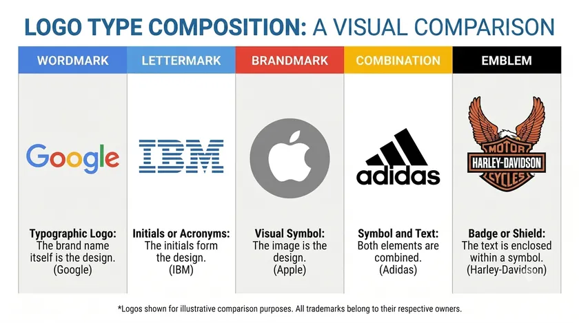
Wordmarks are one of several classic logo types, and choosing correctly shapes your overall brand identity. The key difference between wordmarks and other logo types is that the name itself is the logo—nothing more.
Here’s how the main types compare:
| Logo Type | Example | Best For |
|---|---|---|
| Wordmark | Google, FedEx | Short, distinctive names needing name recognition |
| Lettermark logo | IBM, HBO | Long names reduced to initials or a monogram |
| Brandmark (icon) | Apple, Nike | Globally established brands with standalone symbols |
| Combination mark | adidas (word + stripes) | Flexibility to use the word and icon together or separately, depending on the context |
| Emblem | Harley-Davidson badge | Traditional, institutional, or heritage brands |
A lettermark logo works when a company name is too long to display efficiently. A combination mark gives flexibility—the word and icon can live together or apart. An emblem wraps text inside a shape for a more formal, badge-like layout.
Modern startups, especially in tech and SaaS from 2010 to 2025, have gravitated heavily toward clean sans-serif wordmarks. Digital-first visibility—app stores, browser tabs, and responsive layouts—rewards simple, scalable typography over intricate icons.
A wordmark logo design can also be a first step. Many brands start with a text-only mark and later expand into a richer system with icons, patterns, and alternate marks as their recognition grows.
When a Wordmark Logo Is the Right Choice
Not every brand should use a wordmark. But under the right conditions, it’s one of the strongest moves you can make.
Name Length and Structure
Wordmark logos work best for short and distinctive company names—typically under 10–12 characters or one to three words. Brands like Uber, Etsy, and Visa thrive as wordmarks because their names are compact and readable at any size.
A long or complex business name can be challenging to fit into a wordmark without sacrificing legibility.
Brand Stage and Recognition
For new brands that need to educate audiences on their name, a wordmark accelerates brand recognition. Wordmarks make the brand name immediately visible and are simple to scale, so every touchpoint—from a website header to signage—reinforces the name. They enhance name recognition by directly displaying the business name.
Budget and Resources
They work well for startups with limited marketing budgets. A text-only logo design tends to cost less to produce, maintain, and reproduce than a fully illustrated symbol.
Personality Fit
Wordmarks suit brands that want to project minimalism, confidence, and professionalism—think law firms, B2B SaaS, and creative studios. Where wordmarks may be weaker: very long names, hard-to-spell words, or brands dependent on pictorial storytelling (sports teams, children’s products).
Picture a hypothetical fintech startup using a geometric sans-serif wordmark to signal tech-forward trust or a boutique bakery styling its name in a serif font with custom ligatures to evoke artisanal craft. In both cases, the wordmark puts the name front and center.
How Wordmark Logos Shape Brand Identity and Personality
In a wordmark, typography carries nearly all of your brand’s personality signals. There’s no icon to fall back on, so every design decision matters. A single choice of font, weight, or spacing can shift how trustworthy, playful, or premium a brand feels before a customer reads a word of copy.
That’s why getting this part right pays off across every touchpoint the wordmark appears on.
Font Category Sets the Tone
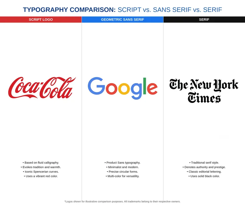
A serif font suggests heritage and formality—think The New York Times. A geometric sans-serif leans modern and techy, like Google after its 2015 redesign to Product Sans.
Script or hand-drawn typefaces evoke warmth and nostalgia. Coca-Cola’s logo uses a flowing Spencerian script that has remained largely unchanged since the late 1800s, building deep cultural and visual associations with tradition.
Choose a typeface that reflects your brand personality. Rounded terminals and open counters feel friendly and approachable. Sharp edges, narrow proportions, and high-contrast strokes tend toward premium or technical.
Color Carries Meaning
Consistent use of brand colors reinforces recognition in wordmark logos. Blue often denotes reliability (PayPal), red conveys energy and urgency (YouTube), and black signals luxury or minimalism (Chanel). Use color to differentiate your brand and attract attention, but always plan for light and dark variants.
Consistency Across Channels
Using the exact same wordmark—same spacing, same color palette, same proportions—across your website, social media profiles, packaging, and slide decks is crucial to cementing identity. A distinct wordmark builds equity only when applied uniformly.
Core Principles of Good Wordmark Logo Design
Think of these principles as a checklist for evaluating any wordmark concept.
Clarity and Legibility
A good wordmark logo demands instant readability at a glance—even at 100 pixels wide on a smartphone screen. Maintain legibility across different sizes and mediums by avoiding overly decorative elements that collapse at small scales.
Distinctiveness
Successful wordmark logos often include distinctive typography and excellent readability. Avoid generic fonts. Instead, use subtle customizations—a unique “g,” a modified “k,” or a custom ligature—to create a unique look that competitors can’t replicate.
Balance and Proportion
Letters should feel evenly weighted. Consistent stroke widths, optical balance between the left and right halves, and carefully kerned letter pairs prevent the mark from feeling lopsided.
Scalability
Test from favicon size to billboard mockups. Thin strokes that look elegant at large sizes may vanish at small ones. Design in vector formats so detail scales cleanly.
Versatility
Design primary and secondary color versions—full-color, solid black, and solid white—that work on light, dark, and photographic backgrounds.
Timelessness
A well-designed wordmark can become one of a brand’s strongest assets. Avoid short-lived trends like heavy gradients or extreme distortions. A well-designed wordmark conveys professionalism and simplicity that ages gracefully over five to ten years.
Key Design Elements: Typeface, Spacing, Shape, and Color
Precise control of a few core design elements largely determines the quality of any wordmark logo design. None of these elements work in isolation—a great typeface can still fail if the spacing is off, and the right color palette can’t save a font that’s difficult to read at small sizes.
Getting each one right and making them work together is what separates a forgettable wordmark from one that holds up across every size and surface it appears on.
Typeface
Start by exploring font families—serif, sans-serif, and script—and then narrow to specific cuts (regular, semi-bold, and bold). Google uses a custom typeface inspired by geometric sans-serif principles. Vogue relies on a bespoke high-contrast serif.
Limit your design to one or two typefaces for cohesion. A carefully selected font does most of the heavy lifting in a custom wordmark logo.
Spacing
Pay attention to kerning for better visual appeal. Adjust tricky letter pairs like “AV,” “To,” and “Wa” by hand. Even optical spacing prevents awkward gaps and collisions. FedEx’s famous 1994 wordmark was carefully kerned to create a hidden arrow between the “E” and “x”—a detail that makes the logo instantly recognizable.
Letter Casing
ALL CAPS projects strength and stability. Title case feels approachable and professional. All lowercase reads casual and tech-forward, as seen in Flickr’s and adidas’s branding. Font weight also shifts perception—ultra-light feels airy, and bold feels confident.
Shapes and Framing
Some wordmarks include subtle enclosing shapes—like LinkedIn’s “in” box—while remaining primarily typographic. Avoid excessive framing that distracts from the name.
Color System
Choose one to two core colors plus neutrals. Plan high-contrast versions for accessibility, targeting WCAG contrast guidelines for digital use. Always prepare monochrome variants for print on single-color surfaces.
Step‑by‑Step: How to Design a Wordmark Logo
Here’s a practical process any brand or designer can follow, from ideas to final logo files. It works whether you’re sketching concepts by hand or refining them digitally, and it applies just as well to a solo founder as it does to a full design team. Each step builds on the last, so skipping ahead usually means redoing work later.
Discovery
Define your brand values, target audience, competitors, and adjectives for brand personality. Create a simple moodboard of typography and color references. This step prevents aimless exploration later.
Concept Sketching
Explore different font directions: geometric sans vs. humanist sans vs. serif. Experiment with casing, ligatures, extended strokes, and simplified letterforms. Even rough hand-drawn sketches help you see what works before going digital.
Digital Refinement
Use vector design software to fine-tune kerning, adjust curves, and tweak alignment. Test the wordmark on sample assets: a website header, a mobile app splash screen, and email signatures. Work in small increments—tiny adjustments to spacing or stroke weight can transform the feel.
Feedback and Testing
Gather feedback from stakeholders and a small user panel. Check readability, emotional tone, and distinctiveness against competitors in the same industry. If the wordmark doesn’t stand apart in a lineup, iterate.
Finalization
Prepare a compact logo kit: vector master files (SVG, PDF), raster exports (PNG in multiple sizes), and a usage guide defining color codes, spacing rules, and minimum sizes. This designed set ensures anyone on your team can apply the wordmark correctly.
You can work with professional designers or use AI-assisted tools, but the same simple steps and attention to detail should apply regardless.
Common Mistakes to Avoid in Wordmark Logos
Text-only logos can look deceptively simple, which leads to recurring errors that undermine the brand.
Overcomplication
Piling on gradients, outlines, shadows, and multiple fonts makes the mark hard to read. Excessive decorative elements cheapen the brand identity instead of elevating it.
Poor Font Choice
Overly trendy or free fonts often lack proper kerning pairs. Worse, choosing a font that mimics famous brands creates legal and credibility problems. Always customize to create a distinctive result.
Bad Spacing
Cramped letters, inconsistent kerning, or horizontally stretched type make even good fonts look amateurish. A great wordmark demands careful, optical spacing.
Ignoring Small Sizes
Testing only at large presentation sizes is risky. At the favicon or app icon scale, thin strokes and tight counters can disappear entirely. Always test across the full range.
Weak Contrast
Light gray text on white, or low-contrast pastels, fails basic legibility on screens. Plan dark and light background variants early.
Lack of Differentiation
Copying the generic blue geometric sans-serif look that saturated the startup world from 2015 to 2020 won’t make your wordmark logo stand out. Add one or two distinctive—but subtle—traits to separate your mark.
Real-World Examples and Sectors That Rely on Wordmarks
Some industries lean heavily toward wordmarks because of how they need to communicate.
Technology and Internet
Famous wordmark logos include Google, Coca-Cola, and FedEx. Companies like eBay (redesigned in 2012) and Spotify have used wordmarks to build global recognition across browser tabs, app stores, and smart devices. Many established brands use multiple logo versions, including full wordmarks and standalone icons for constrained spaces.
Fashion and Luxury
Classic wordmarks for brands like Chanel, Dior, and Zara use restrained typography to represent a premium brand identity on packaging, store signage, and images in editorial spreads.
Media and Entertainment
Disney and Canon are also recognized wordmark logos that function across static and animated formats. Netflix, YouTube, and Disney all prove that text logos work powerfully in video intros and social media.
Small Local Businesses
A 2025 boutique bakery using a bold serif wordmark on its storefront, uniforms, and social media achieves the same consistency as global brands—at a fraction of the cost. Wordmarks are easy to replicate across various marketing materials, from business cards to packaging.
Putting Your Wordmark to Work Across Your Brand
A wordmark logo only becomes powerful when applied consistently across real-world touchpoints. Wordmark logos need to work consistently across various formats such as websites and signage.
Digital Presence
Integrate the wordmark into website headers, email signatures, social media profiles, and app icons. Consider retina screens and dark-mode variants. For digital use, SVG files ensure crisp typography on high-density displays.
Print and Packaging
Use the mark on business cards, invoices, labels, shipping boxes, and storefront signage while respecting minimum sizes and clear-space rules. Templates for common print assets help teams stay consistent.
Motion and Video
Simple animation approaches—fade-in, letter tracking, and subtle underline—preserve legibility while bringing the wordmark to life in intros and social reels.
Brand Guidelines
Create a concise logo usage guide defining correct and incorrect uses, color codes (HEX, RGB, CMYK), and file-format guidance for internal teams and partners. This level of detail prevents misuse.
Scalability for the Future
A well-designed wordmark makes it easier to extend into a fuller brand system later—icons, patterns, campaign graphics—without needing a full redesign. You can customize and expand over time while keeping the core mark intact.
Key Takeaways
- A wordmark logo is a text-only logo built from the brand name, using typography, spacing, and color as the main design tools.
- Wordmarks are ideal for short, distinctive company names and brands that need fast name recognition on a limited budget.
- A good wordmark logo combines clear brand personality, strong readability at all sizes, refined spacing, and distinctive but restrained detail.
- Typography does the work of both text and symbol—every font choice, color decision, and spacing adjustment shapes how people perceive the brand.
- Start with discovery, test rigorously across sizes and contexts, and deliver a complete logo kit for consistent application.
Ready to see your brand name as a wordmark? Enter your business name on our Free Logo Maker and get custom logo concepts in seconds — no design experience needed.
FAQs
This section answers common, practical questions about wordmark logos that the previous sections didn’t fully cover. Each answer is kept concise and focused on actionable guidance.
How do I know if my business name works well as a wordmark?
Ideal candidates are short to medium length—typically under 12–14 characters—easy to pronounce, and free of confusing spelling. Test by typing your name in several fonts and asking someone unfamiliar with your brand to read it at a glance. If they can read and recall it easily, it’s likely a fit for a wordmark.
Avoid names with excessive punctuation, random capital letters, or unusual characters that make consistent styling difficult across different platforms.
Can a wordmark logo include small graphic elements and still be a wordmark?
Yes, a wordmark can include subtle graphic touches—like an underline, a dot transformed into a simple shape, or letters inside a basic frame—while remaining primarily typographic. The line blurs when a separate symbol can stand alone as an icon; at that point, the logo is closer to a combination mark.
Keep any graphics minimal so the brand name stays the main focus and remains identifiable even without the extra element.
What file formats should I export my wordmark logo in?
Always have at least one vector format—SVG or PDF—for infinite scalability without quality loss, which is essential for print and large signage. Export high-resolution PNG files with transparent backgrounds for the web, presentations, and social media. Include JPEGs for non-transparent uses where file size matters.
In 2026, SVG is widely supported on modern websites and is the best choice for crisp typography on high-density screens.
How often should I update or refresh my wordmark logo?
Strong wordmarks typically last many years with minimal changes. Major overhauls are rare and usually tied to significant shifts like mergers, new markets, or brand repositioning. Light refinements every 5–10 years—cleaner kerning, simplified shapes, subtle color tweaks—keep the logo current without losing hard-earned recognition.
Frequent, drastic changes dilute brand equity and confuse loyal customers. Coca-Cola’s script, for inspiration, has survived well over a century with only minor refinements.
Can I trademark a wordmark logo that just uses my company name?
In many jurisdictions, stylized wordmarks can be registered as trademarks if the name and visual treatment meet distinctiveness and legal criteria. Registration typically protects the specific stylization—the font, layout, and unique letter features—while a separate word mark filing may protect the name itself in plain text.
Consult an intellectual-property professional or your country’s official trademark office resources to check availability and file correctly for your industry.

