Not every business name works as a full wordmark. When a name is long, complex, or built around a founder’s identity, trying to squeeze every word into a logo often creates clutter rather than clarity. That’s exactly why initials carry the brand better than the whole word in many cases.
IBM, HBO, and Louis Vuitton prove that a few carefully designed letters can hold the same weight as a full company name—working on a phone screen the same way they work on a storefront sign. This guide covers what an initial logo is, how to choose the right style, colors, and layout, and how to create one using a logo maker—from first idea to production-ready files.
Table of Contents
- What is an initial logo—a letter-based logo—and why it matters in 2026
- Initial logo ideas: from single letters to modern monograms
- How to make an initial logo: step-by-step with Logo.app
- Choosing logo type, color, and font for your initials
- Layouts that work for initial logos across platforms
- From initial logo to complete brand identity
- Downloading high-resolution files and using them correctly
- Key Takeaways
- FAQs
What is an initial logo—a letter-based logo—and why it matters in 2026
An initial logo is a mark built from one to three initials of a brand or personal name. These range from clean, minimal single-letter shapes to decorative interlocked monogram logo styles that suggest heritage or craft. Unlike a full wordmark (think “Coca-Cola”) or a symbol like Apple’s icon, an initial logo emphasizes the brand’s initial letter or letters through deliberate typography.
This type of logo design solves a real problem. Companies with long names struggle with legibility on app icons, social avatars, and favicons. Reducing to initials keeps the mark distinct and readable at small sizes.
A logo contributes to brand recognition by providing a visual symbol customers can associate with the company—often the fastest way people identify a business before they read a single word.
Initial logos are especially popular among solo creators such as photographers, real estate agents, startups with founder names, and heritage brands seeking a timeless feel. IBM’s 8-bar lettermark has been virtually unchanged for over 50 years. HBO’s refined initials have held steady since 1980.
Effective logos facilitate quick brand recognition in crowded marketplaces—and initials do it with remarkable efficiency.
Initial logo ideas: from single letters to modern monograms
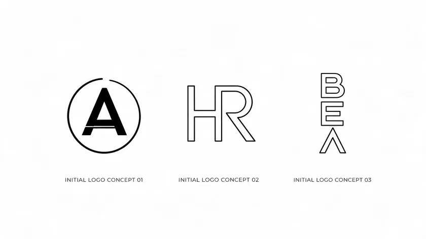
Instead of abstract theory, here are concrete initial logo ideas drawn from current design trends. Professional designers create thousands of initial logo ideas each year, so narrowing your direction early saves time.
Concept directions to explore:
- A single letter in bold geometric type (e.g., a standalone “G” inside a circle)
- Intertwined double initials for personal brands (e.g., “AG” with shared strokes)
- Stacked triple initials for agencies or firms (e.g., “JDS” in a vertical arrangement)
- A letter paired with a simple icon—like a heart symbol for a wellness brand or a shield shape for security
Stylistic approaches vary by industry: minimalist sans-serif for tech, high-contrast serif for law and finance, and script letters for beauty and wedding brands. Sketching multiple concepts on paper—even rough ones—first can lead to a stronger final logo design. Designing in black and white first helps you focus on form and structure before adding color.
Research logos similar to what you want by browsing galleries and logo trend reports, but never copy other logos directly. An effective logo should be memorable and original. Researching competitors helps avoid clichés. Keep shapes clean, use three or fewer colors, and aim for simplicity—simplicity is key for recognition and versatility.
If you need more ideas, try entering related keywords into template search bars or browsing Pinterest boards filtered by industry. Let yourself be inspired, not derivative.
How to make an initial logo: step-by-step with Logo.app
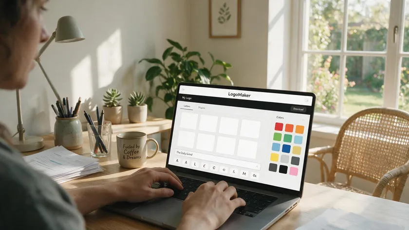
These five steps are all it takes to design an initial logo—no design software, no waiting on a designer. With logo.app, you generate multiple logo concepts from your business name—initial-style marks often show up among the results—and you can keep generating new options until you find the one that fits.
1. Enter your business name
Type in your full business name or personal name. The tool uses your input to suggest initial combinations and font pairings.
2. Select initials and industry
Choose which letters to feature and pick the industry category that matches your brand. This helps the tool surface relevant logo templates and icon options.
3. Choose your colors
Browse the color options that generate an initial logo instantly based on your brand identity and the characteristics of your business.
4. Enter business name & slogan
This is the step in which you add the name of your business and enter a slogan to communicate the value proposition and differentiation.
5. Pick related icons
Select an icon related to the nature of your business, so it can be integrated seamlessly into your final logo. Understanding the relationship between the logo and your product or service is key. Finally, choose the one you like the most!
Choosing logo type, color, and font for your initials
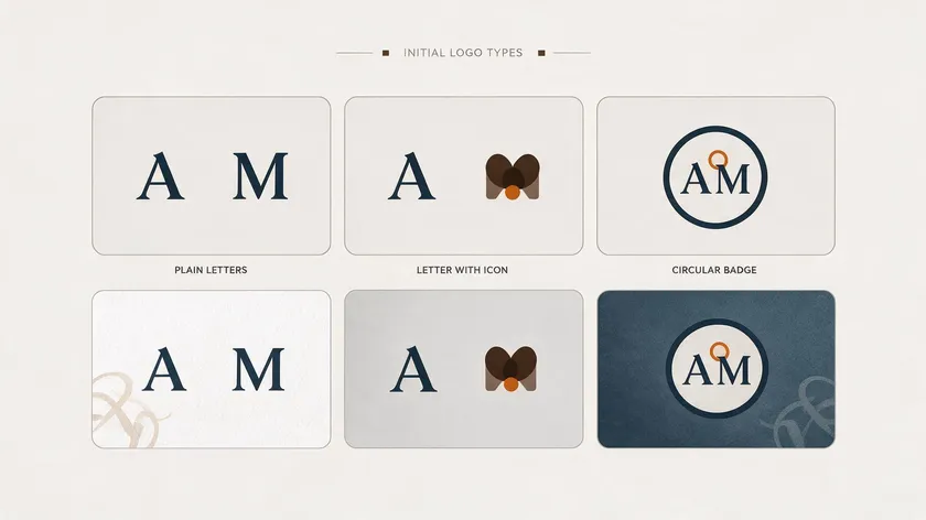
These visual choices are what make two logos with the same initials feel completely different. Picking the right initial logo combination of type, color, and font is what separates a forgettable mark from a perfect design.
Logo Type
Three main approaches work for initials: pure text lettermarks, a letter paired with a simple icon or symbol, and a monogram set inside a shape (a circle, square, or shield). A lettermark suits tech and consulting; a shaped monogram fits luxury and hospitality. Choose based on where the logo will appear most—if it needs to work as a tiny icon, simpler is better.
Color
Colors influence perception and evoke emotions. Blue reads as trustworthy, black as authoritative, and gold as luxurious. Using three or fewer colors creates an effective initial logo—a primary hue plus one accent is usually enough. Limiting to fewer colors also keeps production costs low across print materials and digital assets. Choose wisely: your palette will define the brand’s visual tone for years.
Font
Fonts convey meaning. Clean sans-serifs signal modern tech; classic serifs suggest tradition and trust; expressive scripts work for lifestyle brands. Using bold, clean fonts ensures easy recognition, especially at small sizes on smartphones and social bios. Avoid overly decorative typefaces—if a letter becomes unreadable at 32 pixels, the logo fails its primary job.
Accessibility matters: always test for sufficient contrast and readable letterforms on both light and dark backgrounds.
Layouts that work for initial logos across platforms
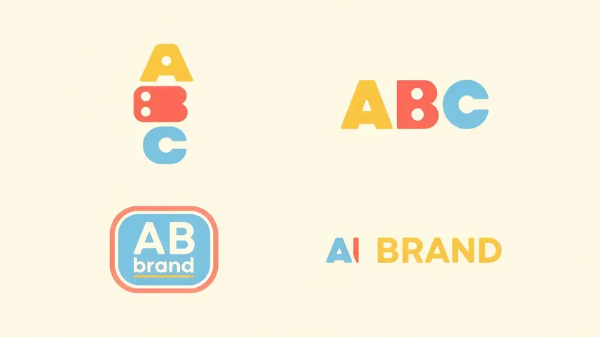
The same initials can look balanced or awkward depending on spacing, alignment, and orientation. A minimalist layout suggests refinement and class, but only if the proportions are right. Testing logos on different backgrounds and sizes is essential before finalizing any layout.
Common layout options:
- Stacked initials—letters arranged vertically, ideal for square avatars and app icons
- Side-by-side letters—horizontal arrangement for website headers and email signatures
- Badge layout—initials inside a circle or rounded rectangle for a contained, polished look
- Lockup—initials above or beside the full logo name, used on business cards and print layouts
Choose the layout that best fits your design space and brand style.
| Layout Type | Best For |
|---|---|
| Stacked / vertical | Social profile pictures, app icons, favicons |
| Horizontal | Website headers, email signatures, letterheads |
| Badge / contained | Stamps, watermarks, packaging labels |
| Full lockup (initials + name) | Business cards, signage, presentation covers |
Every layout works differently across platforms, so preview each version in context—social media profile, website header, and business card mockup—before committing. Your final logo package should include both a compact icon version and a full lockup to cover all use cases.
From initial logo to complete brand identity
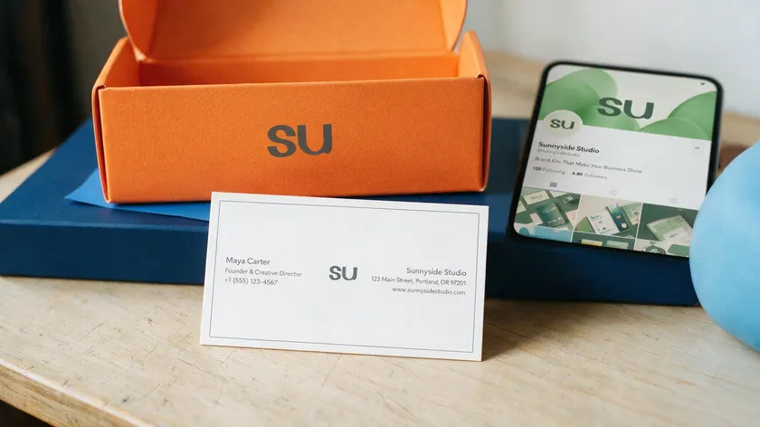
An initial logo is the starting point, not the finish line. A logo is not the brand itself; it represents the brand. Building a cohesive identity means extending the logo into every customer touchpoint in the same way.
Start by defining primary and secondary colors, heading and body fonts, and spacing rules. Taglines in logos should be three to seven words long—enough to communicate your promise without crowding the mark. Unlike an advertising jingle that relies on memorable words and sound, a logo relies purely on visual impact.
Extend the logo into social media posts, presentation covers, invoices, and packaging. Good logos communicate the core values and mission of a business, and using consistent logo design across platforms reinforces brand identity. A professional logo creates a strong first impression on potential customers, and consistent logo use builds long-term recall.
Logos serve as a visual anchor, connecting customer experiences to the business; a well-designed logo builds long-term trust and loyalty over time. A distinctive logo helps differentiate a business from competitors.
When it’s time to change logo direction—refreshing letterforms, adjusting colors, or modernizing the layout—keep the core initials recognizable. You can update a tagline or swap an affiliate coupon link on marketing materials without redesigning from scratch. Store all brand assets in one shared folder so your team, partners, and vendors always access the correct files.
Downloading high-resolution files and using them correctly
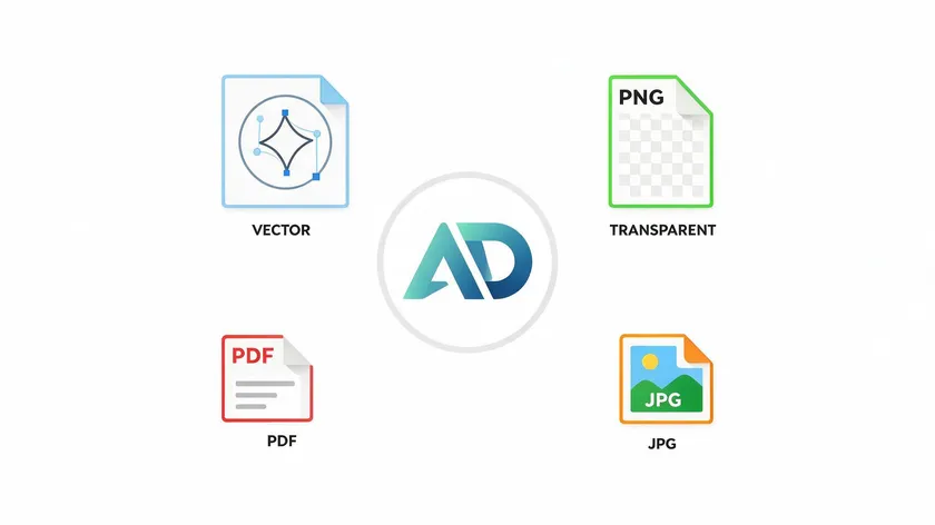
A professional initial logo is only useful if you can download it in the right formats for every use case. High-resolution files are essential for both print and digital use; low-resolution exports will look blurry on everything from banners to business cards.
Standard exports your logo maker should provide are:
- SVG and PDF—vector files that maintain quality across different sizes and formats, from a 32-pixel favicon to a 3-meter banner
- PNG with transparent background—a transparent version ideal for overlays on photos and colored backgrounds
- JPG—lightweight raster format for website use and email
Logos can be downloaded in PNG, JPG, PDF, and SVG formats. Initial logos are available in high-resolution and vector formats, so please ensure you download all the files your projects require. A transparent version of your initial logo is available in PNG format for layering over images and dark surfaces.
Practical tips for file management:
- Keep a master folder organized by format (vector format, raster, color versions)
- Use CMYK color profiles for print materials and RGB for digital
- Maintain full-color, black, and white versions so the logo stays legible everywhere
- Never stretch or distort the logo—vector files prevent quality loss at any scale
Getting these file details right up front saves you from re-exporting logos later when a new use case comes up.
Key Takeaways
- An initial logo is a letter-based mark using one to three initials to create a compact, memorable brand identity across digital and print—ideal when your full name is too long or complex.
- Modern initial logo makers and logo templates let you generate and customize designs instantly, without design skills, while supporting high-resolution, professional output.
- Choosing the right logo type, colors, fonts, and layout keeps initials legible, distinct, and consistent on social media, your website, and packaging.
- Initial logos evolve into a full brand identity and can be edited later as a business grows or needs to update its logo name or direction.
- From first idea to production-ready files, the process is straightforward: enter your name, pick a template, customize, preview, and download.
Ready to see your initials come to life as a logo? Enter your business name on our Free Logo Maker and get custom logo concepts—including initial-style options—in seconds, no design experience needed.
FAQs
These questions cover ownership, revisions, and practical decisions not fully addressed above.
Are initials a good choice for a new brand’s first logo?
Absolutely. Initial logos are especially effective for new brands with long or complex names, or when the founder’s name is central to the service—consultants, designers, and coaches all benefit. Starting with initials speeds up recognition on social media and packaging. If needed, the logo can evolve into a fuller wordmark later.
The one exception: highly visual brands (children’s products, food, and travel) may benefit from an illustrative mark that tells a more immediate story. For most professional services and startups, though, a clean initial logo is a strong first move.
How do I pick an initial logo name if my business has several words?
Use the first letter of each main word. “North Shore Fitness Studio” becomes “NSF” or even “NS” if you want a cleaner mark. Another pattern: combine a founder initial with a core keyword, like “K Studio.” Before committing, search for other logos using the same initials in your industry to avoid confusion or legal overlap.
Keep the visible initials to two or three letters for clarity, even if the full legal business name is longer and appears in text elsewhere.
Can I edit my initial logo after I’ve downloaded it?
Yes. Most modern logo makers let you reopen saved projects in your account and adjust colors, fonts, icons, and layout without recreating the logo from scratch. Common scenarios include refreshing colors for a rebrand, updating a slogan, or tweaking spacing for a new print format.
After any change, export a fresh set of high-resolution files and replace old versions on your website, social media profiles, and templates to keep branding consistent.
Do I own my initial logo, and can I trademark it?
Ownership depends on the logo’s originality and the terms of the logo maker or designer you used—always review the license details before commercial use. A unique initial logo can often be trademarked, but generic letter styles in common fonts may face challenges.
Legal advice is recommended for formal registration. Before investing heavily in brand materials, do a free basic search for existing trademarks with the same initials in your industry.
How do I keep my initial logo consistent across all my materials?
Create a simple one-page style guide showing approved logo versions, clear space rules, minimum size, and your color codes. Using the same file versions and exact color values on your website, social headers, invoices, and ads builds recognition and trust over time.
Store logo files and brand templates in a shared folder or brand hub so every team member and partner always pulls the correct assets. Consistency across every touchpoint is what turns a mark into a recognized brand.

