Some of the world’s most recognizable brands—especially in tech—use a single symbol that doesn’t literally depict anything at all. They rely on shape, color, and form alone to carry meaning, and they work. This guide covers what an abstract logo is, why brands choose one, the core design elements and popular types, and how to design or generate one that works across a full brand identity.
Table of Contents
- What Is an Abstract Logo?
- Why Choose an Abstract Logo for Your Brand?
- Core Elements of a Good Abstract Logo Design
- Popular Types of Abstract Logos (with Examples)
- How to Design an Abstract Logo Step by Step
- Using an Abstract Logo Maker vs. Hiring a Designer
- Making Your Abstract Logo Work Across a Full Brand Identity
- Key Takeaways
- FAQs
- Do abstract logos work for small local businesses or only for big tech companies?
- How long does it take to create a strong abstract logo?
- How do I know if my abstract logo is too complex?
- Can I turn my current literal logo into an abstract logo without losing recognition?
- Who owns the rights to an abstract logo made with an online logo maker?
What Is an Abstract Logo?
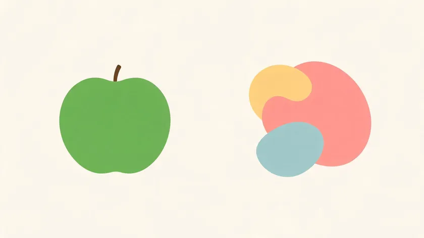
An abstract logo is a non-representational mark made of shapes, lines, or patterns that suggests meaning rather than literally depicting a product or service. Abstract logos often suggest concepts like movement and innovation rather than depicting specific objects.
They allow for unbound creative freedom while remaining memorable and catching people’s attention. This freedom makes them a natural fit for brands that want a mark capable of evolving alongside the business without being locked into a single product, service, or era.
The difference between an abstract logo and a pictorial mark is straightforward. Apple’s logo depicts an actual apple with a bite taken out—a literal image. By contrast, Airbnb’s “Bélo,” introduced in 2014, combines symbols of people, places, and love into one otherwise ambiguous shape that doesn’t show any single object.
Other well-known examples include NBC’s Peacock, which features six colors representing its divisions, refined into a simple geometric form. Sony PlayStation’s logo uses four colors to convey emotions through its stylized “PS” monogram, launched with the original console in 1994.
Abstract marks are one of several core logo styles alongside wordmarks, pictorial symbols, and mascots. Their strength lies in flexibility: abstract logos can be used across various industries effectively because they are culturally adaptable and can grow with a brand as it expands products or enters new markets.
Why Choose an Abstract Logo for Your Brand?
Abstract logos are especially popular among tech companies, creative studios, fintech brands, and startups seeking differentiation. Their unique design can create a visual identity that is hard to imitate, which is why they remain a popular choice in innovative sectors and among design companies.
An abstract logo can future-proof a brand identity when the product offering may change. Consider a 2026 AI startup that begins with language tools but later pivots to robotics or analytics.
A literal robot icon would limit perception, but an abstract geometric symbol implying connectivity and intelligence holds across shifted offerings. Abstract logos are versatile and remain relevant across business changes.
Strategically, they allow for global scalability by transcending language barriers. They enable stronger emotional storytelling and condense complex ideas—innovation, connection, speed—into one symbol. They are also less likely to date themselves compared to literal logos, which can feel tied to a specific era or trend.
Abstract logos are ideal for innovative SaaS platforms, app-based services, and design agencies. But for a local bakery or a children’s charity just starting out, a more literal image might communicate the offering faster.
Here’s a concrete mini-case: a fintech app launched in 2022 could use interlocking geometric shapes to signal security and global transfers. As that company expands into lending or insurance, its abstract mark still fits—because abstraction isn’t tied to a singular function.
Core Elements of a Good Abstract Logo Design
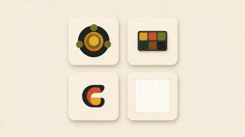
Every strong abstract logo relies on four key elements: symbol, color, typography, and layout. Together, they determine whether a logo can communicate your brand’s personality across every touchpoint. A good abstract logo balances simplicity with distinctiveness.
Symbol
The symbol is the main abstract form, built from geometric shapes, organic curves, or angular lines. Abstract logos use shapes to convey brand identity: circles suggest unity, triangles imply momentum, and interlocking forms hint at connection.
The symbol should reflect the feeling you want your target audience to associate with your business. Test how quickly it reads at a glance—the strongest abstract symbols communicate their core idea in under a second.
Color
Colors in abstract logos shape customer perceptions significantly. Blue signals reliability and trust, making it common in tech and finance. Green evokes growth and sustainability. Bold gradients give a modern digital feel.
Research shows that colorfulness in logo design correlates strongly with attributes like “friendly,” “unique,” “modern,” and “memorable.” Choosing the right color palette is a strategic decision, not a decorative one.
Typography
When a wordmark accompanies your abstract design, typography must complement the icon. A minimal font or clean sans-serif typeface works well alongside a complex symbol. If your mark is very simple, a more complex font or more expressive type can add character. The goal: harmony between symbol and text variation at every size.
Layout
Layout defines how symbols and typography relate. Plan horizontal lockups, stacked versions, and icon-only versions for app icons and favicons early. Abstract logos are adaptable across different media formats, including digital and print, but only if the layout system is built from the start.
Popular Types of Abstract Logos (with Examples)
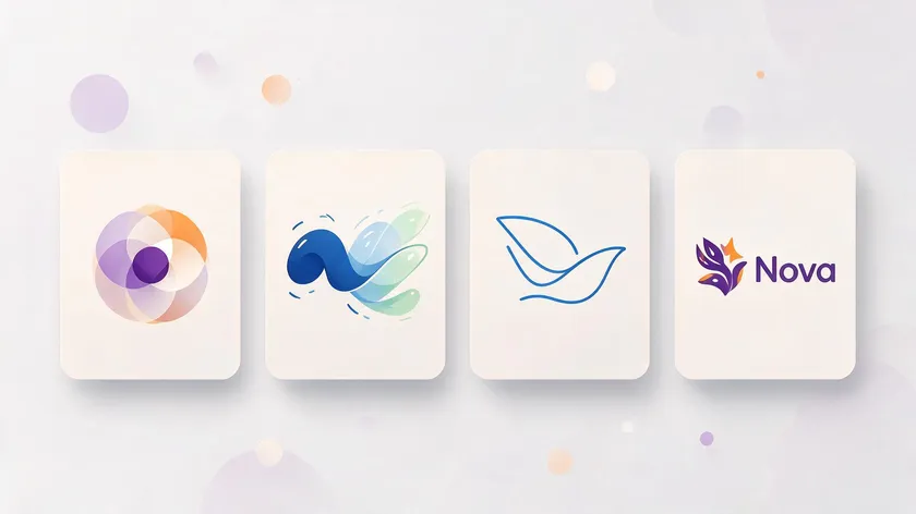
Different abstract logo styles communicate different brand personalities. Before you decide, match the style to your market, your industry, and the feeling you want to represent. Below is a comparison of the four main types.
| Type | Best For | Example |
|---|---|---|
| Geometric | Tech, fintech, B2B platforms | Mastercard’s overlapping circles |
| Dynamic | Media, entertainment, digital platforms | Google’s adaptive icons |
| Line art | Boutiques, wellness, luxury brands | Adidas’s bold diagonal stripes |
| Combination | Any brand needing dual usage | Airbnb’s Bélo + wordmark |
Geometric Abstract Logos
Geometric abstract logos use shapes like squares and circles to create precision and structure. Geometric shapes in logos convey stability and strength. MasterCard’s logo consists of two overlapping circles—red and yellow—simplified in 2016 into a symbol that works without text.
Symmetrical abstract logos feature identical halves in design, reinforcing trust and balance. This style is a popular choice for tech companies and fintech brands.
Dynamic Abstract Logos
Dynamic logos adapt their design based on context and usage. They may shift in color, composition, or animation while keeping a core shape consistent. Google’s adaptive icons and Nickelodeon’s evolving identity are striking examples. This approach helps brands feel alive and responsive to their audience. See our full guide to dynamic logos for a deeper breakdown of how this works in practice.
Line-Art Abstract Logos
Line art logos use distinct lines against a plain background, creating minimalistic styles that feel elegant and refined. Adidas’s logo uses three diagonal stripes forming a mountain shape to convey strength.
These marks work best for boutiques, wellness brands, and digital-first startups that value negative space. Illustrative abstract logos can also interpret recognizable objects creatively using similar line techniques.
Combination Marks
Combination logos merge multiple abstract design techniques—pairing an abstract symbol with a wordmark. This gives companies flexibility: use the symbol alone once recognition is established, or include the name where clarity matters. Airbnb’s Bélo with its wordmark is a picture of this approach done well.
To choose your type, align with brand traits: “innovative” leans geometric or dynamic; “luxury” leans line-art with a restricted color palette; “friendly” calls for softer shapes. That’s how you find the perfect logo for your specific audience.
How to Design an Abstract Logo Step by Step
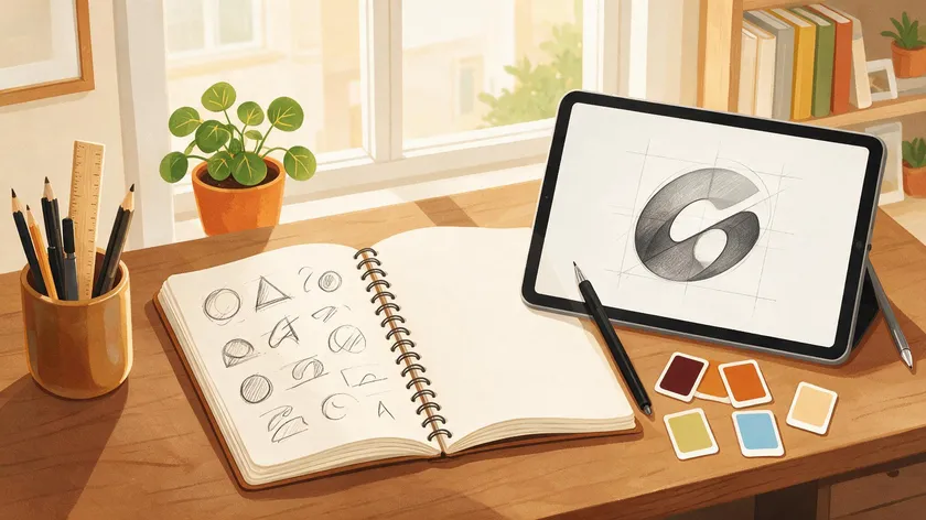
This section is a practical roadmap for going from concept to finished abstract logo design, whether you’re working alone or with an abstract logo maker tool. Creating an abstract logo can be simpler due to fewer design rules, but the process still matters.
Research
Start by analyzing competitors’ logos. Collect marks from 3–5 tech companies or brands in your niche founded since 2020. Note overused shapes or colors to avoid. Gather inspiration from outside your industry too—finance, health, creative studios—to see what feels fresh versus generic.
Brainstorming
Sketch 10–20 quick thumbnail ideas, focusing only on shapes and silhouettes. Ignore color at this stage. Generate multiple concepts exploring different abstract logo ideas: intersecting circles, angular forms, flowing curves.
The goal is finding a strong abstract symbol that reads clearly even at small sizes. Use mind maps of brand values to spark more ideas and creativity.
Refinement
Choose 2–3 promising concepts. Test them in grayscale first to check clarity and hierarchy. Then layer in your color palette to see how mood and meaning shift. Pair each concept with typographic options—compare a minimal font against a more expressive typeface. Customize proportions until symbol and text feel unified.
Practical Tests
Shrink your logo to 32×32 pixels to check icon legibility. Place it on dark, light, and busy mock backgrounds. Print it in monochrome on a regular office printer. Abstract logos can be scaled to fit any size requirement, but only if you test extremes early. Check readability on a phone screen and on a website header.
Collect Feedback
Gather feedback from at least 3–5 people in your target audience—not just designers. Ask them what the mark communicates. Have them sketch it from memory a few minutes later. Use reactions to refine details like weight, angles, and color shade—but don’t completely redesign every time someone shares a subjective preference.
Using an Abstract Logo Maker vs. Hiring a Designer
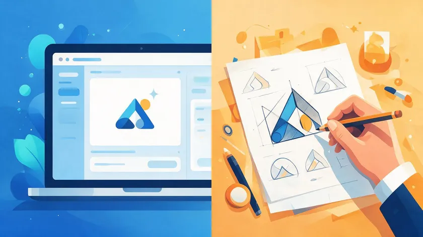
In 2026, businesses typically choose between DIY abstract logo makers and professional designers. Both paths can produce a recognizable result, but they serve different needs.
An online logo maker or AI-powered logo design tool works fast: enter your business name, industry, and style preferences, and the software generates abstract logo ideas in seconds.
Advantages include speed, low cost, instant exports in SVG and PNG, and the ability to iterate on geometric shapes, gradients, and layout without design training. You can access free trials on many platforms to create your own logo quickly.
Hiring a designer brings deeper strategy. You get unique concepts rooted in research, a full brand identity system with color guidelines and typography, and art direction from an expert who understands your sense of purpose.
A study from Frontiers found that only 22.2% of top global brands use fully abstract forms—those that do typically invest in custom work.
A bootstrapped startup validating an idea might use a logo maker first, while a funded SaaS launching globally should budget for custom design.
Regardless of who creates the logo, insist on vector formats, multiple color versions, and clear space rules.
Making Your Abstract Logo Work Across a Full Brand Identity
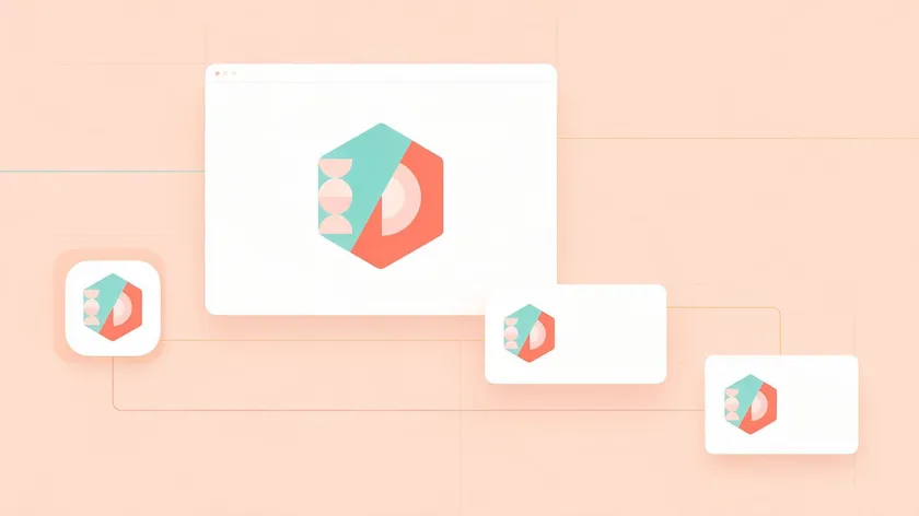
A logo is only one part of brand identity, which also includes your color system, typography, imagery, and tone of voice. Abstract logos often require consistent branding to build recognition over time.
Build a simple brand kit: define primary and secondary colors, heading and body fonts, spacing rules, and minimum sizes. This kit ensures your distinctive brand identity stays cohesive whether it appears on a letterhead, a social media avatar, or packaging.
Adapt the logo to core touchpoints: website header, mobile app icon, email signatures, and presentation templates. A tech company might use its abstract mark as a repeating pattern on app backgrounds or onboarding screens to reinforce recognition.
Create both light and dark versions, plus monochrome variants. This keeps the logo legible in print, on merchandise, and in accessibility-friendly settings. They allow brands to express broad ideas consistently across every surface.
Prioritize consistency over trends. Review your logo and brand assets every 2–3 years for subtle refreshes rather than frequent overhauls—Airbnb’s Bélo has remained unchanged since 2014, which is uncommon in fast-moving tech.
Key Takeaways
A strong abstract logo combines a distinctive symbol, intentional color choices, and versatile layouts that scale from app icons to billboards. Their unique design is difficult to imitate and instantly recognizable once established.
Abstract logos are best for tech companies, digital platforms, creative studios, and brands planning to grow or diversify offerings. They allow brands to represent broad ideas rather than narrow product categories.
Your next steps: audit your current logo, collect 5–10 inspiration examples, then sketch or generate new abstract logo ideas. Refine one direction into a complete brand identity. Experiment with an abstract logo maker or collaborate with a professional designer—keep clarity, memorability, and long-term flexibility as your final decision filters.
Ready to try it? Logo.app’s AI generator turns any of these abstract concepts into a finished, ready-to-use logo in minutes — instant SVG and PNG exports, with unlimited revisions until it’s right.
FAQs
Here are answers to common questions about abstract logos not fully covered above.
Do abstract logos work for small local businesses or only for big tech companies?
Abstract logos can work for local businesses if paired with a clear wordmark and descriptive tagline—for example, “Nova • Coffee & Bakery”—so people immediately understand the offer.
Tech companies adopt abstract logos more often because they represent complex or evolving services, but local brands can still benefit from the modern, memorable feeling.
If your business relies heavily on walk-in foot traffic, a slightly more literal symbol (cup, tool, leaf) combined with abstract styling might be the safest compromise.
How long does it take to create a strong abstract logo?
Using an abstract logo maker, a simple but workable concept can be generated in under an hour, including basic tweaks to color and layout. A professional designer typically takes 1–2 weeks for research, sketching, and initial concepts, plus another 1–2 weeks for refinement and preparing final files.
Plan at least a two-week window before launch or rebrand so the logo can be tested on mockups of websites, apps, and packaging.
How do I know if my abstract logo is too complex?
Shrink the logo to 24–32 pixels, print it in black and white on a regular office printer, and check if the main shape is still recognizable. If details disappear, edges blur, or people can’t sketch the logo from memory after a quick glance, it’s likely too complex.
Remove extra lines, gradients, and overlapping shapes until the symbol reads clearly as a bold silhouette first. Add subtle detail only where necessary.
Can I turn my current literal logo into an abstract logo without losing recognition?
Use a phased approach: start by simplifying the current symbol, then gradually reduce literal elements over one or two redesigns while keeping core colors and layout similar.
For example, a 2018 logo featuring a full coffee cup illustration could evolve into a minimal stylized cup outline, then into an abstract steam shape that customers already associate with your brand.
Communicate the change through announcements and side-by-side comparisons on your website and social channels during the transition period.
Who owns the rights to an abstract logo made with an online logo maker?
Ownership terms vary by platform. Some logo makers grant full commercial rights immediately, while others require a paid license or subscription before commercial use is legally clear. Always check the specific terms of service before publishing or trademarking a logo made with any tool, and keep proof of purchase or download date.
Even with full usage rights from a maker, registering the logo as a trademark is a separate legal step if your business wants exclusive protection.

