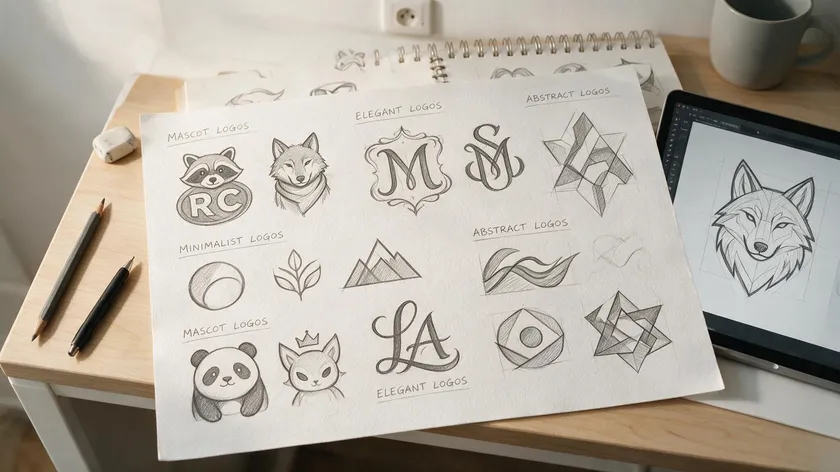
Logos aren’t one-size-fits-all. A brand’s name, industry, and stage of growth all point toward a different visual style, from a simple word set in a unique typeface to a fully illustrated emblem. Understanding the diverse sorts of logos before you design or generate one helps you avoid picking a style that looks great today but won’t scale as the brand grows.
This guide covers a quick, practical menu of the main logo types with real brand examples, plus guidance on how to choose the right one for your purpose.
Table of Contents
- Core Types of Logos (with Real-World Examples)
- How to Choose the Right Logo Type for Your Brand
- Key Takeaways
- FAQs
Core Types of Logos (with Real-World Examples)
There are seven main types of logos, and each type of logo serves a different brand purpose. Below is a brief definition of each, paired with concrete examples you already know. Think of it as a menu: scan, compare, and note which style fits the things your brand needs to communicate.
Wordmark Logos
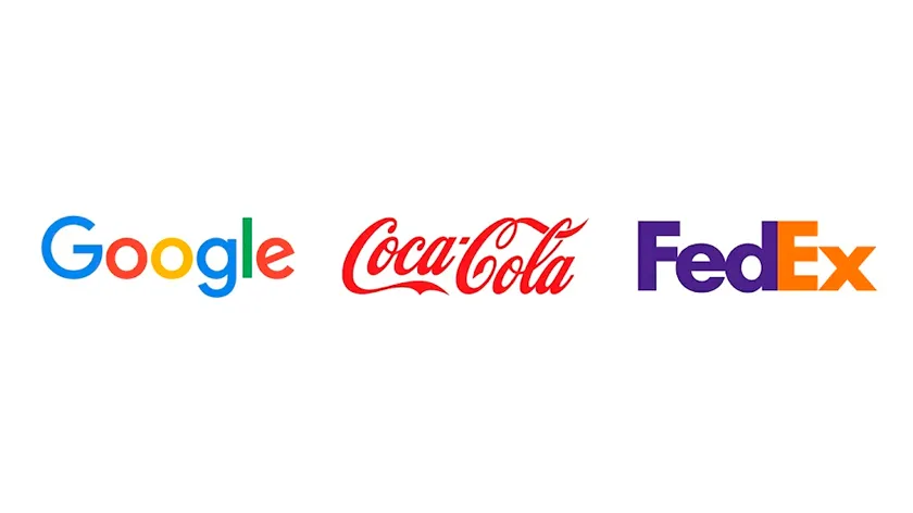
A wordmark is a logo built entirely from the brand’s name rendered in a distinct typeface. In a single sentence: wordmark logos use only text for branding. The quality of the typography does all the heavy lifting, making the word itself the visual identity.
Google, Coca-Cola, and Netflix are classic wordmark examples. Each relies on a unique letterform treatment that people recognize instantly, with no icon required. If your brand has a short, memorable name, a wordmark can be the most direct path to recall.
Lettermark (Initial) Logos
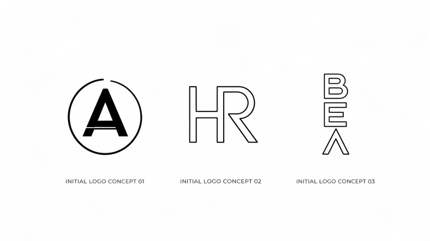
A lettermark, also called an initial logo, tells the same story as a wordmark but in a compressed form. Lettermark logos consist of initials or abbreviations, which makes them ideal when a full name is too long for small spaces. IBM, HBO, and CNN all use this approach.
One common point of confusion: a monogram is technically just one decorative style within the lettermark family, where letters overlap or interlock. It is not a separate category. Lettermark logos can also use a single letter as a memorable brand symbol, as FedEx does with its standalone “F” icon for app badges.
Symbol / Brand Mark Logos
A symbol, sometimes called a brand mark, is a standalone graphic icon with no text. Pictorial logos use images to represent a brand, and once they earn recognition, the image can carry the entire identity without a single word attached.
Apple’s apple silhouette and the Nike Swoosh (created in 1971) are two of the most recognized symbols on the planet. These marks work across every country and language because visuals don’t need translation. The tradeoff: new brands typically need to pair a symbol with text until the audience learns what it stands for.
Abstract Logos
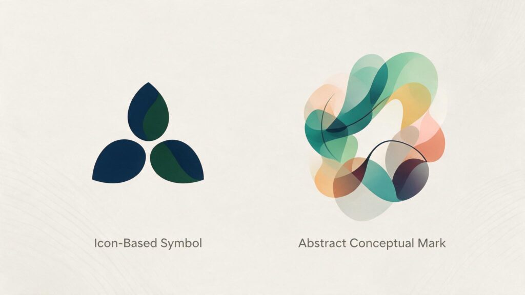
Unlike pictorial marks that depict recognizable objects, abstract logos use geometric forms to convey ideas. They rely on shapes, lines, and color rather than literal imagery. Abstract marks allow a brand to convey concepts without literal imagery, which is why they appeal to companies whose products are intangible or difficult to illustrate.
Pepsi’s globe (introduced in the 2008 redesign), BP’s Helios sunburst (2000), and adidas‘s three-stripe mountain symbol all fall into this class. The meaning behind an abstract mark can feel strange at first, but strong branding turns that unfamiliar form into something audiences associate with a clear idea over time.
Emblem Logos
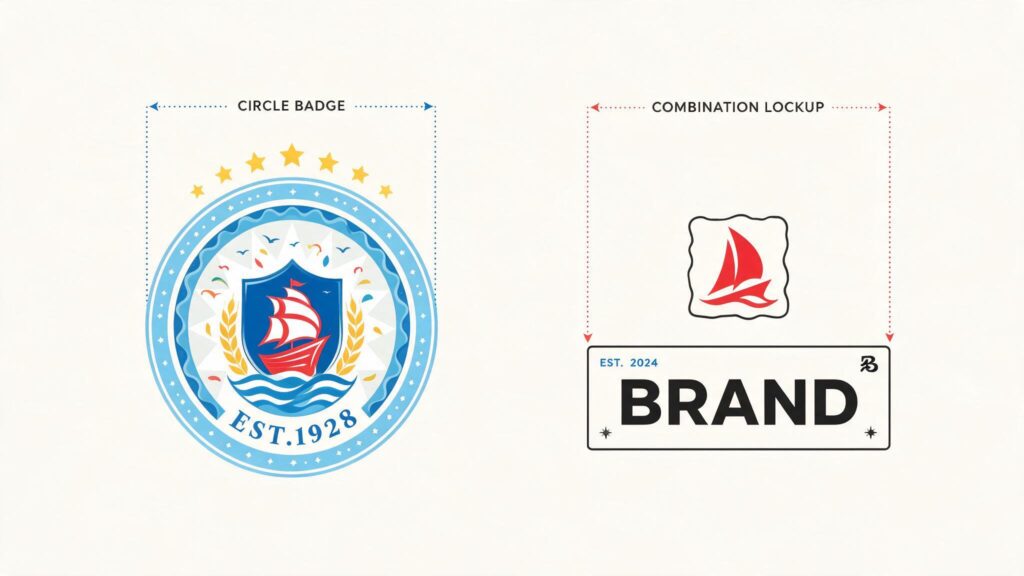
In a single sentence: emblem logos lock text inside a badge, seal, or crest. By nature, emblems suggest authority and tradition in branding, drawing from a past rooted in government seals, university shields, and guild crests.
Special examples of this type include Starbucks’s circular siren, the Harley-Davidson shield (introduced in 1965), and NFL-style sports crests. The challenge is that detailed emblems can lose clarity at small sizes, so many brands now simplify the artwork while keeping the badge structure intact.
Combination Mark Logos
Combination marks pair text with a pictorial mark or abstract mark in a flexible lockup. The different parts—name and icon—can appear together or separate depending on context.
This is the most common logo type among small businesses because combination marks provide versatility for representing brands across advertising, packaging, and digital platforms.
Lacoste (word + crocodile), Burger King (word between buns), and Dropbox (word + open box icon) are well-known examples. The verb “to brand” practically describes what a combination mark does: it stamps both name and visual into the viewer’s memory at the same time.
Mascot Logos
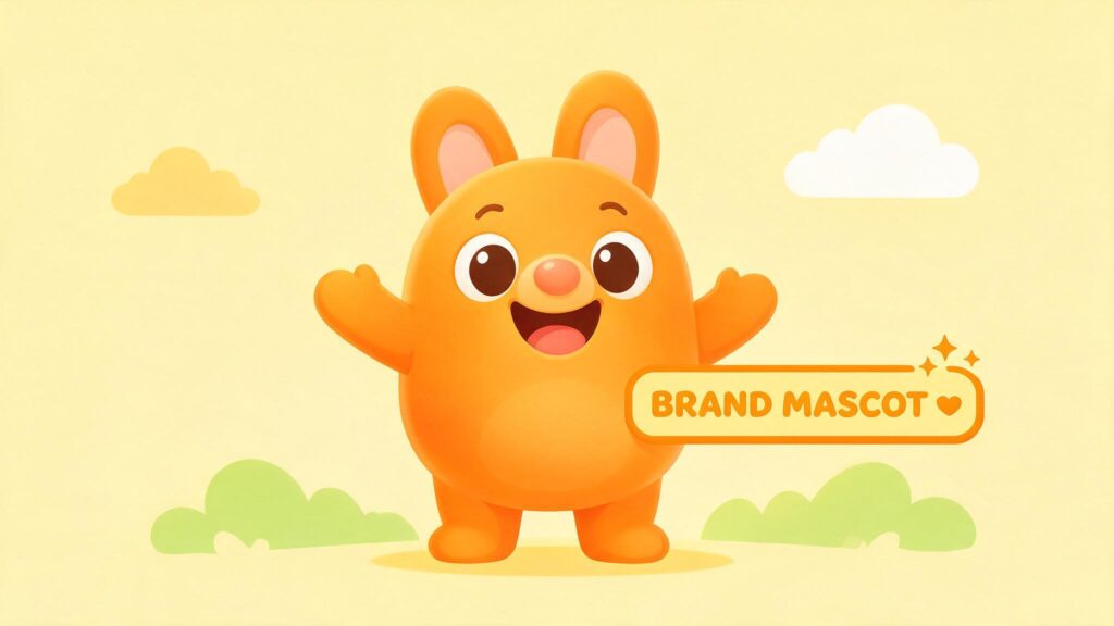
Mascot logos incorporate illustrated characters as brand ambassadors. A character—whether a person, animal, or creature—becomes the face of the brand, giving it a personality that people in the community can relate to.
Mascot logos create emotional connections through friendly imagery, which is why they’re popular in food, sports, and family-facing industries.
KFC’s Colonel Sanders, Michelin’s Bibendum (featured in advertising since 1898), and the Pringles character are all iconic mascots. They are like movie stars who never retire; they tell a story every time they show up. The risk is that mascots can age poorly or limit a brand’s perceived seriousness in formal or B2B settings.
Brands often start with combination marks so the full name gains visibility alongside an icon. As recognition grows, many evolve toward simpler wordmarks or symbol-only versions—a shift several major brands have made in recent years.
Dynamic marks that change shape, color, or text based on context are also appearing more often, though this remains uncommon outside a handful of major rebrands.
How to Choose the Right Logo Type for Your Brand
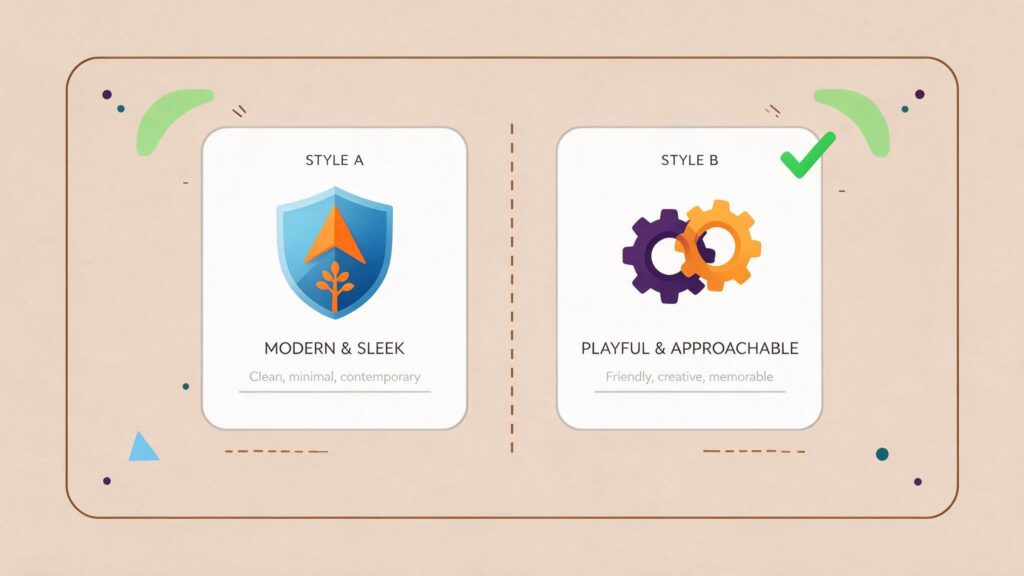
Choosing from differing logo styles comes down to a few practical factors: your brand’s age, name length, audience, and the spaces where the logo will live. Here’s how to view the decision.
New or little-known brands usually benefit from a wordmark or combination mark so the full name is visible on every touchpoint. Long or complex brand names may need a lettermark for smaller spaces, while keeping a similar style to the full wordmark in larger formats. The degree of separateness between text and icon should stay consistent.
Global or multilingual audiences respond well to symbols, abstract marks, or mascots because visuals cross language barriers. Unlike text-based logos, a well-designed icon doesn’t need translation in any country.
Formal institutions—universities, government agencies, and heritage brands—often prefer emblem-style logos to communicate stability.
| Logo Type | Best For |
|---|---|
| Wordmark | Short, unique names; brands that need the name visible everywhere |
| Lettermark (Initial Logo) | Long or complex names; tight digital spaces like favicons |
| Symbol / Brand Mark | Established brands; global or multilingual audiences |
| Abstract Mark | Innovation-led or intangible brands; competitive differentiation |
| Emblem | Heritage brands, universities, government, sports teams |
| Combination Mark | Startups and growing brands; maximum flexibility across media |
| Mascot | Family, food, gaming, sports: brands that thrive on personality and story |
Modern digital products and apps commonly pair a wordmark with a simple icon: the icon acts as the app badge, and the wordmark leads on the website and in standard advertising materials.
Strong brands design several different members of the same logo family—primary lockup, horizontal version, icon-only, and black-and-white versions—while keeping typography, colors, and a consistent core idea.
Before committing, favor clarity over trends. Test your logo options in real contexts: a favicon, a social avatar, and signage. An ordinary screen-size preview won’t reveal problems that a 16×16-pixel favicon will.
Key Takeaways
- Most logos fall into seven main types—wordmark, lettermark, symbol, abstract, emblem, combination mark, and mascot—each telling the same kind of brand story in a completely dissimilar visual way.
- Wordmarks and lettermarks (also called initial logos) deserve special focus because many modern brands rely on just their names or initials to work across every platform.
- A monogram is only one decorative style within the broader lettermark family, not the same kind of category as other main logo types—though they are often treated as synonyms.
- Strong brands design different members of one logo family (primary, stacked, icon-only) to maintain a consistent core idea while adapting to set contexts.
Ready to see it in action? Create your free logo with logo.app and get multiple design options in seconds.
FAQs
Below are answers to questions that come up often when people explore the difference between logo styles. Each one expands on a point only briefly touched on above.
Is a lettermark logo the same as a monogram?
Not quite. A lettermark is the broader category: any logo that uses initials or an abbreviation for brand identification. A monogram is one specific style within that category where the letters are overlapping, interlocking, or otherwise decoratively arranged.
The two terms are sometimes used interchangeably, but the dissimilarity matters. All monograms are lettermarks, but not all lettermarks are monograms—much like twins who share DNA but still have separate identities.
Can one brand use more than one type of logo?
Yes, and most mature brands do. A brand should maintain one core logo system, but within that system it can deploy different members of the same kind—a full combination mark for the website header, a wordmark-only version for print, and an icon-only avatar for social profiles.
The adjective “consistent” is the key: colors, typography, and the core idea should stay unified even when the format changes.
Which logo type works best for small spaces like app icons?
Simple symbols, abstract marks, or reduced lettermarks work best at tiny sizes. Trying to squeeze a detailed emblem or a long wordmark into a 16×16-pixel favicon will make it completely unreadable. The best approach is to create a dedicated small-space version from the start instead of scaling down the primary logo and hoping it works.
Do startups need a mascot, or can they stick to a wordmark?
Most startups are better off beginning with a clean wordmark or combination mark. A mascot demands additional investment in illustration, animation, and advertising assets—and if the brand pivots, the character can feel off-brand fast.
That said, if your brand’s story and audience naturally call for a friendly, recognizable character, introducing one later is perfectly valid. Just make sure it fits the brand’s evolving identity rather than being a novelty.

