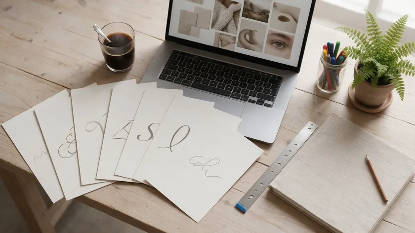
Choosing the right serif font is crucial for a logo’s first impression. Serif fonts add heritage, sophistication, trust, and personality to logos—and with hundreds of options available, this guide narrows it down to a curated, tested shortlist for 2026.
Some widely recommended serif fonts for logo design include Didot, Bodoni, Garamond, and Baskerville, but the full picture is far richer.
Below you’ll find the fast shortlist, deep profiles across classic, modern, luxury, approachable, corporate, and expressive display groups, plus a practical system for choosing between them. For the bigger picture on choosing fonts across your entire brand system, see our guide to the best fonts for branding.
Serif fonts are popular choices for fashion, publishing, and heritage brands, but they also serve tech startups, non-profits, and everything in between. Let’s get into specifics.
Table of Contents
- How This Serif Font Shortlist Was Curated
- Classic Serif Fonts That Instantly Elevate Logos
- Modern Serif Fonts for Contemporary Brand Logos
- Luxury & High-Contrast Serif Fonts for Premium Logos
- Warm, Approachable Serif Fonts for Human-Centered Brands
- Tech, Corporate, and Editorial Serif Fonts That Still Work in Logos
- Expressive Display Serifs Packed with Alternates & Ligatures
- Choosing the Right Serif for Your Logo System
- Key Takeaways
- FAQs
How This Serif Font Shortlist Was Curated
This section outlines the selection criteria used to define the best serif fonts for logos in 2026—emphasizing practical brand use, not just aesthetics. Serif fonts improve legibility and add character to designs, but not every beautiful serif typeface works well as a logo.
- Legibility across sizes and mediums: Every font was tested conceptually from tiny app icons to storefront signs. Fonts with optical sizes or carefully balanced stroke weights at small sizes scored higher.
- Logo-specific versatility: Fonts must work in one to two weights, support basic multilingual characters, and hold up in monochrome or reversed-out applications.
- Technical availability and licensing: Priority went to fonts that are easy to license for logo use—from Google Fonts or major foundries—with clear commercial terms. Many serif fonts require commercial licenses depending on their use, so we flagged free versus paid options throughout.
- Brand personality coverage: The list spans luxury, heritage, corporate, editorial, and playful modern serif moods so readers can find the right serif match for their niche.
Each font ahead has been filtered against these criteria so you can choose confidently instead of digging through thousands of options.
Classic Serif Fonts That Instantly Elevate Logos
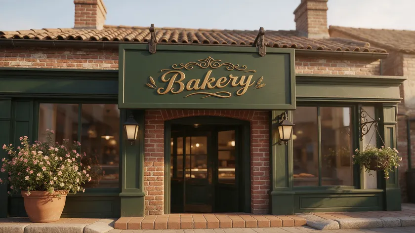
These time-tested serif fonts carry shapes most people subconsciously associate with trust, tradition, and credibility. Serif fonts convey elegance, tradition, trust, and luxury—and the classics do it with centuries of proven refinement. Serif typefaces are ideal for business logos conveying tradition.
EB Garamond
EB Garamond revives a classic 16th-century typeface, based on the Egenolff–Berner specimen of 1592. Garamond features a delicate, organic flow and suggests craftsmanship and tradition. It suits law firms, academic institutions, heritage food brands, and publishing houses. Picture a boutique publisher’s wordmark reading “Heritage Press” in roman with “Publisher” in small caps beneath—timeless and refined.
Libre Caslon
Libre Caslon revives William Caslon’s original forms with vintage ad charm via its Display variant. It includes extended Latin support and many ligatures. Think a 1920s-inspired café wordmark—”Café Caslon”—set in Libre Caslon Display with modest tracking and small caps, evoking old signage with clean lines and a contemporary layout.
Libre Baskerville
Designed by Pablo Impallari, Libre Baskerville is optimized for screen readability while delivering editorial refinement. Baskerville balances tradition with clarity and communicates reliability without feeling outdated. It works well for book covers, formal stationery, and heritage food brands—imagine “Baskerville & Sons” in bold for the family name, regular for the ampersand, and a tagline.
Crimson Text
Crimson Text is a book-type serif inspired by old-style Garalde influences, with strong readability and moderate contrast. Its warmth makes it ideal for small publishing houses, craft bookstores, and gourmet food brands. A bookshop café called “Crimson Pages”, with the italic subtitle “Books & Brew,” would feel literary without being stuffy.
Didot / Bodoni Moda
Didot features high contrast between thick and thin strokes—the hallmark of the late 18th-century Didone style. Bodoni Moda brings that same elegance to Google Fonts as a free download, making luxury-level typography accessible. Both suit fashion labels, beauty logos, and editorial mastheads, but their delicate hairlines demand display text sizes—they tend to struggle at small sizes or in low-resolution print.
These classic fonts are ideal if a brand wants to feel established and enduring. Readers craving a fresher or bolder look should jump to the modern serif fonts section next.
Modern Serif Fonts for Contemporary Brand Logos
A modern serif takes classic serif skeletons and combines them with cleaner geometry, simplified details, or higher contrast that feels current rather than old-fashioned.
Modern serif fonts feature cleaner geometry and higher contrast while maintaining traditional bracketed strokes with modern sharpness. They enhance legibility in both print and digital formats and are suitable for a wide range of design applications.
Cormorant
Cormorant is a free, heavily display-oriented serif family with decorative swashes and alternates. Its personality is sharp and fashion-forward, and modern serif fonts often include features like ligatures and stylistic sets—Cormorant delivers both. Pair the serif logo with a neutral sans like Lato for body text in the broader brand system.
Playfair Display
Playfair Display is inspired by late 18th-century typography, with steep transitions between thick and thin strokes. It includes OpenType small caps and alternate letterforms, making it strong for editorial layouts and fashion-forward wordmark logos.
A lifestyle magazine logo in Playfair Display pairs naturally with Source Sans for supporting typography. For more combinations like this one—plus a repeatable process for pairing any two typefaces—see our complete font pairing guide.
Lora
Lora has calligraphic roots and brushed curves on its serifs, giving it moderate contrast with a warm, approachable tone. It works well for short brand names in direct-to-consumer beauty or boutique services. Pairing it with Roboto for body text keeps the brand system crisp and balanced.
DM Serif
Part of Google’s DM family, DM Serif includes Display and Text variants optimized for desktop and screens. It suits fintech, scholarly tech products, or modern crafts wanting both authority and a digital edge. A fintech logo in DM Serif Display paired with DM Sans creates an elegant, cohesive brand identity.
Modern serif fonts sit at a strong middle ground: they keep the authority of a serif font while aligning visually with current digital-first brands.
Luxury & High-Contrast Serif Fonts for Premium Logos
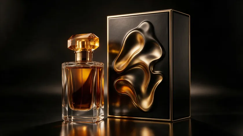
This is the section for beauty, fashion, jewelry, and hospitality brands that want a glamorous serif logo. High-contrast serif fonts create a dramatic, high-end look popular with luxury brands, and high-contrast serif fonts suit luxury branding and fashion content specifically.
Didot
Didot works best at display sizes of 30px or larger on screens. Its hairlines can disappear on low-resolution surfaces, so increase letterspacing generously in any logo lockup. It remains one of the most recognizable serif styles in editorial design.
Bodoni Moda
Now free via Google Fonts, Bodoni Moda brings Didone sophistication without licensing fees. It performs well at medium to large sizes and benefits from extra tracking. A boutique hotel wordmark in Bodoni Moda Bold, reversed out on dark, conveys instant elegance.
Prata
Prata is tall, narrow, and high contrast—strong for premium packaging and hero images. Like other high-contrast serifs, test its thin curves carefully at small sizes to ensure they render well across mediums.
ED Checa
ED Checa sits between Didone display and expressive display serif styles, offering refined alternates for packaging and editorial branding work. Its delicate structure demands generous spacing and quality reproduction.
Vasio
Vasio appears in recent modern/luxury serif curations alongside ED Checa. It brings an expressive shape to luxury logos while offering simpler base forms for legibility where needed.
| Font | Contrast Level | Best Industries | Optimal Size | Logo Complexity |
|---|---|---|---|---|
| Didot | Very High | Fashion, beauty, editorial | 30px+ | Single word / initials |
| Bodoni Moda | High | Hospitality, fashion, beauty | 24px+ | Short names |
| Prata | High | Perfume, jewelry, packaging | 28px+ | Single word |
| ED Checa | High | Cosmetics, editorial | 26px+ | Short names |
| Vasio | Moderate–High | Luxury retail, publishing | 24px+ | Short to medium |
Before committing, test any high-contrast serif logo in black on white, white on dark, and at favicon sizes. Hairlines that look stunning on a billboard can vanish on a 16×16 pixel icon.
Warm, Approachable Serif Fonts for Human-Centered Brands

Not every serif logo has to be stuffy. This section covers serif fonts with rounded terminals, generous curves, and softer slab structure—perfect for brands that want warmth alongside credibility. Serif fonts evoke feelings of elegance and tradition, but these variants add a layer of friendliness.
Merriweather
Merriweather is designed for comfortable on-screen reading, making it a natural fit for wellness studios, edu-tech products, and blogs. Its distinct italic styles add hierarchy for taglines, though it may lack standout uniqueness in crowded design spaces.
Averia Serif Libre
More playful than rigid, Averia Serif Libre suits community organizations and boutique shops. Its slightly irregular terminals give it character but may feel too informal for corporate or high-luxury contexts.
Bree Serif
Bree Serif has personality with softness—ideal for local cafés, lifestyle branding, and ed-tech services. It tends to work best with short brand names due to spacing complexities in longer titles.
Young Serif
Young Serif brings humanist traits and an inclusive feel, with strong multilingual support. It pairs well with looser tracking and light color palettes to reinforce friendliness.
Inria Serif
Inria Serif offers a refined yet warm tone suitable for non-profits and cultural institutions. Its clean structure keeps things readable without sacrificing the personality that makes a logo memorable.
Aleo
Aleo’s slab influences give it sturdier serifs and more weight, making it great for signage and print-heavy applications. In lighter weights, it can still feel approachable for digital brand systems.
Pair these softer serifs with lighter color palettes and slightly looser tracking to reinforce their relaxed tone. They deliver the trust of a serif with the warmth typically associated with rounded sans-serifs.
Tech, Corporate, and Editorial Serif Fonts That Still Work in Logos

Some serif fonts were designed for interfaces or long-form reading, but a select few adapt well into clean, professional logos. These workhorse fonts offer neutrality, strong readability, and extensive language support for global brand systems.
Roboto Serif
Roboto Serif suits SaaS companies, ed-tech platforms, and content-driven brands. Try setting the logo in small caps with generous spacing to add distinctiveness to its understated structure.
IBM Plex Serif
With its heritage but modern structure, IBM Plex Serif works for consulting firms, corporate reports, and enterprise tools. Use medium weight for the primary wordmark and light for a tagline to create subtle hierarchy.
PT Serif
PT Serif’s broad language coverage and balanced proportions suit universities and multilingual organizations. Uppercase letterspacing at 3–5% helps its relatively compact letters breathe in a logo lockup.
Source Serif
Source Serif, from Adobe’s open-source family, delivers a crisp, contemporary feel for newsrooms and digital publishers. It includes multiple weights, allowing flexible headlines and supporting text within a single font family.
Noto Serif
Noto Serif supports global scripts—essential for international NGOs and brands needing multilingual logos. Its neutrality is an asset when the logo must work across dozens of languages without altering its visual tone.
Tinos
Tinos works well for digital news brands and academic journals, offering a familiar serif feel with strong screen optimization. Use a slightly heavier weight for the logo to differentiate it from body text.
Kyiv Type Serif
Kyiv Type Serif brings a contemporary European flavor with excellent Cyrillic support, making it a smart choice for brands operating across Western and Eastern European markets. Its geometric undertones give it a modern edge that feels fresh without being trendy.
These serifs are a strong choice when functional clarity and global readability matter as much as logo personality.
Expressive Display Serifs Packed with Alternates & Ligatures
Some serif fonts are engineered specifically for logo and display work, offering extensive alternates, swashes, and ligatures that let brands craft unique wordmarks. Distinctive details in serif fonts can become recognizable brand assets—and these fonts have details to spare.
Aqreamig
Aqreamig leans into a retro-baroque style with dramatic alternates. It includes simpler base forms for legibility but truly shines when one or two decorative characters anchor a short logo.
RELIGATH
RELIGATH offers a neo-medieval, editorial aesthetic with bold stylistic sets. Its alternates are dramatic, but the default character set remains readable, making it strong for indie fashion labels and boutique studios.
SLTF Winner Baroque
Deeply ornamental with a Baroque-inspired fun flair, SLTF Winner Baroque suits craft spirits logos and artisanal packaging. Start with default glyphs and introduce swashes selectively.
SLTF Night Windfall
This font blends retro elegance with modern simplicity, offering decorative terminals that add sophistication without overwhelming the message. Best for single-word or two-word logos.
Ranfit
Ranfit delivers a refined, editorial display style with clean alternates. Its moderate contrast keeps it versatile across print and screen applications.
Alchimia
Alchimia channels a fantasy-inspired, neoclassical aesthetic ideal for publishers, game studios, and creative agencies. Its ligatures can transform a two-letter combination into a signature mark.
Liria Serif
Liria Serif balances expressive shape with usable proportions, working for boutique brands that want beauty and readability in equal measure.
Workflow tip: Start from the default character set, test legibility, then selectively introduce alternates and ligatures. One decorative uppercase initial with a simpler remainder often creates the best balance.
While these expressive display serifs can make a logo unique, use them with restraint and test thoroughly at small sizes and in single-color applications. Available in TTF and OTF formats from various foundries, always verify the license covers commercial logo use before you download.
Choosing the Right Serif for Your Logo System
This section is about applying the curated font list to real brand decisions. For the fundamentals of typography across every logo type, see our full guide to business logo design.
Export logo concepts using two to three candidate fonts and review them in realistic contexts—social avatars, packaging fronts, and email headers. If the logo uses a rich, decorative serif, the supporting type should be simpler. Neutral serif logos can support more varied secondary typography.
| Industry | Desired Mood | Logo Length | Recommended Group |
|---|---|---|---|
| Fashion / Beauty | Glamorous, bold | Short | Luxury |
| Law / Finance | Trustworthy, elegant | Medium | Classic |
| Tech / SaaS | Modern, crisp | Short–Medium | Modern or Corporate |
| Café / Wellness | Warm, friendly | Short | Approachable |
| Publishing / Editorial | Authoritative, refined | Short–Medium | Classic or Corporate |
| Indie / Creative | Unique, expressive | Short | Expressive Display |
Whichever right serif you choose should anchor the entire visual identity, not just look good in a single lockup. If you’re still deciding how that serif should function within your mark, explore the different types of logos to see where a wordmark, lettermark, or emblem fits your brand best.
Key Takeaways
Here’s a fast cheat sheet of standout serif fonts for logos from this shortlist:
- Didot—luxury fashion and beauty logos with high contrast and drama
- Bodoni Moda—free Didone elegance for hospitality and editorial
- Cormorant—decorative display serif with swashes for creative brands
- EB Garamond—scholarly, heritage-driven logos with organic warmth
- Playfair Display—editorial and lifestyle logos with sharp contrast
- Libre Caslon—vintage charm for artisan and heritage branding
- DM Serif Display—modern authority for fintech and tech brands
- Lora—calligraphic warmth for boutique and DTC beauty
- Merriweather—screen-optimised approachability for digital-first brands
- Aleo—sturdy slab serif for signage-heavy brand systems
Ready to put your favorite serif font into a real logo? Create yours in seconds with our AI Logo Generator—fully editable and yours to own.
FAQs
These questions address common concerns that go beyond the main recommendations—especially around licensing, substitutions, and practical constraints.
Can I use free serif fonts like EB Garamond or Lora in a commercial logo?
Many popular serif fonts on Google Fonts are licensed under the SIL Open Font License, which typically allows commercial logo use. Always verify the specific license for each font, and download from official sources. Archive a copy of the license text with your brand files as a compliance safeguard.
Enterprise-level companies often prefer paid foundry fonts for additional legal clarity and support, but a quick license check up front can prevent costly rebranding later.
What should I do if my preferred serif typeface lacks characters for my language?
Check whether the serif typeface has a “Pro” or extended language version, which often includes additional scripts and diacritics.
You can also pair the logo serif with a comprehensive companion font like Noto Serif for body text in unsupported languages while keeping the logo itself consistent.
Avoid mixing two similar but different serif fonts in the same wordmark—subtle differences in shape and contrast tend to look like mistakes.
For global brands, prioritizing a serif font family with robust language coverage from the start is usually more efficient than retrofitting later.
Is it okay to customize serif letters for a more unique logo?
Light customization—adjusting terminals, adding simple ligatures, or tweaking crossbars—is common practice in logo design when done by an experienced designer.
Heavy modifications can break the internal logic of a serif typeface, leading to awkward kerning or inconsistent stroke weights that weaken the logo. Keep a copy of the unedited font version so custom work can be compared and refined.
The best results usually come from subtle, intentional edits that enhance brand distinctiveness while respecting the underlying serif structure.
How many serif fonts should my brand use beyond the logo?
Limit the brand to one primary serif for the logo and headlines, plus at most one supporting font—serif or sans-serif—for body text and interface elements. Using too many different serif styles can dilute brand recognition and create visual noise across digital touchpoints.
Document the chosen serif font, approved weights, and pairings in a simple one- to two-page brand typography guide for consistent use by your company’s designers and non-designers alike.
A restrained serif palette makes the logo feel more intentional and helps every application—from business cards to app screens—look like part of the same brand family.

