A great photography logo should capture your unique style and communicate what your photography business does at a glance.
This guide starts with concrete photography logo ideas organized by niche, then walks through picking fonts, colors, and layouts that survive real-world use on images, social media posts, and marketing materials.
Before you finalize anything, test every logo idea in three places: as a small watermark in the corner of a photo, as a circular social avatar, and as a website header. A logo that looks polished in Photoshop but vanishes on a bright wedding photo is not a finished logo.
Table of Contents
- What Makes a Good Photography Logo? (Answered Fast)
- Concrete Photography Logo Ideas by Niche
- Minimalist Designs and Negative Space That Work on Real Photos
- Handwritten Fonts, Signatures, and When to Use Them
- Building a Professional Logo System for Watermarks and Branding
- Choosing Colors, Layouts, and Icons That Fit Your Style
- From Idea to Finished Photography Logo with AI
- Key Takeaways
- FAQ
What Makes a Good Photography Logo? (Answered Fast)
The best photography logo ideas share a few traits: they remain sharp when scaled to watermark size, they read in a single color against any background, and they match the visual personality of your niche.
A well-designed logo avoids relying on fine detail or heavy gradients that break apart on a busy image.
Quick-fire qualities to search for:
- Memorable shape that clients recall after a single viewing.
- Business name readable at a glance, even at thumbnail scale.
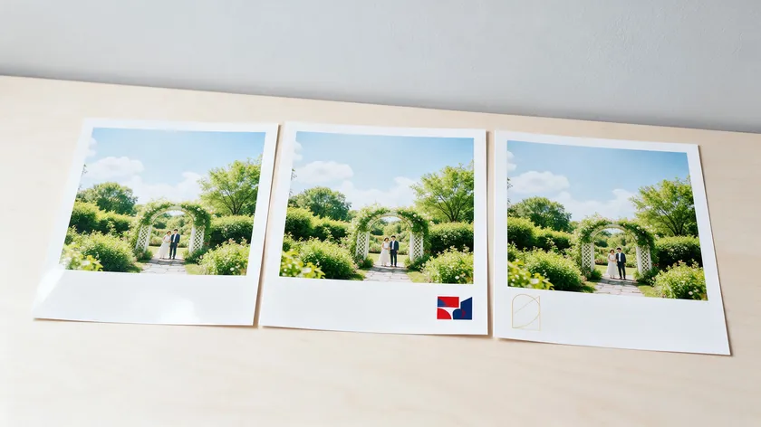
- Photography logos that hold up over busy, high-contrast photos without distracting from the subject.
- Tone that fits your specialty: elegant for weddings, bold for fitness, organic for landscape photography.
- Clean enough to work on prints, album covers, and contracts without modification.
Typical placements include corners of delivered images, Instagram and social profile avatars, gallery headers on your website, print packaging like USB boxes and albums, and the footer of invoices.
Concrete Photography Logo Ideas by Niche

Different photography niches carry different visual expectations. A logo that showcases creativity for a bright lifestyle brand feels out of place on a documentary photographer’s website. The table below pairs each niche with a core logo idea, font direction, and color direction so you can explore options that visually represent your shooting style.
| Niche | Core Logo Idea | Font Direction | Color Direction |
|---|---|---|---|
| Wedding Photography | Thin gold wordmark with a subtle ring icon in the “O” | Refined serif + light script accent | Soft gold, blush, off-white |
| Newborn & Family | Rounded pastel script with a heart or footprint icon | Friendly, rounded sans-serif or handwritten | Pastel pink, sage, cream |
| Fitness | Bold compact monogram inside a badge or emblem | Heavy uppercase sans-serif | Black & white, neon accent |
| Photojournalism | Clean wordmark, minimal line-art icon (map pin or lens) | Condensed serif or neutral sans-serif | Charcoal, deep red accent, monochrome |
| Nature & Landscape | Line-art mountain or tree silhouette above name | Textured slab serif or organic sans-serif | Earth greens, browns, and sky blue |
| Architecture & Real Estate | Geometric building silhouette + name | Modern sans-serif, clean edges | Steel blue, charcoal, slate gray |
| Product & Food | Emblem or combination mark with stylized plate outline | Minimal sans-serif or light serif | Black & white, warm neutrals |
| Bright Lifestyle | Brush lettering with a sunburst or leaf icon | Fun script or relaxed sans-serif | Yellow, coral, warm neutrals |
The visual elements in logos can communicate specific photography styles. A few standout niches:
- Wedding photography clients often expect romance and luxury. Thin serifs, script accents, and champagne tones create that first impression. Geometric shapes give logos a modern edge, but they tend to feel cold for weddings.
- Fitness brands need energy. Heavy sans-serif type, shield or circle emblems, and high-contrast palettes reflect strength and movement.
- Photojournalism values immediacy. Minimal icons, condensed text, and monochrome palettes convey seriousness. Keep the design stripped back.
- Newborn and family work trades on warmth. Rounded letterforms, pastel colors, and soft shapes signal safety.
Nature themes work well for brands wanting an organic feel, and vintage styles can suit photographers who specialize in film-look edits or retro aesthetics.
Minimalist Designs and Negative Space That Work on Real Photos
Minimalist designs strip away unnecessary detail to focus on core shapes and typography, as our minimalist logo breakdowns show. Negative space uses the empty area around or between shapes to form part of the design.
Both approaches lend themselves to photography logos because they hold their form when compressed to watermark size. Minimalist designs often suit logos across creative industries.
Minimalist Photography Logo Ideas
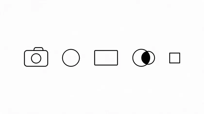
Fewer shapes produce a stronger silhouette. A minimalist logo with two or three elements stays readable at the small sizes photographers need for watermarks and favicons. A minimalist logo design is often timeless and professional because it avoids chasing decoration trends.
Concrete ideas to explore:
- Single-line camera outline above your business name.
- Initials inside a thin circle, sized to double as a social avatar.
- Wordmark only, with one modified letter (e.g., a subtle aperture shape replacing the dot on a lowercase “i”).
- Thin rectangle frame around your name, suggesting a viewfinder.
- Two overlapping geometric shapes forming an abstract lens. Geometric shapes give photography logos a modern edge without resorting to literal camera clipart.
Start with the one or two ideas that feel closest to your style and test them at watermark size first. A concept that stays readable when tiny tends to hold up well when scaled up.
Negative Space Photography Logo Ideas
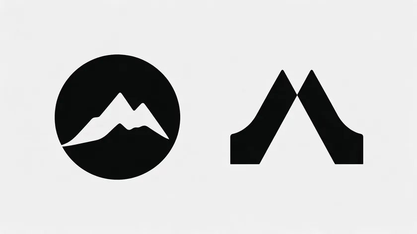
Negative space can create clever and memorable logo designs that stand apart from thousands of generic camera icons.
- Initials “A” and “V” joined so the gap between them forms a viewfinder triangle.
- A mountain silhouette cut from within a circular lens shape for landscape photography brands.
Unique logo designs can use clever negative space and symbolism to make a photographer logo feel distinctive. Good logos can scale from small watermarks to large prints when the core concept is this simple.
Handwritten Fonts, Signatures, and When to Use Them
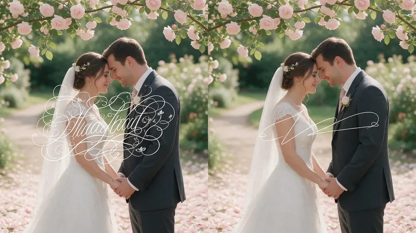
Portrait, wedding, and newborn photographers often benefit from handwritten fonts because clients in those niches value personal connection.
A signature-style logo suggests one-on-one collaboration and human warmth. Handwritten fonts add a personal touch to photography logos, but they carry legibility risks. For broader typeface guidance, see our guide to the best fonts for branding.
Signature-Style Logo Ideas
- Full name written in elegant script, with a small sans-serif “Photography” descriptor beneath.
- Initials in brush lettering, “Photo” or “Photography” in a minimal typeface underneath.
- First name in flowing brush script, last name in restrained serif below, stacked vertically.
- Script signature paired with a tiny icon (leaf, heart, or aperture ring) tucked into the composition.
Whichever signature style you choose, keep the descriptor short and the name legible. The script carries the personality, while the plain typeface keeps the logo professional.
Practical Constraints for Handwritten Logos
- Many script fonts lose clarity at very small sizes. Test your watermark version at the smallest size you plan to use.
- Avoid ornate flourishes that tangle over complex photo backgrounds. Keep strokes clean so the logo stays readable.
Treat these limits as a quick checklist: if the script still reads clearly at its smallest size over a busy photo, it is ready for real use.
Blending Handwritten Fonts with Minimalist Designs
Pair a script first name with a thin geometric line underneath and a clean sans-serif last name to add structure. Our font pairing guide covers more combinations like this. Custom fonts can enhance brand recognition in logos when the rest of the design stays restrained.
Another option: use script only for initials and keep the descriptor (“Photography”) in a straight, neutral typeface.
Building a Professional Logo System for Watermarks and Branding
One logo file is rarely enough. Photographers often need a small set of logo variations: a full lockup, a compact mark, and a watermark-ready version. Each serves a different placement and scale across your photography brand. If you are still shaping the brand as a whole, our guide to business logo design ideas covers the broader process.
Logo Versions Every Photographer Needs
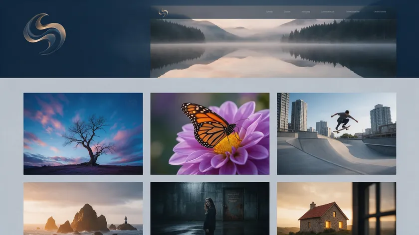
- Horizontal full logo for website hero headers and email signatures.
- Centered stacked version (name over descriptor) for social banners and print ads.
- Icon-only or monogram mark for favicons, social avatars, and album spine stamps.
- Simple text watermark (name or initials only) designed for overlay on delivered images.
- Monochrome version for contracts, invoices, and embossed prints.
Picture a sample photographer’s gallery: the full logo sits in the hero header, a reduced icon appears in the navbar, and a translucent text watermark appears in the corner of each image in the collection.
Testing and Color Variants
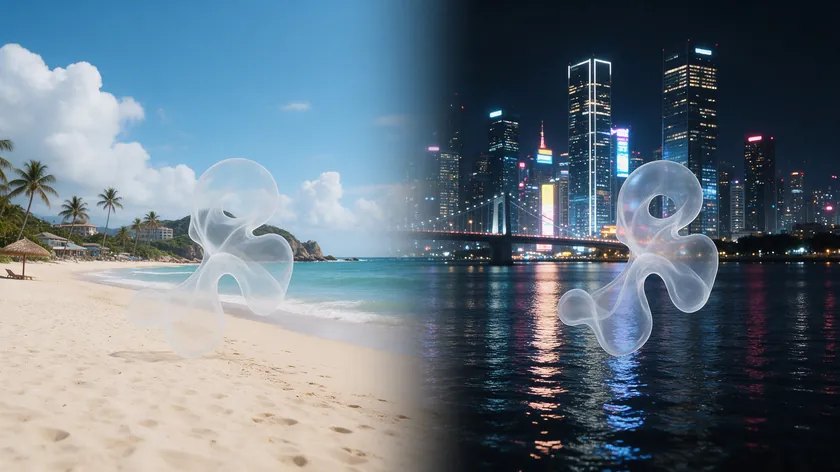
Every version should be tested over both light and dark photos at varying opacities. A watermark at a moderate opacity often balances visibility without distracting from the subject.
You also need both a color variant (for brand identity on your website and packaging) and a monochrome variant (for watermarks and embossed materials). Logos should reflect the photographer’s style and niche across every version.
Choosing Colors, Layouts, and Icons That Fit Your Style
Your color and layout choices should follow your existing photography style. If your images are airy and muted, a neon logo feels disconnected. If your work is bold and saturated, a pale blush wordmark will look timid. The logo reflects your brand’s story before a client reads a single word.
Layout Archetypes That Work for Photography Logos
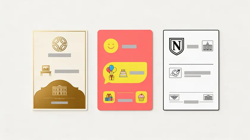
- Simple wordmark (just name + “Photography”): the most versatile starting point.
- Icon-left plus text: small symbol beside name, clean for headers.
- Circular badge or stamp: works well on album covers and packaging.
- Vertical stack: name over descriptor, ideal for constrained widths like social banners.
Many photographers use two or three of these layouts side by side, for example a simple wordmark for the website and a vertical stack for social banners.
Color Direction Ideas
- Monochrome black and white for maximum flexibility across any image background.
- Champagne and soft blush for wedding photography and luxury portrait work.
- Charcoal and deep blue for corporate, commercial, and real estate photography.
- Earthy greens and browns for landscape and outdoor photography.
- A single vibrant accent color if your portfolio’s style is consistently colorful; otherwise, neutral plus one accent tends to age better.
Whichever palette you choose, check it against your own portfolio first, since the logo needs to sit comfortably beside your photos.
Icons to Avoid and Subtler Alternatives
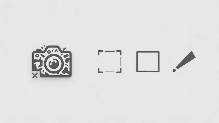
Photography logos should avoid overused camera clichés like detailed shutter blade icons or generic DSLR silhouettes. Subtler alternatives that still carry meaning:
- Focus brackets or a thin frame suggesting a viewfinder.
- A simplified light beam or lens flare abstraction.
- A minimal silhouette tied to your field (mountain outline, wave, or skyline) rather than a literal camera.
If an icon still feels necessary, choose the quietest option and make sure the logo works without it.
From Idea to Finished Photography Logo with AI
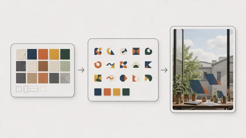
Every idea above can become a real logo without hiring a designer (though hiring a professional designer can yield a unique logo if your budget allows).
Online logo makers simplify the design process for non-designers. Here is a process that works:
- Gather 3–5 inspiration examples whose mood, layout, or color you admire.
- Decide on your niche keywords: “minimalist,” “handwritten,” “negative space,” “elegant wedding,” or similar.
- Sketch rough layout preferences: wordmark, icon-plus-text, circle badge, monogram.
- Generate multiple logo options using an AI photography logo maker and compare them side by side.
- Refine the best concept: adjust font, spacing, icon, and colors, then create all needed versions (full, icon, watermark, and monochrome).
An AI-driven logo maker can churn out variations across styles, letting you customize and test mockups on your own photos before committing. A photography logo template can serve as a starting point, but the goal is always a custom logo that feels like yours.
Key Takeaways
- A good photography logo stays legible when shrunk to watermark size and reads clearly in monochrome over both light and dark images.
- Matching your logo’s mood to your niche (wedding, fitness, landscape) can help build trust with the right clients more than a generic camera icon.
- Minimalist designs, handwritten fonts, and negative space concepts tend to hold up across the places photographers actually use logos: watermarks, social avatars, gallery headers, and prints.
- Building a small system of logo versions (full, icon-only, watermark, and monochrome) prevents awkward scaling failures. Save both light and dark options.
- Testing every logo idea on your own photos is more useful than judging it on a blank white background.
- Refining one strong idea is often more effective than chasing dozens of different concepts. An eye-catching photography logo is one that works everywhere you actually use it: on images, online, and in print.
Ready to turn your favorite idea into a finished photography logo? Try the AI Logo Generator at logo.app to generate several options in seconds and test them on your own photos.
FAQ
How big should my photography logo watermark be on images?
Many photographers keep the watermark small relative to the image, so it stays visible without competing with the subject. Place it near a low-detail area like a corner or bottom edge, and adjust opacity depending on the photo’s contrast.
Social media compression can blur fine strokes, so a slightly bolder watermark version with a stronger stroke weight often holds up better after export.
If you want the watermark to double as a copyright notice, the U.S. Copyright Office explains what a notice includes: the © symbol (or the word “copyright”), the year of first publication, and the owner’s name.
Should my photography logo use my name or a studio name?
A personal name (e.g., “Jane Smith Photography”) often feels trustworthy for portrait and wedding work, where clients value a direct, personal connection. A studio name allows you to scale if you plan to add team members or expand your company.
Check how each option reads at watermark size; long names often become unreadable when small. Keep the choice consistent across your logo, website, and social profiles.
Can I use different photography logos for different specialties?
Many photographers keep one core logo and create subtle variations (shifted color palette, a small icon swap) for different specialties like weddings or fitness. Too many unrelated logos confuse customers and dilute brand recognition.
Visual consistency through the same typography or symbol family often keeps everything unified. Test whether clients clearly recognize that each variation belongs to the same photographer.
How often should I update my photography logo?
Photographers often refresh logos when their shooting style shifts, they move into a new niche, or the current design no longer feels professional.
Gentle evolution (simplifying an icon, adjusting font weight, modernizing a color accent) works better than a full rebrand every year. Consistent use over several years builds recognition with clients, so frequent changes can undercut that investment.
Do I really need an icon, or is a text-only photography logo enough?
Many strong photographer logos are purely text-based. Well-chosen typography and spacing can create a strong logo without any symbol.
An icon can help when you need a small square avatar or a stamp for album packaging, but clarity and legibility matter more than having a symbol. Start with a solid wordmark and add a simple icon later if specific applications demand one.

