
Many churches need a logo for the sign out front, the Sunday bulletin, the livestream, and the social profile, but have no in-house designer on staff. This guide focuses on concrete church logo ideas you can actually use, not generic branding theory. If you are starting from scratch, our guide to business logo design ideas covers the full process first.
Below you’ll find core symbols and their variations, styles matched to traditional, contemporary, and youth or community ministries, layout and readability guidance, color directions, a lightweight team idea process, real-world use cases, and common mistakes worth avoiding.
The tone here is practical and respectful of many church traditions. Whether your congregation worships in a historic sanctuary, a school gym, or a living room, these ideas are meant to be adapted to your story, not to replace it, and nothing here ranks one denomination or style above another.
Table of Contents
- What Makes a Good Church Logo? (Fast Answer)
- Concrete Church Logo Ideas by Symbol
- Logo Ideas by Church Style: Traditional, Contemporary, Youth & Community
- Combining Symbol + Church Name: Layout and Readability
- Color Palette Ideas for Church Logos
- How to Generate and Refine Church Logo Ideas as a Team
- Real-World Church Branding Use Cases (And What Your Logo Has to Survive)
- Common Church Logo Mistakes to Avoid
- Key Takeaways
- FAQ
- How simple is too simple for a church logo—can it really be just a cross?
- Should our church use the same logo for every ministry (kids, youth, outreach)?
- What file versions of our church’s logo do we actually need day to day?
- How often should a church refresh or redesign its logo?
- Can a very traditional church still have a modern-looking logo?
What Makes a Good Church Logo? (Fast Answer)

A great church logo is simple, memorable, rooted in Scripture or mission, and legible from a parking-lot sign down to a 32-pixel social avatar. It should communicate one core idea or feeling instantly—your congregation’s identity distilled into a single mark.
Here are the traits the best church logos share:
- Recognizable without words—logos can convey a church’s values without words when the symbol is strong enough.
- Works in one solid color—a clean, uncluttered shape ensures the logo is legible and recognizable across sizes.
- Connects to your story—meaningful symbolism connects visually to the church’s identity or theological tradition.
- Scales well for church branding—simplicity helps a logo remain effective on various platforms and promotional materials.
Many of the best church logos use one clear symbol—often a cross logo or related icon—plus the church’s name in a strong, readable font.
Concrete Church Logo Ideas by Symbol
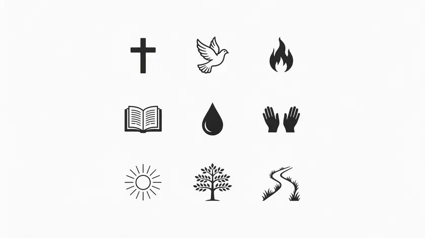
Most church logo designs start with one main symbol. Common symbols in church logos include crosses and doves, but the list extends to flames, open books, water, hands, light, trees, and paths.
Choosing one primary idea and one subtle supporting idea strengthens the logo’s messaging far more than cramming several symbols together.
Every symbol should be testable in solid black to avoid depending on gradients or textures borrowed from a church logo template. Picture a simple grid of black icons showing variations for each family—that’s the level of clarity you want.
Cross Logo Ideas
Traditional logos often feature recognizable symbols like the cross, but a literal, unmodified cross can feel interchangeable.
Using negative space in cross logo designs can create memorable shapes and concepts—think of a cross formed by the gap between two overlapping shapes rather than drawn as a solid outline.
Try blending a cross into local geography: a cross whose base merges with rolling hills, a city skyline, or a window silhouette. You could also integrate the church’s initials so the letterforms themselves create the crossbar.
The goal is to move beyond clip-art proportions into something that represents your congregation’s place and faith.
Dove and Flame Logo Ideas
A dove logo suits churches that emphasize the Holy Spirit, renewal, or Pentecost. Consider a stylized dove whose wings sweep upward to form a subtle cross, or a flame shape that doubles as the first letter of the church’s name—creative expressions of Spirit imagery that stay readable at small sizes.
A flame rising from an open palm or from the spine of a book ties the Spirit to teaching or ministry. Keep line counts low; one or two curves—a principle you can see in minimalist logos. often suggest a dove or flame more effectively than a detailed illustration.
Open Book and Water Logo Ideas
For Scripture-centered congregations, an open book with descending rays—suggesting light pouring from the Bible—works well as a mark. Alternatively, pages fanning outward can echo the shape of steps, implying growth in faith.
Baptism-focused churches might explore water waves that morph upward into a cross or a single droplet whose inner contour reveals a cross silhouette. These ideas tie the life and cleansing imagery of water directly to the cross.
Hands, Light, Tree, and Path Logo Ideas
Community-driven ministries often gravitate toward relational symbols. Interlocking hands arranged in a circle suggest fellowship; a sunrise or lantern silhouette communicates hope.
A rooted tree with a trunk subtly shaped like a cross conveys both nature and faith. A path or road stretching toward a horizon represents the journey of discipleship.
Creative church logos blend faith symbols with unique local elements—logos can incorporate local identity, geographic features, and community values. If your church sits in a valley, near a river, or in the center of a city, weaving that geography into the mark makes the design unmistakably yours.
Logo Ideas by Church Style: Traditional, Contemporary, Youth & Community
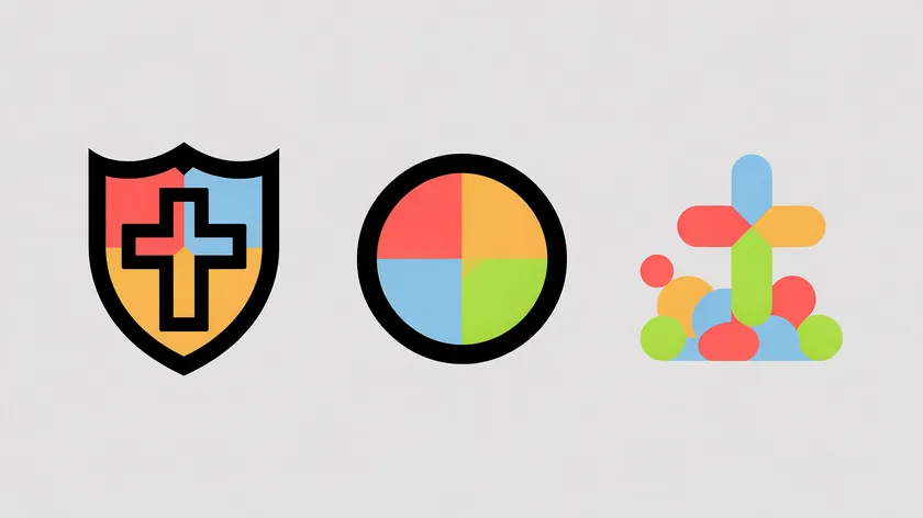
Church logo ideas should match the tone of the ministry. A historic congregation often needs different styling than a youth ministry or a new church plant. Designing a church logo requires a balance of tradition and modern relevance—and the table below offers a starting point, not a rigid box.
| Church Style | Tone | Typical Symbols | Color Palette Direction | Font Direction |
|---|---|---|---|---|
| Traditional Church | Heritage, reverence, architectural | Cross + shield, architectural silhouette, stained-glass window shapes, chalice | Deep jewel tones (royal blue, burgundy, gold), muted neutrals | Serif fonts, classic letterforms like Trajan Bold, modest contrast |
| Contemporary Church | Simplicity, clarity, modern relevance | Minimal cross, abstract geometric icons, light-and-shadow shapes | Soft neutrals with a bold accent, clean blues, teals, grays | Sans-serif fonts like Gotham, clean modern styles, generous whitespace |
| Youth / Community Ministry | Approachable, energetic, participatory | Dynamic icons (light beams, splash, hands, path), playful shapes | Bright accent colors (orange, coral, bright teal) over a neutral base | Friendly rounded or display fonts, informal feel |
Modern church logo designs often use abstract designs—logos featuring abstract shapes can symbolize community and fellowship through their design, and abstract designs can modernize traditional church symbols without abandoning them.
- You don’t need to pick one box. A traditional congregation can adopt a cleaner sans-serif font without abandoning its historic cross symbol.
- Color and typography tend to shift more easily than symbolism—these are good leverage points for refreshing a look without a full redesign.
- Some churches build logo “families”: a core symbol plus style variations for youth, outreach, or children’s ministry to reach more people while keeping unity, much like flexible logo systems used by larger brands.
In practice, the symbol carries the meaning and the type carries the tone, so you can adjust fonts and colors over time without losing the idea your congregation already recognizes.
Combining Symbol + Church Name: Layout and Readability

Even well-designed logo concepts fail if the name is unreadable on a roadside sign, website header, or livestream overlay. A useful church logo is simple, scalable, and memorable, and clean layouts help the eye grasp the mark quickly and move on.
Stacked Layout
Symbol above text. A stacked layout is common in modern church logo designs because it enhances visual hierarchy and fits naturally into square social avatars and app icons. This arrangement also enhances logo visibility and memorability on profile images.
Horizontal Layout
Symbol to the left of text. This works well for building signage and website headers where width is available and the name needs to read clearly from a distance.
Badge or Emblem Layout
Symbol and name enclosed in a badge shape, much like emblem-style marks. This layout feels at home on bulletins, T-shirts, patches, and event posters—anywhere the logo needs a self-contained frame.
Symbol-Only Layout
A stand-alone symbol that can be paired with text when needed. This is the version you’ll use for livestream watermarks, favicon icons, and small merchandise where text would be illegible.
Font Choice and Readability Testing
Typography plays a crucial role in modern church branding and influences the perception of spirituality in your mark. Common fonts for church logos include Gotham for a clean, contemporary feel and Trajan Bold for a timeless, classical tone. For a deeper look at font categories, see our guide to picking brand fonts.
Typography should feel appropriate for the church’s culture and mission—choose one primary display font for the logo and a simpler companion font for bulletins and slides, and always emphasize clarity over decorative scripts.
Test your work: print the church logo in black and white at one inch wide, then view it as a phone home-screen icon. If details blur or the name vanishes, simplify.
Color Palette Ideas for Church Logos
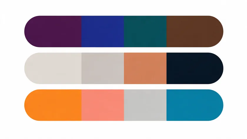
Color palette choices quietly communicate tone—calm, joyful, historic, or energetic. Many great church logos limit themselves to two or three main colors, and muted color palettes are a common choice in church logo designs.
Colors in church logos carry emotional and traditional weight, such as blue for stability and green for growth.
Calming Blues and Teals
Blue often signals peace and trust, which is why many churches lean toward it. Blues and teals tend to suit churches wanting a calm, welcoming tone. Try pairing a deep blue with a warm off-white for a grounded, approachable palette.
Earthy Greens and Browns
Greens and browns often communicate growth, renewal, and groundedness. Earthy colors like brown and beige often appear in modern church logos, especially among congregations with creation-care or outreach emphases. A forest green paired with a soft sand neutral feels rooted and alive.
Warm Neutrals with a Single Accent
Warm neutrals with one accent color often feel quiet, modern, and understated—ideal for contemporary churches that want the symbol to stand out. Warm gray with a single terracotta accent keeps the mark sophisticated without competing for attention.
Deep Jewel Tones for Tradition
Burgundy, royal blue, or emerald often communicate heritage and reverence. A burgundy paired with gold or cream tends to resonate with historic congregations that value timeless design.
Bright Accent Colors for Youth Ministries
Bright accents such as orange, coral, or bright teal often communicate energy and approachability. Keep to one bright color over a clean neutral base—this prevents the mark from looking chaotic while still drawing attention from younger audiences.
Contrast and Consistency for Screens and Print
Your church logo should stand out clearly on both light and dark backgrounds, with a simple one-color version ready for overlays.
Consider a muted color palette to suggest peace and community, then pick actual hex codes and document them so they stay consistent across your website, signs, and printed materials.
How to Generate and Refine Church Logo Ideas as a Team
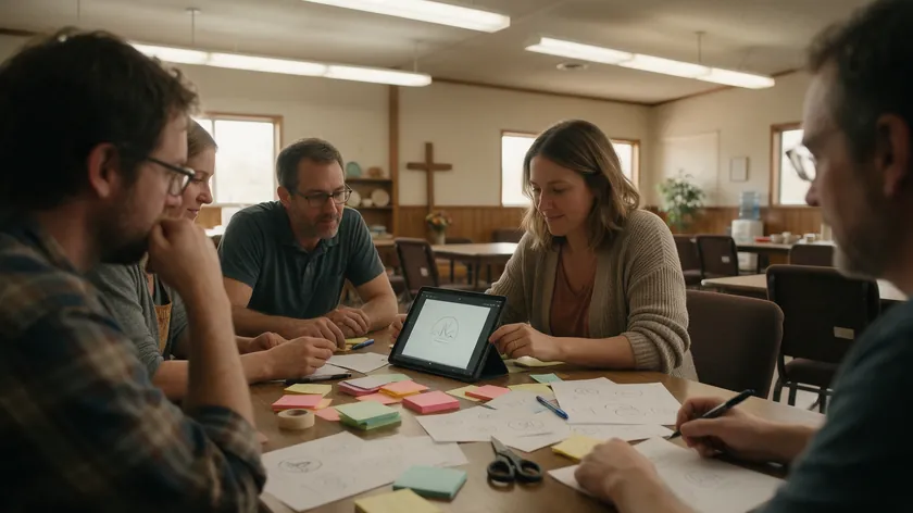
Most small churches don’t have in-house designers, so they rely on volunteers. Here’s a lightweight, church-specific idea process.
Step 1: Run a Symbol Brainstorm Night
List core ministry values on a whiteboard—worship, Scripture, hospitality, and outreach—and map each to concrete symbols rather than abstract adjectives. This grounds the conversation in shapes, not opinions.
Step 2: Sketch 10–20 Tiny Thumbnails
Sketch tiny, rough logo thumbnails mixing symbols, church initials, and simple shapes. Emphasize speed over artistic skill. You’re looking for clear silhouettes, not polished graphics.
Step 3: Test Your Favorites in Real Mockups
Paste rough versions into mockups of a street sign, Sunday bulletin header, livestream frame, and social profile image. You’ll quickly see what holds up and what falls apart.
Step 4: Build the Digital Version
Once a direction feels right, move to a digital version using an AI-based church logo maker. AI-powered tools can create church logos quickly and export them in standard file formats.
Even when using digital tools, keep control of font choice, color palette, and main symbol to avoid generic, template-like results.
Real-World Church Branding Use Cases (And What Your Logo Has to Survive)
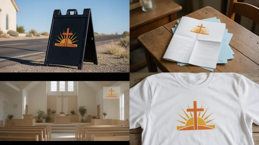
A church logo will live far beyond the website—on exterior signage, bulletins, livestream overlays, and more. Effective branding balances timelessness with modern clarity across various mediums, so test your mark in every context it will actually appear.
Exterior Signage
Large roadside signs and building facades demand bold shapes with strong daylight and night contrast. Fine details vanish at distance—your logo should read as a clear silhouette from across a parking lot.
Printed Materials
Bulletins, invite cards, prayer cards, and event posters are often reproduced at small sizes on budget printers. Keep a one-color version of your logo ready for these situations.
Digital and Livestream Use
Website headers, app icons, social media avatars, and livestream lower-thirds all favor simple symbols over long taglines. A 32-pixel icon leaves no room for detail—your symbol-only version matters here.
Merchandise
T-shirts, mugs, volunteer lanyards, and banners reproduce best with solid shapes and limited color separations. Use a simplified, symbol-first version for embroidery and screen printing.
Stress-Testing Legibility
View the logo on a phone from arm’s length, on a TV across a living room, and on a black-and-white laser print. If it stays clear in all three, you have a logo that will survive.
Common Church Logo Mistakes to Avoid
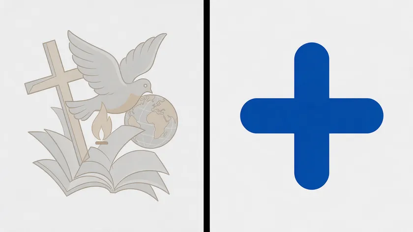
Many churches inherit dated, cluttered marks. Here are avoidable design issues worth watching for:
- Too many symbols at once. Stacking a cross, dove, flame, Bible, and globe creates clutter. Choose one main idea and perhaps one subtle supporting element.
- Clip-art-style graphics. Generic stock icons with inconsistent line weights make your logo look like every other church’s. Custom simplification—even starting from church logo templates—makes a difference.
- Low contrast colors. Colors that disappear on livestream overlays or projectors undermine your brand. Test dark-on-light and light-on-dark versions.
- Small, thin fonts. Decorative scripts vanish at social media avatar size. Pick a bolder font choice for words like “Church” or “Community.”
- Copying another church’s logo. Imitating distinctive shapes creates confusion. Focus on your own story and location-specific imagery instead.
- Overcomplicated gradients or textures. Flat color versions tend to reproduce more reliably across low-cost printing and embroidery.
Most of these problems come down to the same fix: choose one idea, simplify it, and test it at the smallest and largest sizes your church will actually use.
Key Takeaways
- A good church logo is simple, recognizable without text, meaningful to the community, and readable on signs, screens, and social media.
- Most ideas start from a few core symbols—cross, dove, flame, book, water, hands, light, tree, and path—combined thoughtfully with the church’s name.
- Pick one symbol tied to your mission and decide your church style: traditional, contemporary, or youth and community.
- Choose a tight color palette and font that work in black and white. Muted blues and greens are a common choice in church logos, largely because of the calm, growth-oriented feelings they tend to suggest.
- Avoid clip art, “just a cross” clichés, and overcrowded graphics. Prioritize readability at every size.
Bring your ministry team or volunteers into the idea process. Design skill is less important than clarity and honesty about who your congregation is.
A well-designed logo reflects a church’s values and mission—and the simplest path to finding yours is to explore what already makes your community distinct.
Ready to turn your best church logo ideas into polished files? The AI Logo Generator at logo.app lets you translate your symbol, font, and color decisions into usable logos for signage, bulletins, and every digital channel your ministry touches.
FAQ
This FAQ tackles specific, real-world concerns not covered in detail above, aimed at pastors, elders, and volunteers working on a church logo for the first time.
How simple is too simple for a church logo—can it really be just a cross?
Many effective church logos are extremely simple, but a literal, generic cross alone can feel interchangeable with thousands of other marks.
Adding subtle distinctives—unique proportions, a surrounding shape, or integration with your church’s initials—keeps the mark minimal while making it unmistakably yours.
Should our church use the same logo for every ministry (kids, youth, outreach)?
Many churches keep one main logo for the whole organization and create related variations for ministries—the same symbol and font choice, but a different color palette or a small icon for kids or youth. This maintains unity without losing personality across programs that reach different audiences.
What file versions of our church’s logo do we actually need day to day?
At minimum, keep three: a full-color version for web and print, a one-color version for overlays and low-cost printing, and a simplified symbol-only version for social avatars and small merchandise.
Vector-based originals are ideal for resizing without loss of quality. Make sure your tool exports a vector file (SVG) and PNG versions so a single download covers everyday needs.
How often should a church refresh or redesign its logo?
Churches often keep a core symbol for many years, updating type and simplifying shapes every decade or so as media needs change.
Only redesign when the current mark feels confusing, unreadable, or out of step with the church’s present identity—not just because trends have shifted.
Can a very traditional church still have a modern-looking logo?
Yes, often. Many traditional congregations successfully pair historic symbols—architectural silhouettes, stained-glass shapes, and classic crosses—with cleaner lines and updated fonts. The result is a logo that honors heritage while feeling approachable and inspired to newer generations.

