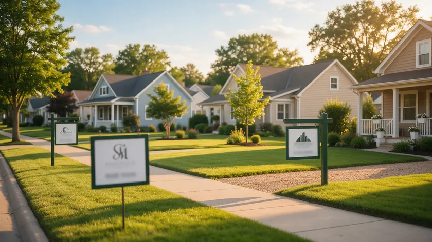
A strong real estate logo idea ties to your name, a specialty, or a local market—and stays legible on a yard sign from twenty feet away and at thumbnail size on a phone screen.
The best real estate logos in 2026 move past generic house icons toward something personal and distinctive: bespoke initials, subtle local landmarks, or a clean wordmark that clients remember after a single glance.
This guide gives you ready-to-use real estate logo ideas organized by who you are (individual agent, small team, or new brokerage) and what you sell (luxury, first-time buyers, vacation homes, investment property).
You will also get a comparison table and simple real-world tests so you can check that a logo actually works before you order a single yard sign.
Whether you are creating your own real estate logo on a tight budget or just looking for a concrete direction to hand off to professional designers later, the ideas below will help you skip decision paralysis and land on a logo that fits your real estate business.
Table of Contents
- Why Your Real Estate Logo Matters More Than Ever
- Start Here: Quick Real Estate Logo Directions You Can Choose From
- Logo Ideas for Individual Real Estate Agents
- Logo Ideas for Small Teams and Boutique Brokerages
- Luxury Real Estate Logo Ideas That Feel Truly High-End
- Modern Real Estate Logos for Urban and Tech-Savvy Markets
- Local and Niche-Focused Real Estate Logo Ideas
- Choosing the Right Color Palette and Design Elements
- Comparison Table: Which Real Estate Logo Idea Fits You?
- Real-World Tests Every Real Estate Logo Must Pass
- From Idea to Finished Mark: Using AI Without Losing Control
- Key Takeaways
- FAQ
- Should my real estate logo feature my personal name or my brokerage name?
- How often should I update my real estate logo?
- Can I use the official Realtor symbol or similar marks in my logo?
- What file types do I really need for my real estate logo day to day?
- What if my market already has logos similar to the one I like?
Why Your Real Estate Logo Matters More Than Ever
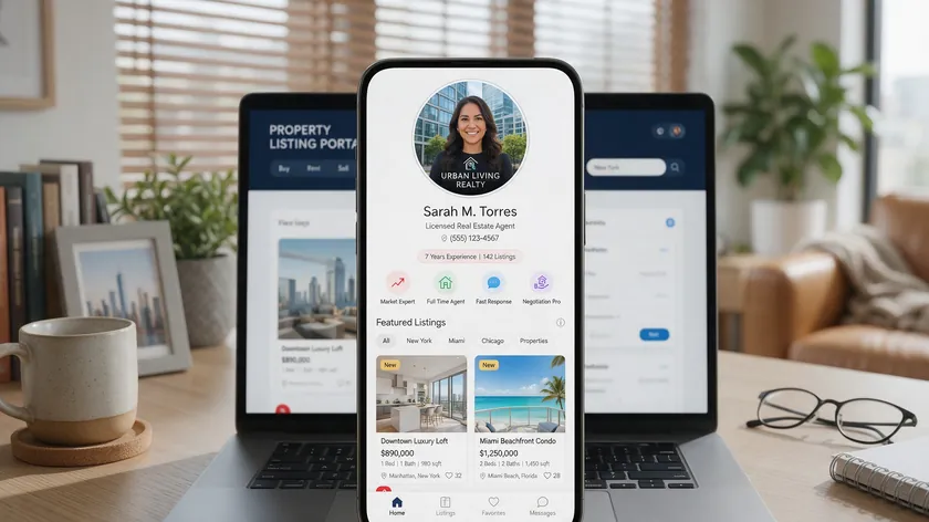
In 2026, many buyers may first meet you on listing portals, social media, or Google—so your real estate logo often speaks before you do. A strong logo needs to communicate trust, professionalism, and stability across every format: open house signs, postcards, listing presentations, and digital ads.
Your logo is the visual anchor of your brand identity, and it shapes how clients perceive your real estate company before they ever pick up the phone.
Many agents still rely on clip-art house or key icons. Those generic symbols tend to blur together along streets lined with yard signs, or in online directories where every other logo looks the same. A strong logo connects to something real about the brand—your name, your niche, or the community you serve.
Different roles call for different strategies. A solo agent’s logo often centers on a personal name or signature. A small team needs something that feels bigger than one person but still approachable. A new brokerage needs a mark that conveys authority and scale.
The sections below walk through specific ideas for each, plus practical tests to make sure any direction you choose actually works in real life. For ideas beyond real estate, see our guide to business logo design ideas.
Start Here: Quick Real Estate Logo Directions You Can Choose From
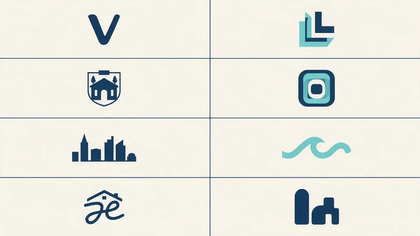
Think of this section as a menu. Instead of staring at a blank screen, pick the one or two directions that match your situation, then read the deeper sections that apply to you. Design themes for real estate logos include modern, minimalist, traditional, and established—so there is a style for every market.
Here are concrete logo directions to consider:
- Clean name-only wordmark—Best for solo agents whose name recognition is their main asset. Color palette: navy and white or charcoal and warm gray.
- Modern monogram—Bold initials enclosed in a circle or square, with “Team” or “Group” underneath. Color palette: deep green and cream, or navy with a teal accent.
- Luxury crest or seal—Initials inside a refined badge with “Est. YYYY.” Color palette: black and gold, forest green and ivory.
- Minimalist geometric mark—Abstract architectural lines suggesting buildings. Ideal for new developments and urban condo specialists. Color palette: graphite and white with a single bright accent.
- Local landmark icon—Simplified skyline, bridge, or mountain silhouette beside your name. Color palette: slate gray and warm wood tones.
- Waterfront or mountain silhouettes—Stylized waves, peaks, or desert forms for vacation and second-home markets. Color palette: muted blues and cream, or warm sunset tones.
- Friendly script plus roofline—Handwritten first name over a clean surname with a subtle roofline. Color palette: soft blues, light grays, muted green.
- Bold abstract mark—Upward bars or grid forms implying growth, suited to investor or developer niches. Color palette: charcoal and electric accent.
Minimalist designs tend to work well for real estate logos because they hold up at every size. You can plug any of these directions into an AI logo generator at logo.app—for example, “Modern real estate logo, initials ‘JR’, navy and white, abstract skyline”—and see variations in seconds.
You can also customize colors, fonts, and layouts until something clicks. Before you scroll further, note your top two or three directions. That way you can read selectively and focus on the sections that matter most to your brand.
Logo Ideas for Individual Real Estate Agents
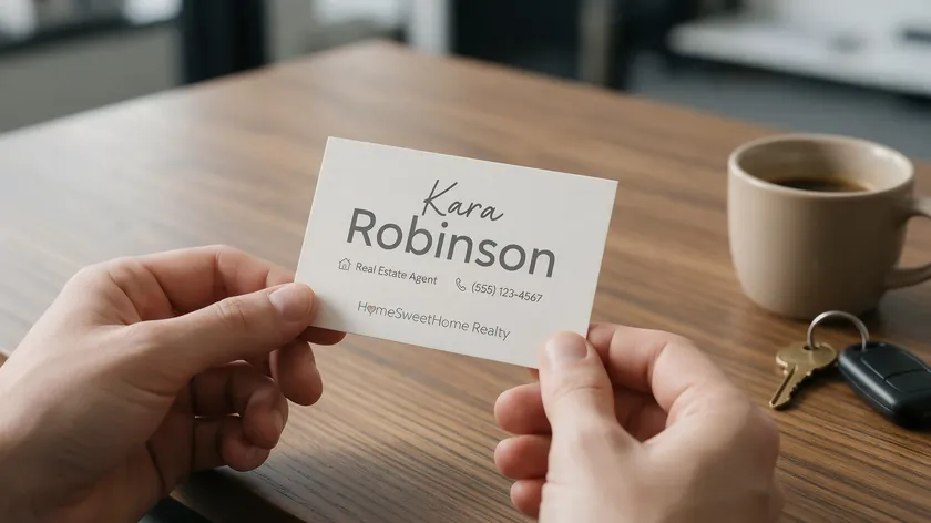
As a solo agent, you are the brand. Your real estate agent logo usually leans on your name, initials, or a personal signature rather than a corporate feel.
A good logo should be simple and easy to understand—clients need to connect it to you instantly on a postcard, an email signature, or a yard sign.
Typography shapes how clients read a real estate logo’s identity, so font choices matter here: readable serif fonts tend to work well for family-focused agents, while sans serif fonts suit a more modern commercial style.
Signature Plus Clear Surname
Picture your first name in a relaxed handwritten script placed above or beside your last name set in a clean, bold sans serif. This direction communicates personal warmth and clear identity at the same time.
It works well on listing signs and email signatures—just make sure the script stays legible when scaled down. If the handwriting gets unreadable at business-card size, simplify the strokes.
Initials-Based Approach
For longer names, use your initials in bold letters enclosed in a subtle shape—a circle, square, or rounded rectangle—with “Real Estate” or your brokerage descriptor beneath. This approach shines as a social media avatar, a stamp on listing photos, or a monogram on a folder.
Keep the initials distinct and uncluttered so they read at a glance. Avoid ornate flourishes or very thin strokes that disappear when the logo shrinks to a social media avatar or a business card.
Name-Focused Logos Tied to a Niche
Add a discreet niche cue to a name-based logo: a simplified condo outline for downtown specialists, a small tree line for suburban family homes, or waves for coastal agents. These symbols must stay minimal so the logo scales down without losing detail.
Where the brokerage name goes depends on your broker’s rules and local regulations—typically it appears in a smaller line underneath. Confirm with your managing broker before finalizing the layout.
Logo Ideas for Small Teams and Boutique Brokerages

Small teams need logos that feel more substantial than a solo mark but still personable. The same logo will appear on group ads, team yard signs, and recruiting materials, so it must flex across a broad range of formats.
Here are a few concrete concepts:
- Two-initial monogram with “Group” or “Team” underneath—Monograms can convey a polished, premium identity in real estate branding. Pair them with a geometric sans serif for a modern look.
- Shield or badge with team name and founding year—Communicates heritage and unity. Works on business cards and office signage alike.
- Horizontal wordmark with a simple geometric symbol at one end—A small abstract building block or doorway icon replaces the literal house, keeping the design fresh.
Use subtle design elements—like a thin horizontal line separating the team name from a descriptor—to keep hierarchy clear even at small sizes. A modern real estate logo for a boutique brokerage might use clean uppercase lettering, a thin underline, and an abstract shape instead of a literal house icon.
Stick to two or three colors that communicate trustworthiness: navy with warm gray, or deep green with cream. Keep the design flat and avoid heavy shadows so it reproduces well on everything from social media headers to recruiting flyers.
A logo must be on-brand to enhance business recognition, so make sure the mark feels true to the team’s personality—not just polished for the sake of it.
Luxury Real Estate Logo Ideas That Feel Truly High-End

Luxury real estate logos in 2026 tend to favor restraint. Clean type, generous white space, and a limited color palette do more work than ornate flourishes ever could. The strongest luxury logos look simple but feel expensive.
Consider these luxury real estate logo ideas:
- A navy wordmark with spaced-out capital letters and a discreet gold line beneath.
- A monoline gate or key icon above a refined serif wordmark.
- A minimal crest with initials and “Est. 2020” for a boutique luxury firm.
Gold and navy tend to signal an established, high-end brand. Effective palettes also include charcoal and ivory, or forest green with a metallic accent. Test metallics in print before committing; gradients can flatten on paper.
Tasteful symbols that echo high-end living—stylized gates, arches, palm fronds, skyline outlines—add a sense of luxury without overloading the design with decorative detail. If you work a specific luxury niche (waterfront mansions, ski-in/ski-out homes, downtown penthouses), weave in one local cue that still looks upscale.
Always test your logo against both dark and light backgrounds so it holds up on black-and-gold listing signs and white letterhead alike.
Modern Real Estate Logos for Urban and Tech-Savvy Markets

Modern real estate logo ideas are ideal for city agents, investor-focused brokerages, and tech-forward teams who rely heavily on digital lead generation. Sans serif fonts suit modern commercial real estate firms, and flat design keeps icons crisp on screens of every size.
Specific concepts worth exploring:
- A simplified skyline bar above the company name.
- Stacked initials in a square grid—clean, compact, memorable.
- An abstract “doorway” icon that doubles as a letter from the business name.
- An upward-angled bar mark combined with a clean wordmark, implying growth without clichéd arrows.
Bold but controlled color palettes work best: charcoal with electric blue, black and white with a single bright accent like coral or teal. These modern logos tend to work well as social media avatars and website favicons because their icon portion remains crisp at very small sizes.
Real estate logos often use black and white color palettes as a base, adding a single vivid highlight for distinction.
Local and Niche-Focused Real Estate Logo Ideas
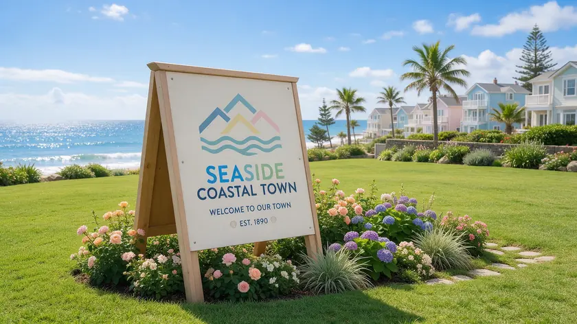
Tying your real estate logo to a location or niche tends to be far more memorable than repeating generic rooftops. A logo rooted in local geography helps you claim territory in a buyer’s mind and signals that you know the area better than out-of-town competitors.
That said, house and roofline symbols are effective for communicating real estate concepts when used sparingly and combined with unique elements.
Local Landmarks
Use a simplified silhouette of a recognizable landmark—a bridge, mountain range, lake outline, or downtown skyline—drawn in a one-line style above or beside your name. Prefer line work or minimal fill so the icon reads at any scale. The same principle applies to mountain ranges, coastlines, rivers, or city silhouettes.
Niche Specialties
Small farmhouse silhouettes work for rural acreage specialists; simplified multi-unit blocks signal investor focus; tree lines and neighborhood map elements suit suburban move-up markets. The key is to keep symbols stylized enough to recognize from a moving car on a yard sign.
Vacation and Second-Home Markets
Sailboats, ski peaks, or desert cacti can anchor a vacation-market logo—but keep them minimal so they scale down well. An AI real estate logo maker can quickly generate several logos similar to your favorite local concept by varying lines, angles, and icon simplification until one feels right.
Choosing the Right Color Palette and Design Elements
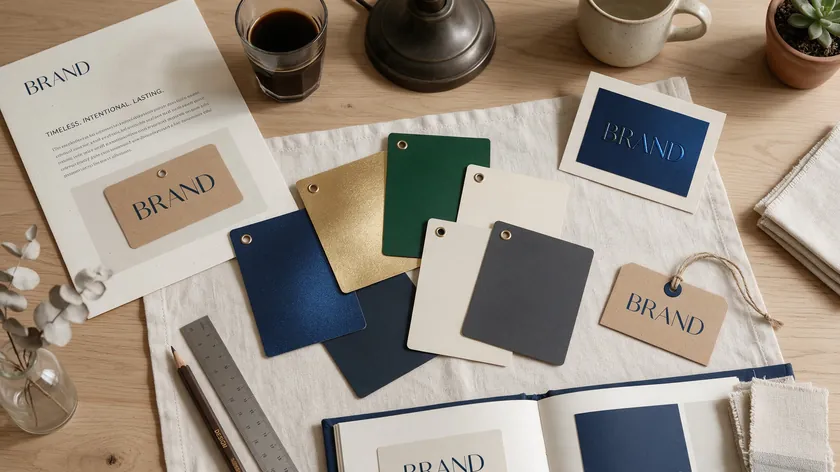
Color psychology influences how clients perceive real estate brands, so your palette should connect directly to your positioning.
Warm colors can create an approachable and friendly atmosphere in real estate branding, while cooler tones like navy and charcoal project authority. Effective logos typically use two to three colors for impact—primary, anchor, and accent.
Palettes tailored to real estate:
- Navy and gold—luxury and established feel.
- Deep green and cream—“land and lifestyle” positioning.
- Black, white, plus one bright accent—modern city brands.
- Soft blues and warm gray—approachable family agents.
Common design elements in the real estate industry include roofs, keys, doorways, skylines, and lot markers. To avoid clichéd designs, try more distinctive spins: negative-space doors inside letters, simplified property boundaries, or geometric shapes suggesting windows.
Test your color palette by printing the logo in black and white. If the design loses all clarity without color, the contrast needs more work. Avoid very light text on light backgrounds—it will disappear on a sunlit yard sign.
You can experiment with alternate color palettes in logo.app once you have a strong structure, instead of redesigning from scratch.
Comparison Table: Which Real Estate Logo Idea Fits You?
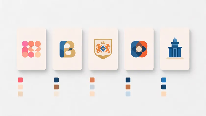
Use this table to quickly match your role and market to a logo direction. Each row connects a style to the situations where it tends to perform best.
| Logo Style | Best For | Typical Design Elements | Suggested Color Palette | Where It Shines Most |
|---|---|---|---|---|
| Name-only wordmark | Solo agents building a personal brand | Clean serif or sans serif, minimal icon or none | Navy + white; charcoal + warm gray | Yard signs, email signatures, listing presentations |
| Team monogram | Growing teams wanting unity and scale | Bold initials, shape enclosure, “Team/Group” descriptor | Deep green + cream; navy + gold accents | Team signage, recruiting materials, group ads |
| Luxury crest / seal | Luxury brokers or developers | Crest or badge, initials, “Est. Year,” refined type | Black + gold; forest green + ivory | Brochures, embossed stationery, luxury portfolios |
| Modern geometric mark | Urban or tech-savvy agents | Abstract building forms, sans serif, minimal detail | Charcoal + electric blue; black/white + bright accent | Websites, social avatars, investor materials |
| Local landmark icon | Hyperlocal or vacation-market agents | Silhouette of landmark, minimal outline, paired with name | Slate gray + warm wood tones; muted blue + cream | Yard signs, local press ads, market-specific promos |
The best real estate logo for you is the one that matches your audience and works in all the places you actually market—from a 24-inch sign to a 40-pixel avatar.
Real-World Tests Every Real Estate Logo Must Pass
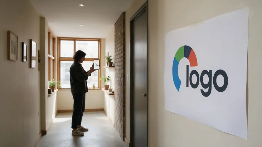
Before you finalize any real estate logo, run these quick practical tests. They take minutes and can save you from an expensive reprint. Simplicity in design helps logos remain legible at any size, and these tests prove whether your logo has it.
Logos should be recognizable at a glance and versatile across various platforms—these checks confirm both.
Yard Sign Test
Print your logo at roughly 18×24 inches, tape it to a wall or door, and step back 20–30 feet. Can you still read the name and phone number? If the name blurs, increase font weight or simplify the icon.
Thumbnail Test
Shrink the logo to 40×40 pixels and preview it as a mock social media profile picture and in an email signature. If the symbol or text becomes indistinct, you need higher contrast or fewer elements.
Photograph Overlay Test
Place the logo in the corner of a sample listing photo. It should be visible without overpowering the property image. If it vanishes against busy backdrops, add a subtle stroke or semi-transparent background bar. For more on logos that sit on top of images, see our guide to photography logo ideas.
One-Color Test
Convert the logo to solid black. Does it still work? You will need a one-color version for inexpensive black-and-white flyers, faxed contracts, or embossing. If the design collapses without color, the structure needs more work.
Trusted Client Check
Show two or three options to a few trusted clients or colleagues and ask specific questions: “Can you read the name from across the room?” and “What kind of property do you think this logo represents?” Their answers often reveal unintended impressions no screen preview can catch.
These five tests give you objective evidence that a logo will hold up in the real world, whether it was created by an AI tool or sketched by hand.
From Idea to Finished Mark: Using AI Without Losing Control
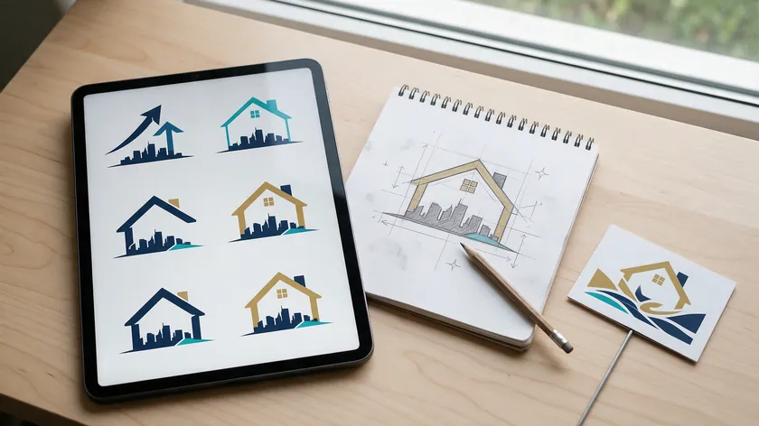
AI tools can quickly turn a written idea—“modern real estate logo with initials ‘LM’ and a subtle skyline, navy and white”—into multiple visual options. Online logo makers use algorithms that can generate a logo in seconds, and many offer customizable real estate templates.
But speed is only useful if you stay in charge of the creative direction. Decide on the name, the specialty, and the overall mood before you generate anything, so every option you see can be judged against a clear brief.
Here is a simple workflow:
- Pick 2–3 directions from the sections above.
- Write short prompts and paste them into the AI Logo Generator at logo.app. Example prompts:
- “Luxury real estate logo, ‘Harbor Lane Realty’, navy and gold, minimal crest with subtle wave line”
- “Modern real estate agent logo, initials ‘KT’, charcoal and teal, abstract city skyline”
- “Family real estate logo, ‘Greenfield Homes Group’, soft blue and warm gray, friendly script with roofline”
- Generate multiple variations for each prompt. Save three to five favorites.
- Run each favorite through the real-world tests above—yard sign, thumbnail, photo overlay, one-color, and client check.
- Iterate intentionally: first lock in a layout that reads well, then refine the color palette, then tweak fonts. Avoid changing everything at once.
Do not accept the very first output. Compare several options side by side, mock them up on a yard sign template and a social media post, and only then commit. Logos should communicate your brand’s essence effectively, and that takes a few rounds of honest comparison.
When your real estate business grows, you can always have a designer refine the strongest AI-generated concept into a polished long-term brand mark—complete with brand guidelines and all necessary file types. But starting with a clear, tested logo today is far better than waiting months for the “perfect” design.
Key Takeaways
- Most strong real estate logos in 2026 rely on clear names, focused symbols, and tight color palettes instead of generic house icons and trendy fonts.
- Choose a logo direction that reflects who you are (agent, team, brokerage) and what you sell (luxury, local, niche) before worrying about tiny design details.
- Test every logo idea in real-world conditions—on mock yard signs, thumbnails, and listing photos—so you know it will work before ordering any print materials.
- Use AI tools like the AI Logo Generator at logo.app to quickly explore multiple logo directions, then refine the best one instead of settling for the first draft.
- Plan for consistency: once you pick a good real estate logo, apply it the same way across signs, cards, flyers, email signatures, and social media to build recognition over time.
Ready to turn your favorite real estate logo idea into a finished mark? Take your top two or three directions to the AI Logo Generator at logo.app, generate a few options, and run them through the real-world tests above before you print anything.
FAQ
Should my real estate logo feature my personal name or my brokerage name?
Solo agents who are the main “face” to clients often lead with a personal name—something like “Alex Rivera Real Estate”—and include the brokerage or company name in a smaller secondary line.
Teams or brokerages planning to grow may benefit from a brand name that is not tied to a single person, making it easier to add agents later.
Either way, build the logo around the name your clients are most likely to search for and remember. Brokerage and franchise rules sometimes dictate how the business name must appear, so confirm with your broker before finalizing layouts.
How often should I update my real estate logo?
Many successful real estate brands keep the same core logo for years, making only small refreshes a simpler type, a cleaner icon—every few years as styles shift.
Consider an update if your logo feels dated on current digital platforms, is hard to read on phones, or no longer matches your market after a move into luxury or a different property niche.
Avoid changing too frequently, since consistency helps clients recognize your signs and ads. Treat any update as an evolution—keeping recognizable elements like core colors or a familiar symbol—rather than a complete reset.
Can I use the official Realtor symbol or similar marks in my logo?
The REALTOR® marks are collective membership marks controlled by the National Association of REALTORS®. Members may use them only under NAR’s trademark rules, which restrict altering the marks or placing them inside a firm name.
Check with your local Realtor association or managing broker for the most current rules before including such symbols.
Many agents choose to keep their primary logo independent and display the Realtor mark separately in a compliant way.
What file types do I really need for my real estate logo day to day?
For everyday use, you need a high-resolution PNG with a transparent background for your website and social media, plus vector formats like SVG or PDF for print items such as yard signs and vehicle wraps.
Vector files let printers scale your logo to any size without it getting blurry, which matters on large outdoor signage. Keep a simple folder with light and dark versions, full-color and one-color versions, and both horizontal and stacked layouts if available.
Many logo makers can export multiple formats at once, making it easy to stay organized from the start.
What if my market already has logos similar to the one I like?
Common symbols—roofs, skylines, keys—can easily lead to logos that look alike in the same city or county. Stand out by leaning harder on your unique name, initials, or niche plus a specific local element, rather than relying solely on standard icons.
Do a quick search of local competitors’ sites and social pages, then compare your proposed logo side by side to ensure it reads as distinctive.
Small but meaningful tweaks—a different color palette, creative typography, or a more abstract take on a shared symbol—can create clear differentiation and help your real estate agency own its visual identity in a crowded market.

