
A good fitness logo is simple, readable at small sizes, and matched to the type of gym or training business it represents. Logo design can influence customer perceptions before they ever use a service, so a fitness logo often acts as the visual heartbeat of a brand.
A well-crafted logo can communicate core values before any text is read. For gyms, studios, and online coaches, that first impression often happens on a phone screen—not a front desk. Your logo needs to work on walls, apparel, apps, and social media, not just inside a mockup.
Table of Contents
- It All Starts With a Fitness Logo
- What Makes a Good Workout and Fitness Logo?
- Fitness Logo Directions by Gym or Trainer Type
- Logo Design Details That Matter in the Fitness World
- Lessons from Well-Known Fitness Brand Logos
- Create and Launch Your Fitness Logo Fast
- Key Takeaways
- FAQ
It All Starts With a Fitness Logo
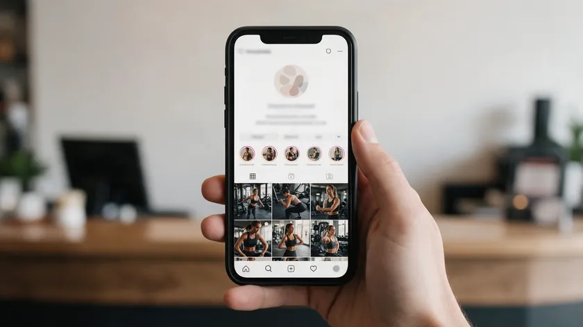
Many members tend to see a gym logo on their phone screen before they ever walk through the door, making it the first “workout” with your brand. In practical terms, a fitness logo is a consistent symbol and wordmark that appears on building signage, membership cards, class schedules, and social media posts.
Fitness brand logos for gyms, PTs, and fitness apps need to signal results, safety, and community at a glance. A great logo shows what you stand for. It becomes the anchor for everything else—color scheme for the facility, tone of marketing, and even merch like T-shirts and shaker bottles.
Memorable logos help build brand recognition across multiple platforms, so a logo needs to function equally well across various media formats. With modern logo design tools like Logo.app, a small studio or solo trainer can test multiple fitness logo ideas in a single afternoon instead of waiting weeks.
What Makes a Good Workout and Fitness Logo?
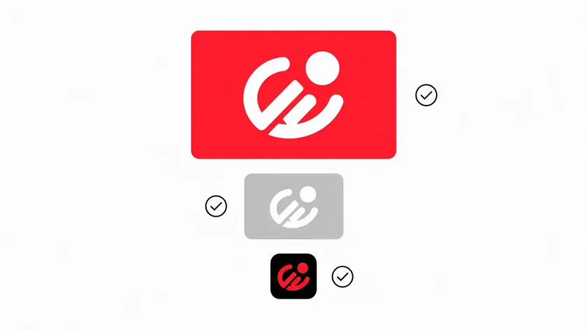
Strong fitness logos tend to be simple, memorable, and easy to reproduce at different sizes and on different materials. Clean minimalist designs suggest professionalism and simplicity, while strong logos tend to avoid generic symbols and convey distinctive visual ideas. Fitness logos should reflect the brand’s training style and values.
Core ingredients include a clear symbol (barbell, heartbeat line, silhouette in motion), a readable name, and a color palette that fits the gym’s promise.
Shapes convey messages before words do in logo design—think of a circular mark with a kettlebell and bold sans-serif text, or a vertical wordmark with a rising arrow replacing a letter. Fitness logos communicate brand identity through color and shape.
Avoid overly detailed muscles, tiny gradient lines, or crowded icon sets—simplicity helps a logo scale without losing legibility. A fitness logo should maintain readability across various sizes. High-quality logos can signal competence and care to potential customers, and effective logos often evoke an emotional connection with consumers.
Designing a fitness logo requires balancing visual energy with versatility. Distinctive logos help clients recognize a brand and help differentiate businesses in a crowded market.
Quick checklist: Does it work in black and white? Is it legible across the gym floor? Does it feel on-brand on a cotton tee?
Fitness Logo Directions by Gym or Trainer Type
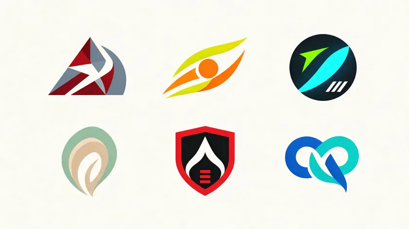
Here’s a shortcut: pick the gym type closest to yours and use the direction below as your starting point for concrete gym logo ideas.
Strength and Powerlifting Gyms
Rugged icons like plates, barbells, or chains tend to work well. Bold fonts and angular shapes tend to convey strength and performance. Lean into darker, high-contrast palettes—black, steel gray, deep red.
Functional Training and CrossFit-Style Boxes
Dynamic shapes—diagonals, arrows, motion lines—capture energy. Slightly distressed wordmarks and colors like lime, orange, or electric blue on dark backgrounds tend to match this world.
Boutique HIIT and Group Training Studios
Clean, modern gym logos with minimal icons (pulse line, circle, bolt) and friendly rounded sans-serif fonts work here. High-intensity spaces often use aggressive colors like red and orange, so pick bright accents that stand out on Instagram.
Yoga and Pilates Studios
Softer geometric or organic symbols (lotus, waves, circles) with balanced spacing suit wellness. Calming tones like sage green and soft purple often appear in wellness spaces, reflecting the health and balance these studios promise.
Martial Arts Academies
Emblem-style or badge-inspired designs with simple silhouettes in motion tend to read well on belts and gi patches. Confident reds, blacks, and whites keep things bold.
Personal Trainers and Online Coaches
Focus on a strong wordmark with a subtle icon—initials forming a monogram, a small checkmark. Colors should look trustworthy on apps, PDFs, and video thumbnails. People need to recognize you at every level of your digital presence.
| Gym Type | Logo Direction | Type Style | Color Direction |
|---|---|---|---|
| Strength / Powerlifting | Rugged icon + emblem | Condensed bold sans-serif | Black, steel gray, deep red |
| Functional / CrossFit-style | Dynamic shapes, motion | Distressed or semi-bold | Lime, orange, electric blue |
| Boutique HIIT | Minimal icon, clean mark | Rounded friendly sans-serif | Bright accent + dark base |
| Yoga / Pilates | Organic geometry | Elegant light sans-serif | Sage green, soft purple, sand |
| Martial Arts | Badge / emblem silhouette | Strong uppercase serif or sans | Red, black, white |
| PT / Online Coach | Monogram + wordmark | Clean modern sans-serif | Trustworthy blue, teal, charcoal |
Pick one direction, generate several variations, and quickly mock them up on a wall photo, shirt, and app icon to learn which gym logo feels most authentic.
Logo Design Details That Matter in the Fitness World
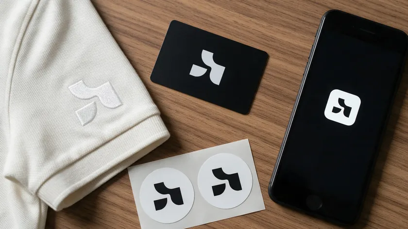
Beyond looking good in a concept file, here are the design elements that tend to make or break fitness brand logos in real-world use.
Icon Choices
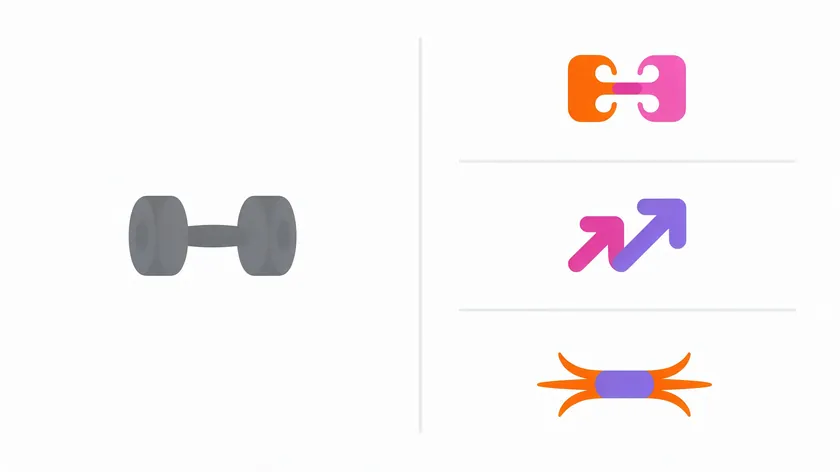
Dumbbells and flexed arms can work when simplified, but they often feel generic. Pictorial logos visually represent fitness services or products offered—so pick an icon that tells your specific story. Negative space logos creatively use white space to convey fitness themes, while pictorial logos represent what your business contributes to fitness.
Alternatives like stylized initials, progress arrows, or motion streaks often feel fresher.
Typography for Gym Logos
Bold, clean sans-serif typefaces tend to suit strength-focused brands. Slimmer, more elegant sans-serifs tend to suit yoga and Pilates, while high-contrast bold fonts help HIIT studios with quick recognition. Wordmark logos focus on typography to represent fitness brands—they declare your existence as a service provider.
Emblem logos can suggest strength and history and work well for established gyms with a legacy feel.
Color Decisions
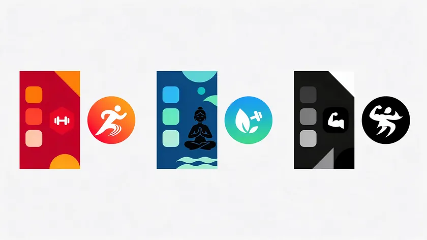
Colors can trigger immediate emotional responses in fitness branding. High-energy reds and oranges tend to fit intense training; blues and greens can signal health and recovery; monochrome schemes often feel premium for clubs and personal brands. Logos communicate brand identity through color and shape, so document your exact HEX values for consistency.
Real-World Testing and Common Pitfalls

Test your logo by embroidering it on staff polos, printing it small on membership cards, cutting it in vinyl for front doors, and checking legibility as a 48×48 pixel app icon. Common pitfalls include neon gradients that don’t print well, ultra-thin letterforms, and stacking tiny taglines under the main wordmark.
Keep a “stress test” mindset—if the logo survives embroidery, black-and-white printing, and tiny digital sizes, it is probably solid enough for a growing fitness brand.
Lessons from Well-Known Fitness Brand Logos
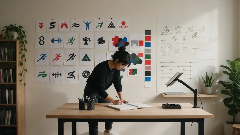
Studying a few established fitness brand logos can offer practical lessons—search for inspiration, not templates to copy.
Gold’s Gym features its strong central lifter figure and bold lettering, an old-school, power-focused mark that has stayed in use for decades. Gymshark’s shark-inspired symbol paired with a clean wordmark tends to suggest speed and modern performance, fitting a modern, style-conscious positioning.
Planet Fitness pairs a gear logo with a purple-and-yellow palette that tends to feel approachable and non-intimidating, supporting its “Judgement Free” positioning. The brand announced a refreshed gear logo and an updated palette in September 2026.
Equinox takes the opposite approach with a minimalist wordmark and refined spacing, tending to signal a premium, lifestyle-driven fitness club.
Takeaways: commit to a single idea, limit detail, and match style to your target audience. Never copy protected designs—apply the principles instead.
Create and Launch Your Fitness Logo Fast
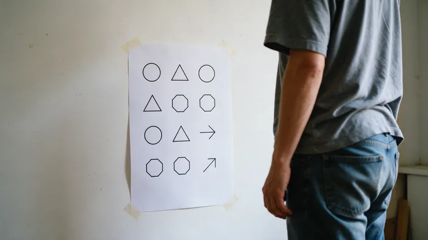
You can move from idea to usable fitness logo in days, not months:
- Define your audience and vibe—hardcore strength, family-friendly, or mindful—then collect 5–10 reference gym logos and pick 2–3 potential icon themes.
- Use a logo design tool like Logo.app to generate several variations, experimenting with different fonts, icons, and color palettes from the directions above.
- Print a one-page sheet of your top options, tape them to a wall, and view them across the room to see which stand out and which become unreadable.
- Show the strongest 2–3 options to a handful of current or potential members and ask which logo best matches how they describe your gym or coaching brand.
- Export final logo files for key uses—signage, website header, social icons, and class schedule templates—so the new gym logo rolls out consistently from day one.
Treat these five steps as a loop: if feedback points to a weak option, go back to step two and generate a new set before you export. For the broader brand system around your logo, see our business logo design ideas.
Key Takeaways
- Different gym types benefit from different logo directions—pick yours from the table above and iterate from there.
- Simple shapes, limited color palettes, and legible fonts are non-negotiable for real-world use like embroidery and signage.
- Stress-test the logo before launch: if it survives embroidery, black-and-white printing, and tiny digital sizes, it is probably solid enough for a growing fitness brand.
- Study established fitness logos for lessons, not to copy them: commit to a single idea, limit detail, and match the style to the audience.
Ready to see your gym or studio name come to life? Enter it in Logo.app’s AI Logo Generator, compare several fitness logo directions in minutes, and download ready-to-use files for signage, apparel, and apps.
FAQ
What is a good logo for a fitness app?
A good fitness app logo is a simplified mark—often a single icon or monogram—that stays legible as a small app icon and social avatar. Avoid fine details or gradients that collapse at 48×48 pixels; instead, aim for a bold, recognizable shape with one or two colors.
Should my gym logo include a dumbbell or barbell?
These icons can work when handled simply, but they often feel generic. Try testing at least one concept without obvious equipment—an abstract or initial-based symbol may feel more unique and still communicate a workout-focused brand.
Can I use famous gym logos as inspiration without copying them?
Inspiration means learning principles—commit to one idea, limit detail, match style to your audience—not replicating protected designs. If you’re unsure whether a concept is too close to an existing trademark, consider checking with an IP professional.
Can I change my fitness logo later if my gym grows?
Rebrands are common as gyms add locations or new services. It is usually best to keep some continuity in color or typography so existing members still recognize the brand, even as the mark evolves to reflect your next level of growth.

