A strong cafe logo needs to signal atmosphere, quality, and personality at a glance. Whether you run a minimalist specialty bar, a plant-filled brunch spot, or a late-night espresso bar, your logo is the first thing customers notice—on a cup, a storefront sign, or an Instagram profile.
This guide covers concrete cafe logo ideas across four proven styles: emblem, typographic, linework, and mascot. A great logo communicates your cafe’s brand identity, and the right style helps you attract the customers who will love your space.
A logo maker like Logo.app lets coffee shop owners generate, customize, and export multiple cafe logo concepts in minutes—without hiring a full design agency. You can explore directions, refine fonts and colors, and walk away with files ready for print and digital from day one.
Table of Contents
- Why cafe logos matter more than ever
- Emblem-style cafe logos: badges for cups, signs, and stickers
- Typographic cafe logos: letting the name do the talking
- Linework and minimalist icons: modern cafe logo ideas
- Mascot and character cafe logos: adding personality to your brand
- From idea to finished cafe logo: colors, layouts, and using Logo.app
- Key Takeaways
- FAQ about cafe logos
Why cafe logos matter more than ever
In 2026, most customers find a coffee shop on Instagram, Google Maps, or a delivery app before they ever walk through the door. With independent specialty cafes multiplying in every city, your logo is often the deciding factor between a tap and a scroll past.
- A good cafe logo communicates atmosphere at a glance—a cozy neighborhood spot, a third-wave roastery, or a grab-and-go espresso bar. The logo should reflect the cafe’s unique vibe and attract the right customers.
- Consistency across brand elements—cups, loyalty cards, tote bags, apparel, and signage—enhances recognition and builds trust over time. Customers remember a cafe by its visual identity more than its menu.
- Generic coffee logo clichés (random cups, floating beans, wispy steam) are everywhere. That matters more now than ever: according to Daily Coffee News, specialty coffee consumption hit a 14-year high in 2025, with 58% of American adults drinking a specialty coffee in the past week. In a category growing this fast, logos that communicate the cafe’s story and values visually—drawing on local architecture, origin stories, or neighborhood motifs—stand out more than generic designs ever could.
- Memorable cafe logos can justify higher drink prices by signaling craft and quality. The most effective logos combine simplicity with uniqueness.
- Researching competitors can help create a unique logo that stands out in a visually crowded market. A logo should communicate the brand’s essence visually, not just decorate a cup.
Emblem-style cafe logos: badges for cups, signs, and stickers
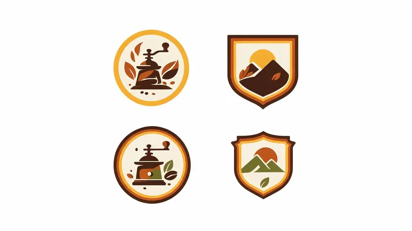
Emblem logos are badge-style marks that combine an icon and text into a single unified shape. Emblem logos combine icons with wordmarks for strong branding, making them a natural fit for cafes that want a heritage or artisan feel.
- Circular or shield-shaped emblems sit naturally on coffee cup lids, pastry bags, and outdoor hanging signs—ideal for cozy neighborhood cafes or roastery brands.
- Imagine a 2026 micro-roastery called “Copper Mill Coffee” using a round emblem: an outer ring reading the cafe name with “Est. 2026” and a city name, an interior icon of a hand grinder, and a subtle coffee bean plant leaf as an ornament. That single shape works on a cup stamp, a tote bag, and a front-door sign.
- Visual themes that suit specialty coffee shops include roasting tools, mountains where beans are grown, sunrise over a cup, or plant motifs. Iconography should use clear symbols like coffee cups and beans, but effective logos often focus on one visual metaphor to avoid clutter.
- For colors, consider deep espresso brown, copper, forest green, and cream for artisan warmth. Monochrome versions work well for minimalist, third-wave cafes.
- Emblem cafe logos can be simplified into a tiny mark for app icons or social avatars. Test the simplified version at small sizes to ensure legibility—if interior details get lost below 32 px, strip them back.
Typographic cafe logos: letting the name do the talking
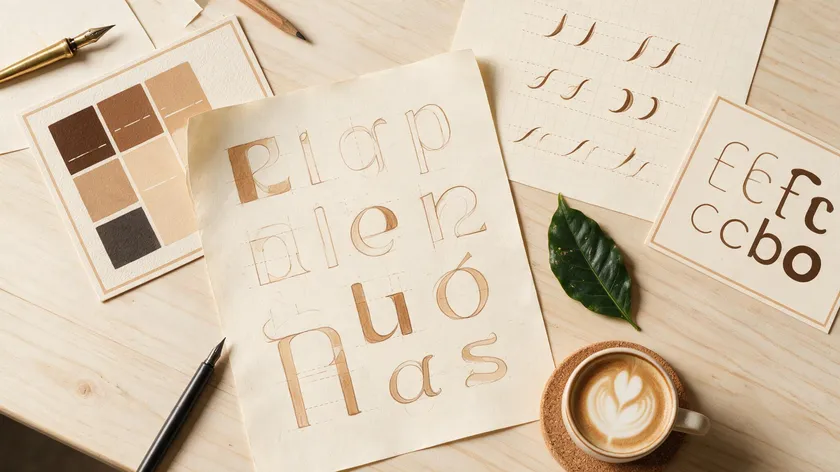
A purely typographic cafe logo—sometimes called a wordmark—centers the shop name itself as the primary visual identity. Typographic logos rely on strong typography for versatility and are well suited for modern espresso bars and bookish cafes where atmosphere and name recognition matter most.
- Font directions to explore: soft rounded sans-serif for family-friendly brunch spots, condensed grotesk for industrial coffee bars, and elegant serif for patisserie-heavy cafes. Logos should feature bold, clean fonts for recognition, and typography should align with the brand’s personality and be legible.
- Imagine a small coffee shop named “Morning Lines” with a tall, narrow wordmark echoing the vertical lines of pour-over stands and shelving. Logos can be designed using typography for versatility—no supporting icon required.
- Subtle customizations elevate a wordmark from generic to distinctive: stretched letters, ligatures, a coffee bean-shaped dot over the “i,” or a rising baseline to evoke steam without literal icons. Effective logos feature custom illustrations and thoughtful typography, even when “illustration” means a single bespoke letterform.
- Test legibility across real-world uses: chalkboard menus, window decals, loyalty stamps, and mobile screens. A practical threshold is 16–24 px on screen. If the logo design holds up at that size, it will work almost anywhere.
- Pair the main wordmark with a short tagline like “slow coffee & fresh pastries” to quickly position the brand. Effective taglines for logos should be three to seven words long.
Linework and minimalist icons: modern cafe logo ideas
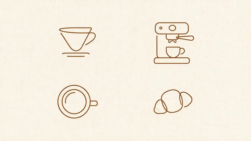
Linework and minimalist icon styles use thin strokes, open shapes, and negative space to create contemporary cafe logo ideas. Minimalist designs suggest refinement and class in logos and are popular among third-wave specialty cafes with pour-over bars, single-origin menus, and clean interiors.
- Concrete icon ideas that avoid clichés: abstract dripper shapes, simplified espresso machine outlines, a croissant silhouette, or a top-down mug view rendered as a circle with a single-line handle. Creative cafe logos often blend minimalist design with clever visual metaphors.
- Imagine “North Pier Cafe” using a single-line illustration that turns a pier silhouette into the handle of a mug—reinforcing its waterfront location while keeping the coffee logo distinctive and instantly readable.
- Use one or two colors—charcoal and cream, or dark green and off-white—to keep things minimalist while still printable on napkins and sleeves. Ensure high contrast for readability in black-and-white or small formats.
- Balance delicacy and durability: linework logos use intricate designs for a contemporary look, but lines too thin will disappear on textured cup materials or screen-printed apparel. Test on corrugated sleeves before finalizing.
- Logos should be simple for use on small items and large signs. Combine a minimal icon with a simple brand name in uppercase to create a flexible logo system for merch like enamel pins and canvas bags.
Mascot and character cafe logos: adding personality to your brand
A mascot cafe logo introduces a friendly face—an animal, barista character, or illustrated object—that makes a small coffee shop feel approachable and memorable. Mascot logos feature characters to represent the brand, and they work especially well where cafe culture emphasizes community and playfulness.
- Illustrative ideas: a sleepy fox waking up with espresso for an early-opening cafe or a smiling croissant reading a book for a quiet, reading-focused coffee shop. These illustrations give customers a sense of the world inside your doors.
- Style choices matter: flat, bold shapes suit youth-oriented cafes serving iced lattes and colorful pastries; softer, hand-drawn lines align with artisan bakeries offering house-roasted coffee.
- Use the mascot across touchpoints—latte art stencils, kids’ cups, loyalty stamps, and seasonal social media posts—to build a cohesive brand identity inspired by one recognizable character.
- Versatility is key so logos can be used across various media and formats. Keep the character simple enough to reproduce in one color for embossing on sleeves or debossing on leather menu covers. The logo must remain recognizable in full color and black-and-white.
From idea to finished cafe logo: colors, layouts, and using Logo.app
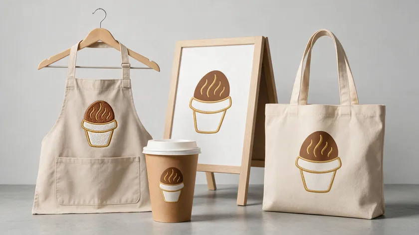
Choosing colors strategically enhances the emotional response to a logo. Colors evoke emotion and can suggest warmth or energy, so select a palette that matches your cafe’s positioning. Different colors communicate different emotions, reflecting the café’s atmosphere. A good logo uses three or fewer colors for simplicity, and warm browns signal coziness while bright colors signal high-energy vibes.
Color Palette
| Cafe Positioning | Recommended Colors | Why |
|---|---|---|
| Rustic / artisan roastery | Earthy Brown + Terracotta | Feels warm, handcrafted, natural |
| Dessert-forward / brunch cafe | Pastel Tones (blush, mint, cream) | Feels soft, inviting, playful |
| Minimalist / third-wave espresso bar | Charcoal + Off-White | Feels clean, modern, focused |
| Cozy neighborhood cafe | Deep Green + Cream | Feels warm, natural, welcoming |
Layout Variations
- Every cafe logo should have basic layout variations: a primary horizontal version for menus, a stacked version for signage, and a simple icon or monogram for cup stamps.
Testing on Real Mockups
- Recommend testing draft logos on real mockups—12 oz cups, A-frame sidewalk boards, and Instagram profile circles—to check clarity and impact before committing.
Using Logo.app
- In Logo.app, start by entering your coffee shop name, opting for a relevant style direction (emblem, typographic, mascot, linework), and then browse generated cafe logo ideas. Refine fonts, icons, and colors until the design feels right. It’s easy and free to search through thousands of starting points.
- Export multiple file formats and color variants—full color, black, and white—so your cafe logo works across print and digital uses. Having those files ready on opening day saves time and ensures the brand stays consistent from packaging to social media posts.
Key Takeaways
- Successful cafe logos connect style, emblem, typography, linework, and mascot with the real experience customers will have in the space. The keyword is alignment between what you design and what you serve.
- Simplicity, legibility, and versatility across cups, menus, signs, and social media matter more than visual complexity. If it works on a 2 cm stamp, you’ve hit the right level of detail.
- Tools like Logo.app let cafe owners explore multiple logo directions quickly, customize colors and shapes, and continue refining until the brand identity feels right.
- Treat your cafe logo as the foundation for all future branding—from packaging to seasonal campaigns to excellence in every customer touchpoint.
Ready to grow your brand? Create a professional cafe logo in seconds with our AI Logo Generator—fully editable and yours to own.
FAQ about cafe logos
Here are quick answers to common questions that come up when cafe owners start the cafe logo design process.
How simple should a cafe logo be?
A cafe logo should be simple enough to recognize at a glance and reproduce at small sizes, but still distinctive enough to stand apart from nearby competitors. A useful rule of thumb: if it works in one color on a 2 cm loyalty card stamp, the level of detail is appropriate.
Do I need a different logo for my coffee beans and my cafe?
Most coffee shops can use one core logo for both the physical cafe and packaged beans, adjusting only the layout or color for packaging. If your business has multiple arms, adding a small descriptor like “Roastery” or “Bakery & Cafe” under the same brand identity keeps things cohesive without creating confusion.
What file formats do I need for a new cafe logo?
You need vector files (SVG, PDF, or EPS) for printers and sign makers, plus PNG and JPG for websites, delivery apps, and social media. Transparent-background versions in both light and dark colors make it easier to place the logo on photos, menus, and window decals.
How often should I update my cafe logo?
Independent cafes rarely need full rebrands. Subtle refreshes every five to eight years—refining typography, simplifying the icon, or tightening colors—keep things current without confusing regulars who already agree your cafe feels like home.

