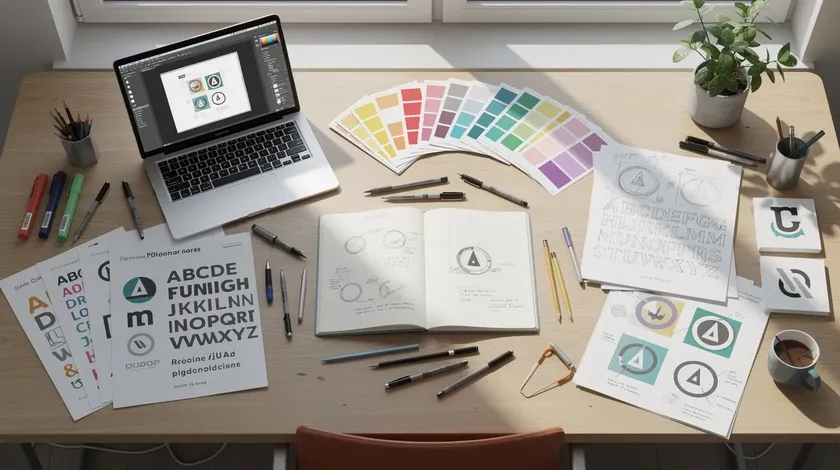
If you’re launching a new business in 2026, you likely need a logo before your website or even your first customer conversation exists.
A strong logo distills a brand’s essence into one clear image or idea, and this guide will walk you through turning a business idea into a logo concept, choosing the right logo type, picking colors and fonts, and applying practical design principles that work at any size across various industries.
Logo.app’s AI Logo Generator uses AI to generate custom business logo ideas across dozens of style categories—then lets you export a ready-to-use logo in just a few clicks, no design background needed.
Table of Contents
- How to Start: Turning a New Business Idea into a Logo Concept
- Choosing the Right Type of Business Logo Design
- Color Ideas and Psychology for Business Logos
- Typography Basics: Picking Fonts That Fit Your Brand Identity
- Cool Business Logo Design Ideas That Work Across Industries
- Practical Design Principles: From “Idea” to a Usable Business Logo
- Logo Ideas by Business Stage and Budget
- Industry Snapshots: Where to Go for Deeper Logo Ideas
- Bringing It Together: From Logo Concept to Brand System
- Key Takeaways
- FAQs
How to Start: Turning a New Business Idea into a Logo Concept
If you’re staring at a blank screen thinking “I need a logo before I can launch,” take a breath. The process can be structured and fast.
Start with a simple three-part self-brief:
- Your business name and tagline. What are you called, and what’s the one-liner?
- What you sell. Write a single sentence (e.g., “subscription-based fitness app for busy professionals”).
- Your ideal customer. Who are you designing the logo for?
A good logo should be unique, simple, and memorable, and logos should reflect the brand’s identity and values. That reflection starts here, in the brief.
Next, translate your brief into visual directions. List 3–5 adjectives that describe how your brand should feel: bold, minimalist, friendly, premium, techy. These adjectives become anchors for every decision that follows:
- “Trustworthy and modern” → cleaner sans-serif fonts, cooler neutrals or blues
- “Playful and youth-focused” → bolder shapes, brighter accent colors, rounded icons
This is also the right time to check the availability of your business name and domain so you can lock in your name and logo together, avoiding costly conflicts later.
Choosing the Right Type of Business Logo Design
Before picking colors or fonts, decide which category of logo fits your business. The main types include wordmarks, lettermarks, symbols, abstract marks, mascots, emblems, and combination marks. For a deeper breakdown, see our guide to different types of logos—here’s the practical summary.
Wordmarks & Lettermarks
A wordmark logo uses stylized text for brand representation, making it ideal when your business name is short and distinctive. A wordmark can involve altering one letter slightly to create a memorable detail—think of how Coca-Cola’s logo uses a flowing cursive wordmark that’s instantly recognizable.
Monogram design combines initials in a unique, stylized way, which is useful when a company name is long and needs a compact mark. These types work well for a new law firm or consulting agency where the name itself should convey authority.
Symbols & Abstract Marks
When a tech startup wants a flexible mark that doubles as an app icon and sits beside the business name on products, a symbol or abstract mark makes sense. Apple’s logo features a bitten apple for distinction—a great example of a pictorial symbol that works globally.
Abstract marks use shapes and negative space rather than literal images, which helps when you need to send the right message without being too literal.
Combination Marks
For small businesses in 2026, combination marks are the most practical choice. They pair a readable name with an ownable icon that can later stand alone on social media, T-shirts, or merchandise. Integrating text and imagery this way can enhance logo recognition from day one.
A boutique clothing brand might combine a stylized stitch-pattern icon with an elegant serif name. A SaaS analytics startup could pair geometric shapes suggesting data flow with a clean sans-serif wordmark.
Playful logos use a cartoon or stylized character to represent a brand, which can work for youth-focused companies or creative agencies. Use symbols that complement your logo’s colors and layout to keep everything cohesive.
Color Ideas and Psychology for Business Logos
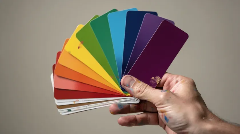
Color is often the first thing people notice about a business logo. Research suggests that 62–90% of snap judgments about a product are influenced by color alone, and color choices influence emotions and perceptions associated with a brand at a subconscious level.
Here’s what common brand colors generally communicate:
- Blue → trust, stability (banks, software)
- Green → growth, sustainability (eco brands, wellness)
- Red → urgency, excitement (food, sales-driven companies)
- Black/Gold → premium, luxury (jewelry, fashion)
Using distinctive colors can help a logo stand out, and colors in logos should resonate with the target audience. Choose colors that reflect your business and resonate with customers rather than simply picking a favorite shade.
Effective logos often use one to three colors to aid recognition, so limit your palette to 1–2 main colors plus a neutral. Too many colors look unprofessional and are harder to reproduce consistently across a website, business cards, and packaging.
Try pairing one “brand color” with a more muted partner for balance—bright teal with charcoal gray, sage with cream. Test color variations on both light and dark backgrounds, and check contrast so the logo remains readable on screens, especially for small text or icons. Logo.app’s color tools let non-designers quickly experiment with different palettes without guessing.
Typography Basics: Picking Fonts That Fit Your Brand Identity
Typography is the voice of your business name. The same word can feel serious, playful, or cutting-edge depending on the font, and choosing the right typography reflects a brand’s personality instantly. Select fonts that capture your company’s personality and values before worrying about anything else.
| Font Family | Typical Use Case | Example Business Type |
|---|---|---|
| Serif | Tradition, credibility, authority | Law firms, publishers, financial advisors |
| Sans-Serif | Modern, clean, digital-first | Tech startups, SaaS platforms, apps |
| Script | Boutique, creative, handmade feel | Bakeries, wedding planners, luxury brands |
| Display | Bold statements, niche personality | Entertainment, streetwear, event brands |
Readability is the first priority. Your company logo text must be legible at 40–60 pixels on a mobile screen, on a small business card, or in an email signature. Research shows that fonts with a larger x-height significantly improve reading speed at small sizes—so avoid ultra-thin weights for logo text.
Keep fonts to one or two choices: one for the business name and one simpler partner for the tagline. A bold sans-serif name plus a lighter sans-serif tagline works cleanly, as does a distinctive serif name with a neutral sans-serif tagline. Layering text this way can create depth and hierarchy in logos without visual clutter.
Logo.app’s editor lets you change fonts and preview your business name in multiple pairings so you can see which style matches your desired brand personality without installing anything manually.
Cool Business Logo Design Ideas That Work Across Industries
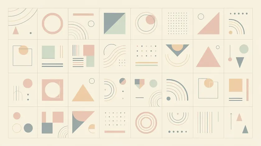
Looking for creative inspiration that isn’t tied to a single vertical? Here are cool logo ideas and patterns visible in some of the most iconic logos and modern logos created in recent years.
- Geometric motion. Simple geometric shapes suggesting movement or growth work across different industries. Nike’s swoosh logo symbolizes motion and speed—a concept equally powerful for a local gym, a logistics company, or a consulting firm. Shapes in logo design influence perception and emotional responses, so choose them deliberately.
- Negative space. Negative space logos hide a symbol within the letters or shapes of the logo. The clever use of negative space in FedEx’s hidden arrow is a great example. Using negative space can create hidden meanings in logos that reward a closer look.
- Minimalist line icons. Continuous line art uses a single, unbroken line to create a logo, while minimalist logos focus on clean lines and limited color palettes. Both approaches pair beautifully with a clean wordmark.
- Nature-inspired geometrics. These blend natural elements with geometric shapes—think a leaf built from triangles or a mountain from simple polygons.
- Iconic symbols. Chanel’s logo features interlocking Cs representing its founder. The Olympics logo features five interlocking rings. McDonald’s logo is known as the Golden Arches. Memorable logos often include subtle symbols that support the brand story.
Creative logo designs often stem from blending simple concepts with unexpected elements. Start designing logos in black and white to ensure strong shape recognition, then add color variations once the core idea works as a black and white logo. Timeless designs avoid chasing current design trends to remain effective over decades.
To find fresh ideas, open Logo.app’s AI Logo Generator, enter your business name and a few style keywords (e.g., “minimal, bold, geometric”), and browse thousands of generated logo options that embody these cross-industry ideas.
Practical Design Principles: From “Idea” to a Usable Business Logo
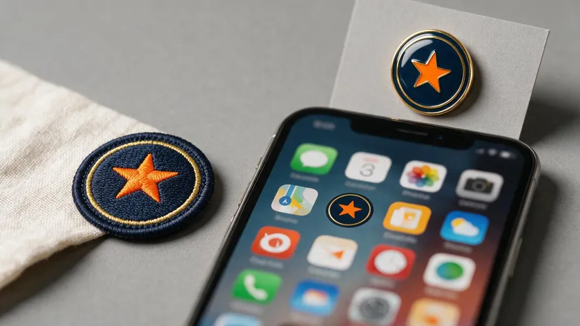
This is where inspiration becomes execution. A beautiful logo that only works in one context isn’t a strong logo—it needs to perform everywhere: websites, social media, signage, invoices, and packaging.
Simplicity and focus. A strong business logo should be sketchable in 10 seconds. Simplicity is important for logo recognition and memorability, and logos should communicate a single concept rather than multiple messages. Avoid tiny details that vanish at small scales. A simple logo layout scales better across different mediums.
Versatility. Plan for at least three layout versions:
- Horizontal (website headers, email signatures)
- Stacked or square (profile pictures, app icon)
- One-color or white logo (stamps, embroidery, low-cost printing)
Versatility ensures a logo looks good at any size and in monochrome. Balance and proportion can be achieved through grid systems or the golden ratio if you want extra polish.
Test at small sizes. Export mockups at the favicon (16×16 px) or social avatar scale. Test your logo for readability across various formats. If the text or symbol becomes illegible, simplify. Testing logos with feedback from others helps assess recognition and representation.
Logo files and exports. You’ll need logo files in multiple high-resolution formats:
- SVG / EPS → scalable for print, signage, t-shirts, and banners
- Transparent PNG → websites and overlays
- JPEG → quick previews and documents
Logo.app can output all of these, ready for use.
Legal basics. Choose an original logo with unique symbols rather than free stock images or generic icons that other businesses might share. Consider a quick trademark check before finalizing—this protects your brand recognition long-term.
Logo Ideas by Business Stage and Budget

Logo needs shift as your business grows. Here’s what makes sense at each stage.
Lean Startup Path
At the idea stage, speed matters most. Use a logo maker like Logo.app’s AI Logo Generator to create a logo in under an hour—generate options, easily customize fonts and colors, and download essential files.
This gives you a clean, legible logo that won’t embarrass you on a pitch deck or landing page.
Growing Business Approach
Once you have traction, refine your visual identity. Lock down exact color codes, font files, and layout versions. Update assets—business cards, slide decks, social media headers, invoices, and email signatures—for consistency. This is just what separates a scrappy startup from a credible brand.
When to Hire a Designer
When brand complexity increases—multiple product lines, international expansion, and premium positioning—it can make sense to hire a logo designer or work with graphic designers for a fully custom logo.
A funded fintech startup or national franchise may need a unique brand identity system that goes beyond what any template offers. But many small businesses never need to go beyond a well-crafted, AI-assisted custom logo of their own.
Industry Snapshots: Where to Go for Deeper Logo Ideas
Logo priorities differ by industry. This pillar page is intentionally general—if you operate in one of these verticals, click through for deeper, niche-specific advice:
| Industry | What Makes Its Logo Distinct | Deep Dive |
|---|---|---|
| Construction | Bold lines, structural shapes, durability feel | Construction Logo Ideas |
| Lawn Care | Organic motifs, green palettes, outdoor themes | Lawn Care Logo Ideas |
| Restaurant | Appetite appeal, texture, emblem, or badge style | Restaurant Logo Ideas |
| Cafe | Cozy, artisanal, handwritten scripts, earthy tones | Cafe Logo Ideas |
| Band | Bold typography, high contrast, memorable silhouette | Band Logo Ideas |
| Church | Simple, symbol-led marks that stay readable on signs, screens, and avatars | Church Logo Ideas |
| Photography | Watermark-ready marks, signature styles, and simple symbols that stay readable on photos | Photography Logo Ideas |
| Real Estate | Name-led marks, local cues, and logos that stay legible on yard signs and phone screens | Real Estate Logo Ideas |
The same logo design process applies to other fields—gyms, legal practices, online education, or e-commerce. The building blocks covered above (type, color, typography, testing) remain consistent across different industries.
What changes is the emotional tone and the visual elements you emphasize to add personality and send the right message to your audience.
Bringing It Together: From Logo Concept to Brand System
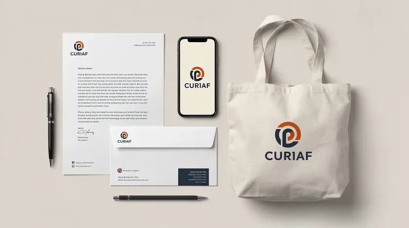
Your logo is the starting point, but a lasting impression comes from applying it consistently across every customer touchpoint. A professional logo becomes a full visual identity when it appears cohesively in these places:
- Website header and favicon
- Social media profiles
- Business cards and invoices
- Packaging and labels
- Email signatures and presentation templates
For small businesses, a lightweight “brand system” is all you need: a defined logo, a small color palette, 1–2 fonts, and simple usage rules (minimum size, clear space around the logo, when to use the full-color version vs. a monochrome version). This creates brand recognition that compounds over time, making your brand easily recognizable.
Tools like a Brand Kit inside design platforms make it easier to store and reuse your logo, brand values, and fonts so every new design automatically matches the core identity. Timeless logos prioritize clean forms that can endure with minor refinements—no need to reinvent every year.
Ready to turn these ideas into a finished company logo? Open Logo.app’s AI Logo Generator, enter your business name, pick a style, and customize your logo—turning logo inspiration into a beautiful logo and a complete brand identity in a single session. Create a logo today and design a logo that tells your story.
Key Takeaways
- Start every logo project with a mini-brief: your business name, what you sell, and who you serve. The best logo ideas come from brand clarity, not decoration.
- Pick your logo type first (wordmark, combination, symbol), then narrow color and font choices. These three decisions do the heavy lifting in creating a professional, eye-catching logo.
- Limit your color palette to 1–3 colors and choose fonts that stay legible at small sizes—your logo must work on an app icon, a favicon, a business card, and a banner.
- Export your logo in multiple formats (SVG, PNG, JPEG) and create at least three layout variations for real-world flexibility.
Use Logo.app’s AI Logo Generator to generate thousands of logo options, discover fresh ideas, and export a finished, ready-to-use logo in minutes. It’s the fastest path from concept to a strong, memorable logo for any new business—and it shows the human side of your brand from day one.
FAQs
Do I need a finished logo before I launch my business?
You don’t need perfection, but you do need clarity. An early-stage business usually just needs a clean, legible logo that won’t need to be thrown away within a few months. A simple AI-generated custom logo is often enough to start selling and testing your idea.
Spending months chasing the best logo is rarely necessary at the beginning—it’s more important to ship a clear identity and focus on product–market fit, with the option to commission a refined redesign later.
How many logo variations should my business have?
Plan for at least three: a primary full logo (symbol plus business name), a compact or stacked version for square spaces, and an icon-only mark for app icons and social avatars. A one-color version is also useful for embossing, stamps, or low-cost printing.
All should share the same style so your brand stays consistent. These can all be exported easily once the core design is finalized, giving you the logo options you need for any situation.
How often should I update or redesign my logo?
Small updates every 3–5 years are common: tightening spacing, simplifying shapes, and refreshing a color. Full rebrands are typically tied to bigger changes like a merger, a new audience, or a major product shift.
Avoid frequent drastic changes, as they confuse loyal customers. Focus on evolution rather than revolution unless the business itself is changing direction.
What are the essential logo file types I should download?
Transparent PNGs work best for websites and social media. SVG or EPS files are needed for sharp, scalable printing and signage. JPEGs are useful for quick previews or documents that don’t support transparency.
Always keep a master vector version of your logo safely stored so you never get stuck with a low-resolution file when you need to print banners, merchandise, or high-quality materials.

